Friday, October 31, 2008

The Urban Market – Sunday, November 2!!


Snap14 

What has become an antique shopping tradition in Houston  -  The Urban Market – is scheduled to be held this Sunday, November 2, 2008.   Doors will open at 9am until 5 pm.  For early birds – the parking area, only, will open at 8:15 am.  The location is new this year.


Snap10


Be sure to make note of the new address for The Urban Market:

The Knights of Columbus Hall & Fields  -  in the Heights.

607 E. Witney Drive  -

Directions:    I-45 North, Exit Airline, Left on Airline, Right on Whitney


ss


Recently, Jackie Sharbrough purchased The Urban Market and this Sunday will be her first market day as the new owner!   Good luck Jackie, it’s going to be great, as usual.   The only thing that has changed under Jackie’s direction is the location.  Jackie has worked hard to get all the same dealers and even some new ones for the market.  There are always lots of bargains to be had, so be sure to get there early.  Jackie also wants to remind everyone that Saturday night is when we change our clocks back from Daylight Savings Time, so don’t forget to set your clocks back one hour before you go to bed!!!   Jackie also wants everyone to know that the Knights of Columbus will be serving BBQ Sunday.  Tickets are $5 at the gate and $3 after 1:oo pm.  Children are free.  My favorite delivery company, Crowded House, will be on site!


image


The list of antique dealers confirmed to be at the Urban Market this Sunday is long and Cote de Texas readers will recognize a few names that will be selling their wares:    Sally Wheat, The Fabulous Flea, Vieux Interiors,  Carolyn Westbrook Home, and Found For The Home are just some of the dealers that should sound familiar.  For the entire list of dealers and more information, go to www.theurbanmarkethouston.com.


Snap13


The weather is supposed to be wonderful this weekend – s0 if you love antiques you should definitely stop by and check it out!  And be sure to
“HI” to Jackie, Sally Wheat, The Fab Flea and Vieux Interiors for me!!!


baa


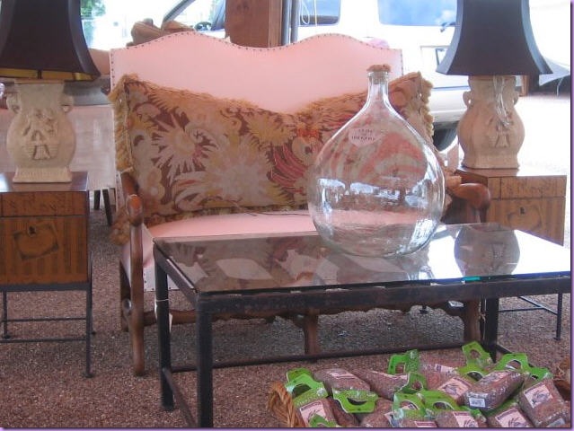
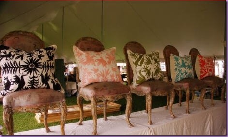
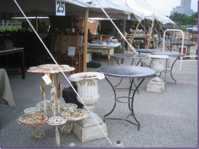
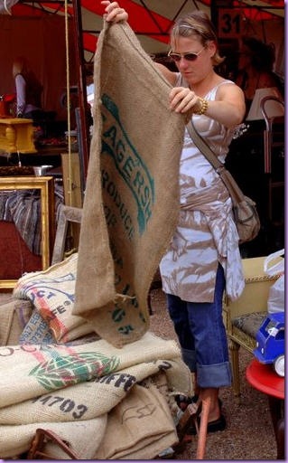
All photos are from past Urban Markets.   The map to Knights of Columbus – Heights:


image

Tuesday, October 28, 2008

Michael S. Smith’s Houses – A Winner!


image

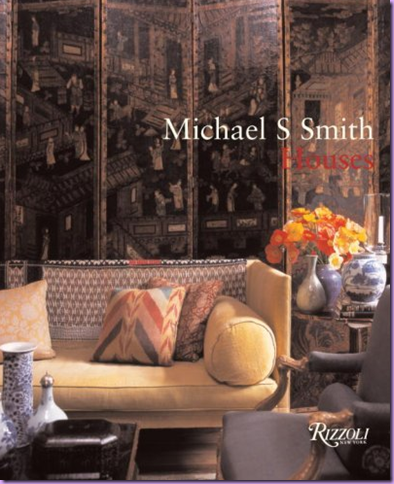
Michael S. Smith, interior designer from California, has been profiled here a few times before:   as the designer of the fabulous hotel Shutters and more recently, The Canary, and as Cote de Texas’ Top Ten Designers - #9  (obviously he is a HUGE favorite of mine!!!)    Smith’s aesthetic is one that has broad appeal – his interiors are both accessible and sophisticated at the same time.  He prefers to use the finest of surfaces, the rarest of antiques, the most exclusive of fabrics, yet his rooms are always friendly and warm.  Nothing about a Michael Smith interior says – don’t touch - nothing is ever off limits.   How he manages to combine the two – priceless and comfortable - is the mark of his genius.   It’s not easy to make the most rarefied seem so cozy, yet he does, perfectly.    Smith’s first book, Elements of Style, was a runaway hit and his second, Houses,  has been eagerly awaited.  It does not disappoint.    With the dizzying array of design books published these days, it is difficult for an author to have his book noticed.   Even though the competition this holiday season is intense, Smith’s Houses is clearly the standout – a must buy for anyone who is serious about interior design.    With the economy on everyone’s minds,  many people have become  discriminating  while choosing a pricey design book, but Smith’s newest should definitely make the cut.     A well known secret about many design books is they truly are not an interesting read.  The pictures drive the book, not the words.  There are, of course, exceptions.  Rose Tarlow’s The Private House comes to mind immediately.  Tarlow’s pictures are secondary to her fascinating story, though the images are certainly worthwhile.  Another design book great, John Saladino’s Style by Saladino, is a bible.  So educational and enlightening, Saladino’s book should be taught in design schools – “Saladino  101.”   Villa, Saladino’s newest is  due out this spring.  Smith’s newest book competes with Tarlow’s and Saladino’s on every level.  He explains his thought processes on design, breaks it down, and justifies his choices.  Written in simple prose, one is able to take away concrete ideas to utilize in one’s own home or a client’s.  Interesting to note that Smith cites Saladino as a major influence of his, along with Niall Smith, Gep Durenberger, Michael Trapp, and a host of other notables, most of whom he either has worked for or  with. 


image   

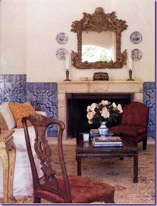
This house, inspired by Portugal with walls made of gorgeous tiles, is featured in the new book.  Smith reveals in Houses that these clients actually wanted a Tuscan inspired house.  Smith, characteristically bored with the plethora of Tuscany houses in Southern California, suggested the clients look to Portugal for inspiration.  The result is one of the prettiest Portuguese styled homes in the United States.  Not that there are that many of those!


In his new book, Smith confirms his first love and the inspiration for his own house is the English Country Manor style, with its look of faded beauty.  He especially adores Georgian style architecture and furniture.  No aspect of an English country home is off limits to his critical eye:  he earnestly studies the massive servant kitchens for ideas.   It is no surprise that Smith’s interiors are typically filled with English, not French, furniture.   In Houses, Smith presents several interior projects recently undertaken.  He has many rules for himself which are listed and are intriguing to study:  wood floors should be stained and waxed, always leave off the polyurethane sealant.  Of course it is much more work to rewax your floors once a year or so, but the effect is worth it.  I must agree with Smith on this point .  I have clients with wood floors that are waxed and they are far superior looking to the sealed hardwoods that turn dull and lifeless looking within a few short years.   Another gem:  his hardware was all replated in silver.  How gorgeous!   He describes the plated finish as being “alive.”  Of course, again, the upkeep of the silver plated finish is something that most people would rather not want, yet this exquisite finish should be considered when choosing hardware.  If the upkeep scares one off, try limiting the silver plate to the powder room and master bath, where it can be enjoyed with daily use.   Most fascinating, Smith’s house was not not painted, instead he used venetian plasters in each room, along with lime washed ceilings.   One can only imagine the cost, and the beauty, of his walls.   The doors are especially refined:  are all paneled of solid mahogany – a luxury few of us will ever experience.   Page after page is filled with these musings on design choices and, for that alone, the book is a must have.   


  image

This beautiful house is featured in the new Michael Smith book.  A new home, built in the Italianate style, Smith and the architect worked hard to have the  house appear to have a patina that is acquired only after a century or two.  I find this room stunningly beautiful!


It is fair to note that many of the projects in the book have been published before.  There are some new houses to be sure, but there are many that have already been seen in magazines.    Yet, this does not detract from the value of the book as it is worth having these beautiful images in one place for further research and enjoyment.  And, of course,  Smith’s running commentary that accompanies the houses shown is priceless.    For each house, Smith takes the reader through the process of his initial inspiration up through the purchasing of the furniture, art, and accessories.  Smith is “obsessed” with design and uses that word frequently:  “Right now I am obsessed with……..”” he says over and over again.  His enthusiasm for interior design and great furniture is infectious.   He also confesses a tendency to get bored with certain fabrics or styles.  He is constantly on the lookout for the next thing that excites him.    Trends have little value to Smith and as soon as something does become mainstream, he leaves it in a cloud of dust – off  seeking out a new inspiration.   This passion comes through the book loud and clear.      He feels great furniture is vastly undervalued when compared to works of art on canvas.  To Smith, a beautiful dining room table IS a work of art.    Lovers of interior design will certainly relate with this sentiment.   While it is true his clients are among the wealthiest, and he is certainly making a nice living, he still retains a air of humbleness.   He seems like one of us when he describes his favorite past time  - perusing real estate listings, dreaming of a different life to be lived in a new place.    One never gets the feeling that his work is a business for Smith.  That seems secondary to him.  It is impossible to imagine Smith being willing or even able to be anything other than an interior designer.  He is that passionate about his art. 


In anticipation of the book’s release, there has been a rash of published works by Smith.  Below, are the two projects just published that are from the new book.  

Enjoy!                                                                                                                                                                                                                                                                                                                                                                                                                                                                                                                                                                                                            ms

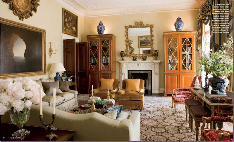
From Town and Country Magazine:   This opulent home located in London was created out of three apartments put together all one floor.  The owners are American, long term clients, who requested Smith furnish the apartment in a few months time.  Looking at this space, it is hard to believe it was put together so quickly, yet this is the claim.  The space is spectacular.  In this room, notice the glorious rug and the matching bookcases that flank the marble fireplace.  Blue and white porcelain, a favorite of Smith’s, finds a home in almost every Smith interior.   The curtain fabric is a blue and cream stripe.  For expediency, Smith had all the curtains made in New York and shipped over.


image

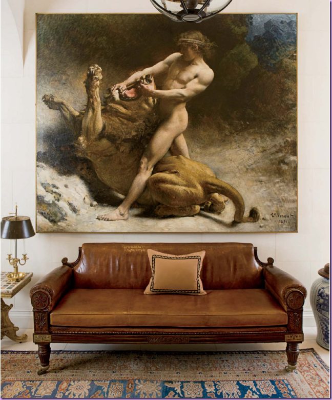
The entry hall.  Smith loves the large entrance halls of country houses in England.  In his own home, he put a fireplace in his entry room.  Here, an oversized painting becomes the focal point in a room without much architectural interest.  The leather sofa is quite stunning itself.


image

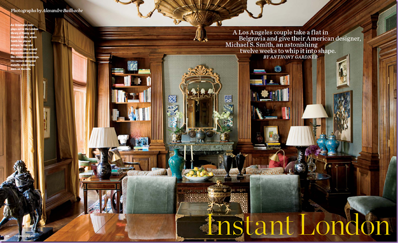
The beautiful library shares space with the dining room.  The peacock blue colored velvet of these dining room chairs is a particular favorite of Smith’s – he used this same fabric in his own dining room.  


image

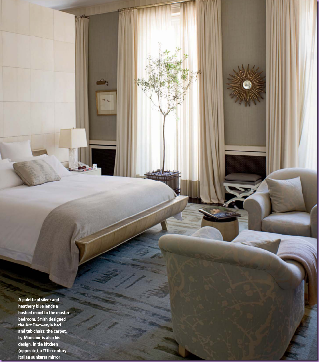
A surprise, the master bedroom has a Hollywood glamour feel to it.  Smith designed the rug and the Art Deco styled bed and chairs.


image

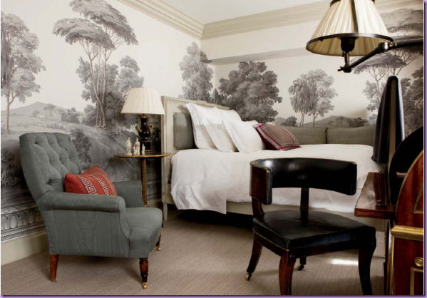
The guest room – where Smith stays when he visits his clients who have become close personal friends.  The walls are covered in a Zuber grisaille paper.  Smith uses de Gournay and Zuber hand painted wall coverings repeatedly. A miniscule room, the paper elevates it tremendously.


image

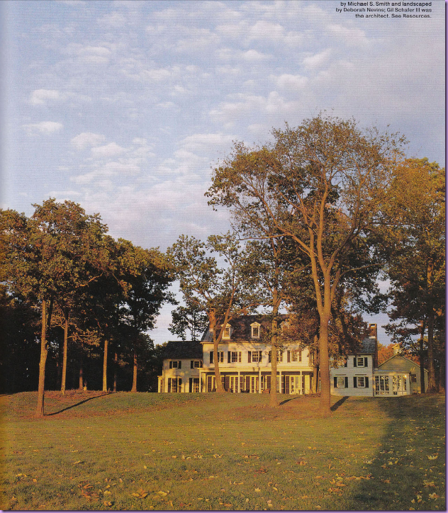
Elle Decor:   This weekend and summer horse farm was built in Millbrook, New York for a Hollywood major player.  Gil Schaefer III was the architect in charge of the three year project.  The house appears old due to the use of original parts taken from an nearby older house that was bought and dismantled for the project:  the beams, floors, moldings, and hardware hinges were all taken from the older house.   Looking at the design of the facade, it truly does look like an older house added on to over the generations.   There is a realism to the architecture that is usually lacking when a lesser architect tries to “age” a new house.


image

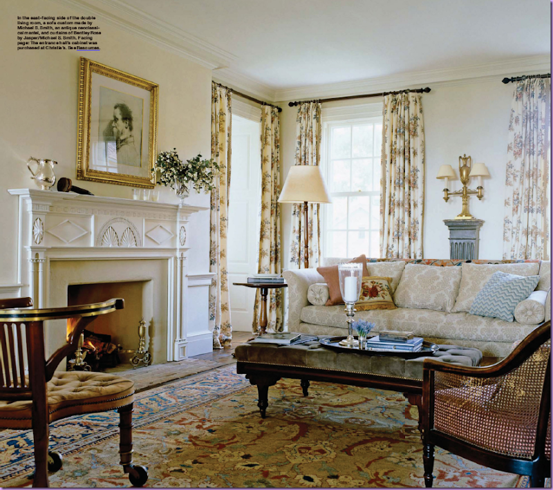
Michael Smith at his best – cozy, warm and inviting.  J’adore the curtains – made of his own fabric Bentley Rose by Jaspar.  Smith’s fabric line is a favorite of mine – the color ways available are never bold, but instead are muted and “off.”    The prints are reminiscent of Robert Kime’s line and his Tree of Life fabric is particularly satisfying. 


 image

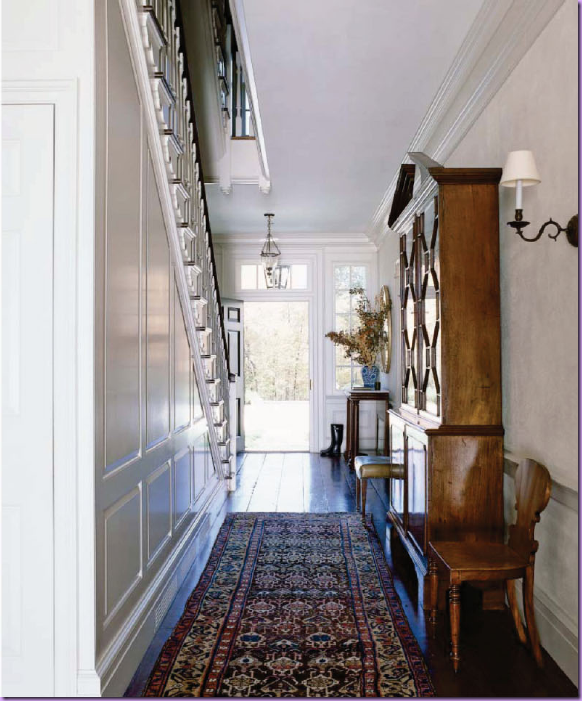
The entry hall with authentic paneling and aged floorboards taken from the other house.

 image

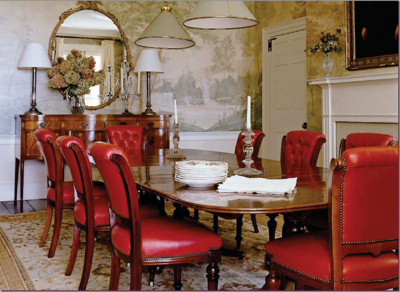
The dining room has a spectacular mural painted to resemble an old paper.  Tufted red leather chairs further the English feel of the room.   The table is an antique with a patina that Smith says is impossible to duplicate from scratch. 


image

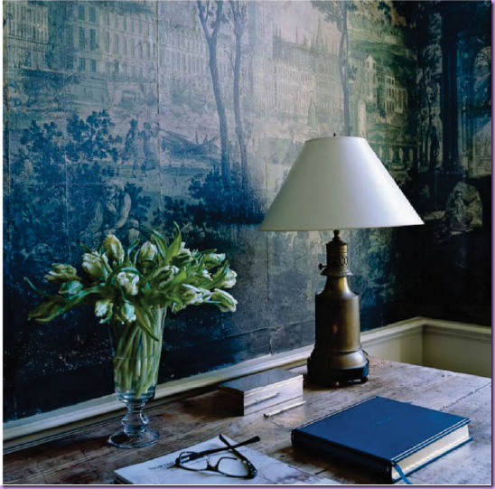
This is actually the mudroom!  The paper, bought at auction,  is a crumbling antique from the early part of the 19th century. 


 image

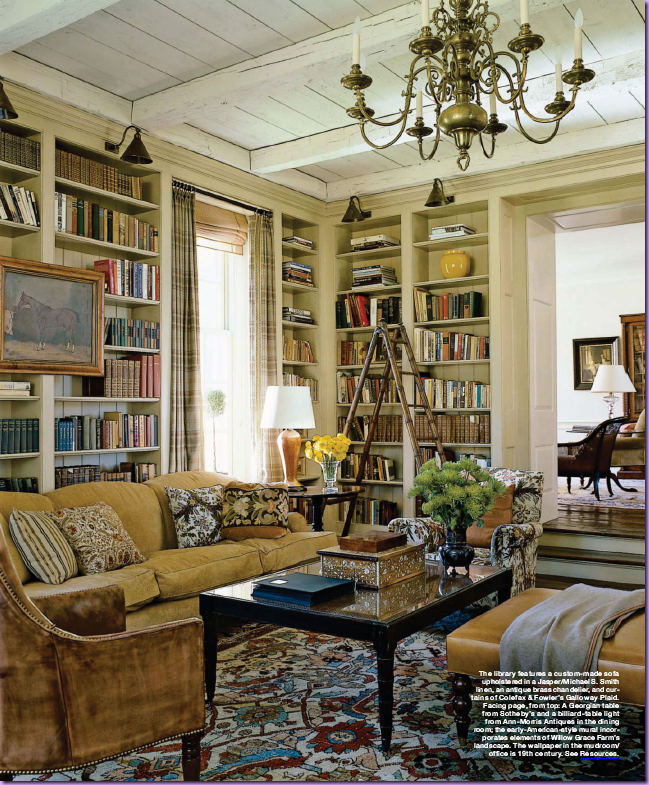
In the library – notice the wonderful wood ceiling and beams, taken from the old house.  The sofa is covered in Smith’s cotton linen fabric.  The shelves are lighted by charming brass fixtures.   My favorite piece in this room - the wonderful library ladder! 


 image

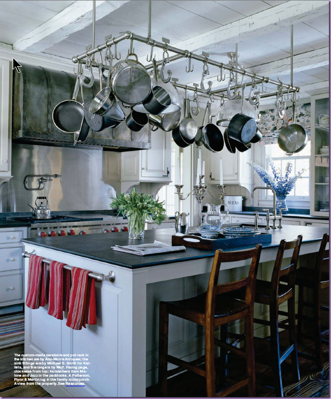
In the kitchen, the countertops are a flamed granite – giving them a matte and dulled, rather than shiny, finish.  The chairs and pot rack were custom made for the house. 


image

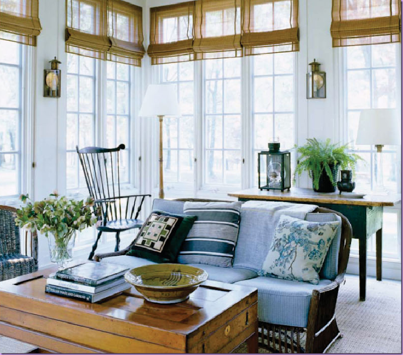
The sunroom features an elegant Windsor chair and  rustic rattan sofa.  The coffee table is actually an antique French game box.  Fabrics by Smith for Jaspar.   I love the lanterns used as sconces.   The picture in the book of this room is larger and in it you can see the ceiling fan – not just any ceiling fan, but an antique, original ceiling fan!


 image

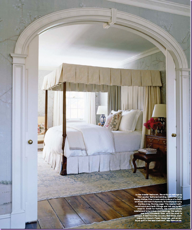
In the master bedroom – you can really see the beauty of the aged floor boards taken from  the old house – they are so gorgeous!  And the arch – separating the bed and sitting rooms - was also taken from the other house.    The wallpaper is hand painted de  Gournay. 


image

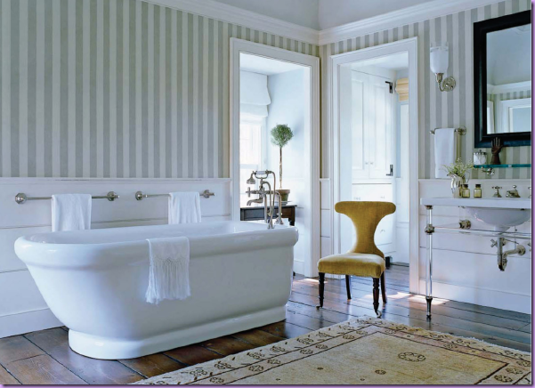
The bathroom features the hardwood floors again – making it just so cozy.  In the book, Smith states he likes to add a table with a lamp in bathrooms which immediately warms up the room.  What a great idea to use in your own home!  All fittings are from Kallista by Michael Smith.


image

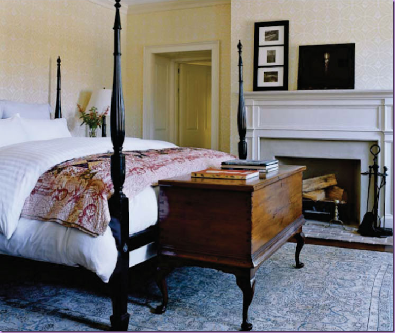
The guest room features an ebony four poster bed.  The chest at the end of the bed is the standout piece here.  Smith states it is a very rare piece from the Bahamas. 


To read Cote de Texas Top Ten Designers  #9  - Michael Smith, go here.    To order Houses by Michael Smith, go here.

Friday, October 24, 2008

Antiquarian Michael Trapp Grows Up

image


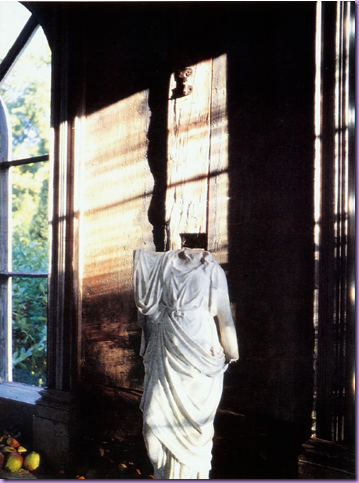
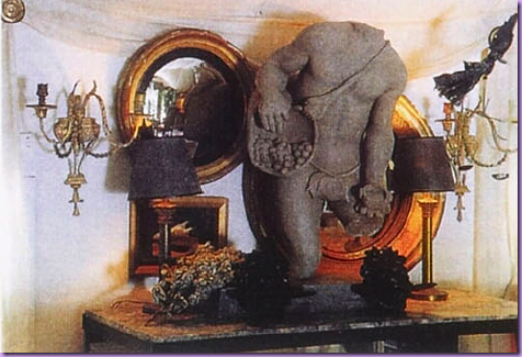
Do you have concrete statuary or rusty iron urns inside of your house? You know the kind - the kind that up until this past decade would only be found outside in the garden.  Do you have that kind in your house?  Have you ever wondered why?  Ever wonder why you bring weathered urns inside your house, or a statue, or shells, or an architectural fragments?  Ever wonder why we are so enamored  these days with having patina indoors instead of out?  Who started that trend -- the decaying, peeling painted urns and statues and fragments inside the house? Do you know?   
 

image


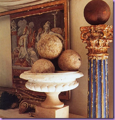
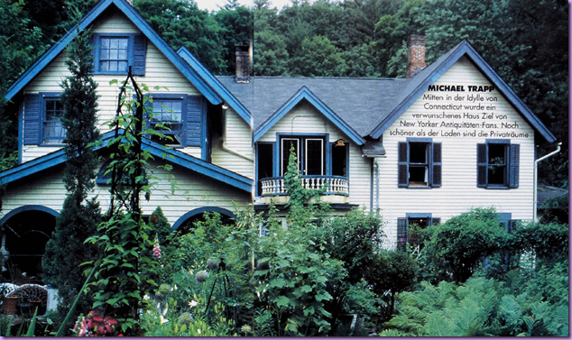
The man attributed to starting the trend is Michael Trapp.  Michael who?  Michael Trapp started out as a gardener many years ago.  He had a quirky aesthetic - he coveted the architectural fragments that no one wanted at the time.  The peeling, crusty, rotted French doors and windows from buildings being demolished were all his for the taking - no one else wanted those fragments back then.  He saw beauty in old garden urns and concrete statues and fountains when others wanted only new elements for their gardens.  To develop his business and indulge his style, Trapp bought a piece of wild property in West Cornwall, Connecticut back in 1989.  He bought the property for the landscape, but there just happened to be a Greek Revival home built in 1820 included in the deal.  The house was a mess, with ill advised and falling down additions - just exactly what Trapp liked.  On his property, he plotted to create a mysterious landscape, overgrown and lush, with the atmosphere of an Italian garden or an English one - he couldn't decide.  The house would become not only his home, but also his shop which he set up on the ground level.  Trapp moved his private living quarters upstairs.  He spent time getting the house just right - he opened it up by tearing down almost all of its interior walls.  He ripped off the bad additions and dug a basement.  His house became his laboratory, an experiment in baroque design using antiques from the garden and parts of demolished buildings.  His vision was certainly like nothing that had been seen before.  In a short amount of time, Trapp became quite celebrated.  His gardening business grew, as did his interior design business and his antique business.  He has added on to his property over the years - a swimming pool or two, terraces, follies and a "Garden House."    Bunny Williams, the celebrated interior designer is a neighbor, friend, and client of Trapp's.  Of his garden, Williams says "When you step into Michael's garden, you can't believe you are in Connecticut.  It's not Italy exactly, not England exactly, nor Northern France exactly.  But you know Michael has kept his eyes open in all those places."
 

image 


As Trapp's reputation grew, so did his following.  He received much laudatory press and devotees started  emulating his look.  Suddenly Trapp's unique vision became quite common.  As his popularity grew, he acquired many fans.  People would come to his store, his house, at all hours of the day and night, even though opening hours were limited to the weekends.  No one, it seemed, paid heed to the posted "Closed" sign.  Trapp says he would find strangers roaming his property, making themselves quite at home, even coming upstairs, uninvited, to his private living quarters.   Finally, it all became too much for the privacy-loving Trapp and he plotted a move.   It took a few years to find a suitable place to relocate to.  But,  he finally found Paradise II, a large spread in the Berkshires, not far from his previous place.  The property was on a cliff, overlooking the vast, gorgeous mountain range.  He was hooked.  The only problem was again, the house.  This time the house was much newer.  A relic from the 80's - it was a ranchburger.  Trapp's friends and fans were horrified that he would give up his Baroque lifestyle for a common ranch house.   But he forged ahead with his plans.
 

image


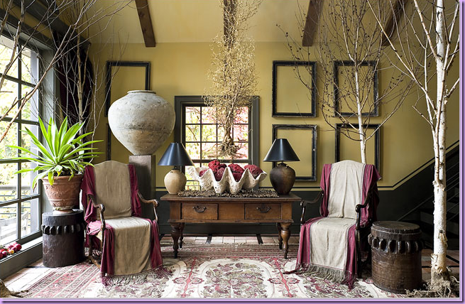
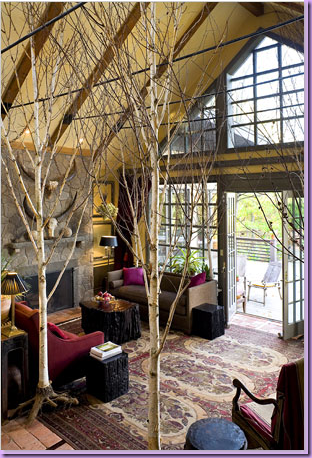
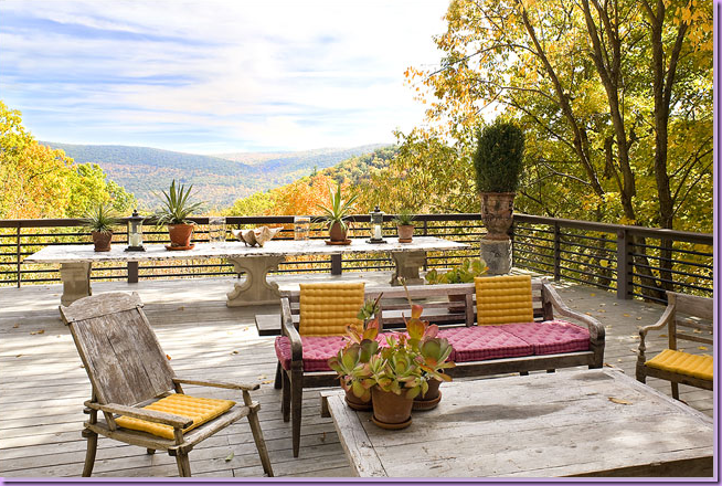
Trapp spent a few years completely remodeling his new house and landscaping the property.  Today, the former ranch style house  is barely to be found, instead, it has been renovated into an eclectic house, with Asian and Arts & Crafts Movement influences.  The house is 3,000 sq. ft., as is the outdoor living spaces - crowned by a large deck on which the Berkshires can be seen in all their glory.   Stone terraces surround the house and the deck.  While the interiors are quite tame by his old standards, they are still quirky, but in a more sophisticated way.  Dead birch trees fill his living room - a Trapp touch that can only be called wholly original.   Outside, unlike West Cornwall, there are no flowers, only greenery and succulents, another extreme change for Trapp.  While the country and the world are still embracing the crusty, peeling urns and columns that he introduced us to, Trapp has moved on.  The store in West Cornwall is still open, but Trapp's aesthetic has changed, he has grown up.


Where it all began:  The gardens and house at West Cornwall, Connecticut:
 

image

The 1820 Greek Revival house.    Originally Michael Trapp painted the house cream with a Prussian blue trim.  The store, Michael Trapp Antiques, is located on the ground floor.  His living  quarters are on the second floor.
 

image

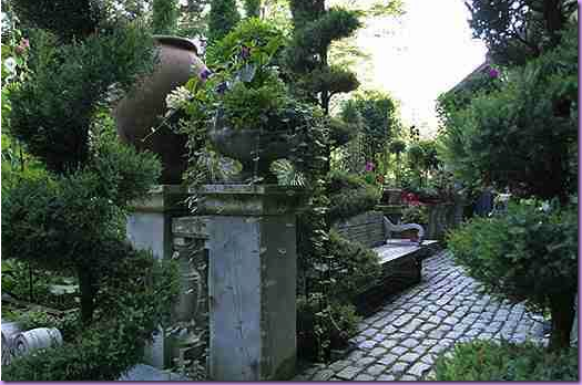
Reclaimed cobblestones taken from freshly re-paved streets make up the garden paths that wind through the property.  Urns, pots,  and columns are everywhere.
 

image_thumb136

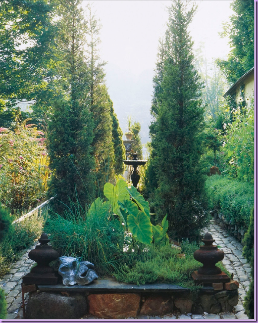
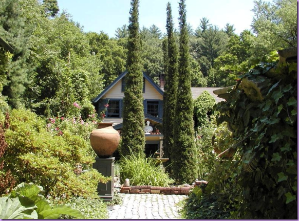
Large Chinese junipers guard over the reflecting pond, placed between the cobblestone paths.  Finials and fountains are found throughout the property.
 

image

The view of the pond and the house - notice how high the same junipers have grown in this photo compared with the photograph above!
 

image_thumb138

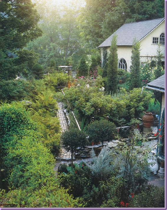
Looking from the house, past the pond, is the Garden House, formerly the garage.  Inside the Garden House, Trapp lowered the floor three feet to accommodate French windows taken from the Rhode Island State Capitol building during a refurbishing.  The Garden House is used as an extra dining room and the upper floor is used for guest quarters.
 

image_thumb156

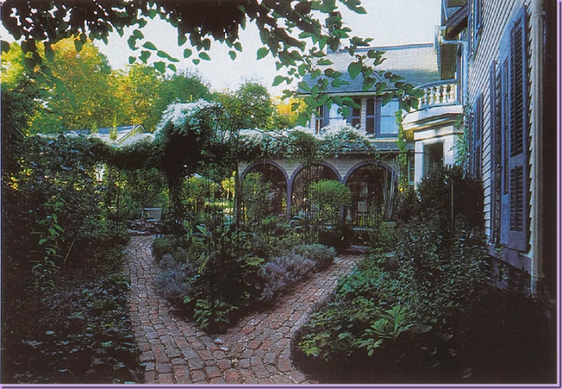
The house also has windows taken from the Rhode Island Capitol building.  In the photo above, where the arched windows are, is Trapp's private dining room/kitchen.  Cobblestone pathways lead from the house on the right back  to the Garden House. 
 

image

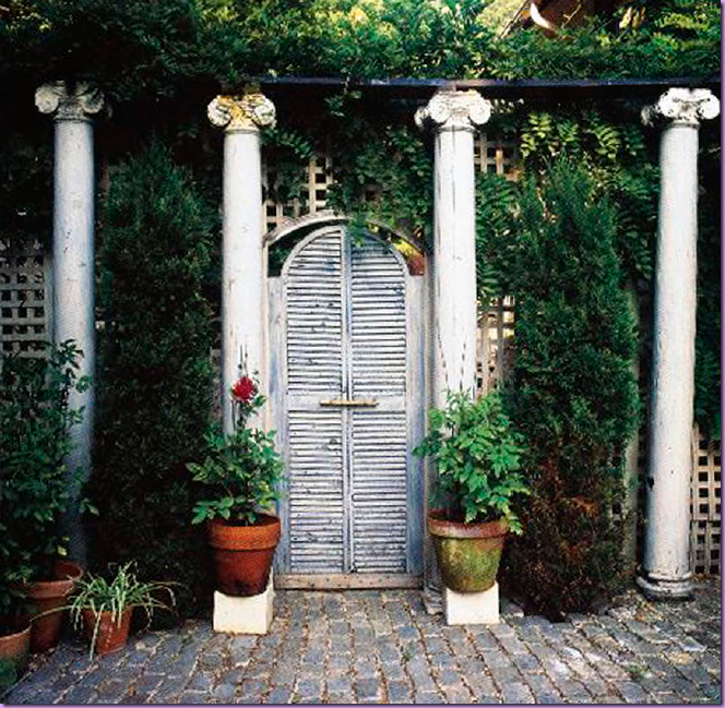
In an attempt to control the crowds of wandering customers and uninvited guests, Trapp installed old shutters between the shop/house and the private Garden House. 
 

 image

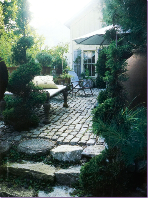
Besides bringing outdoor furniture inside, Trapp brings inside furniture outside! Here an antique eastern bed becomes a garden bench.  Shown here is the patio between the stop/house and Garden House.
 

image

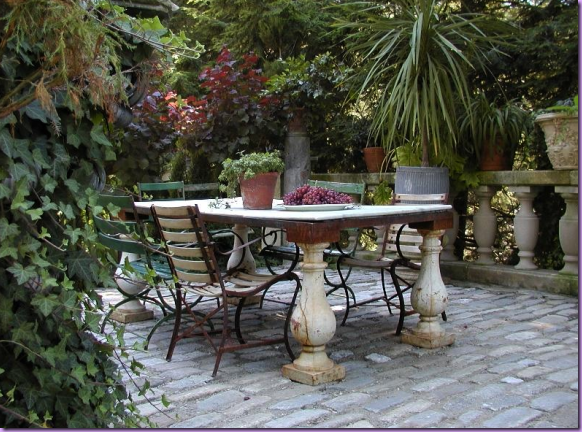
A view of the terrace with a dining table.  The terrace is  bordered with reclaimed balustrades.
 

image_thumb141

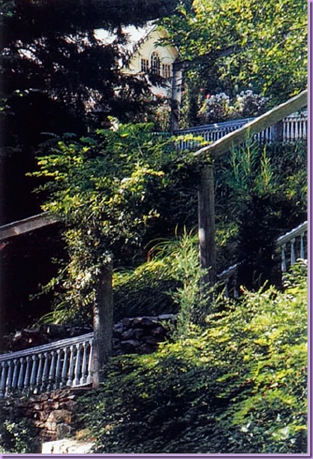
The property which overlooks a river, is divided into two areas - the upper garden and the lower garden.  Here, you can see the Garden House on the upper level and the stairs leading down to the lower level garden.  Old, discarded balustrades and columns were used for the staircase.
 

image

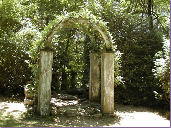
This vine covered arch leads you down the stairs to the lower garden area.  
 

image

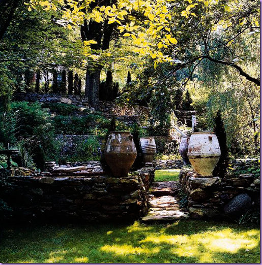
This views looks past the lower garden's reflecting pool back up to the stairs that lead to the upper garden.
 

  image

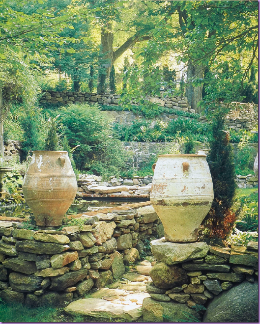
Large Spanish pots mark the reflecting pool in the lower garden.   Trapp used stacked stones for the pool and the retaining walls found on the property.
 

image_thumb250 

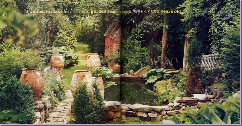
With a quote from Trapp:  "I wanted to make the house and the garden seem as though they were 500 years old," this photograph of the reflecting pool and the garden shed seems to confirm he achieved his goal.
 

image_thumb148

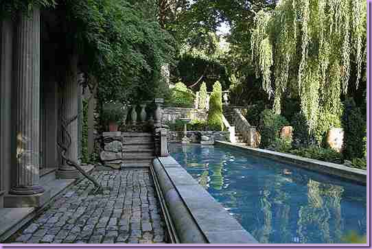
Today, a new pool house and swimming pool sit in the lower garden.  The stairs lead back to the upper garden.
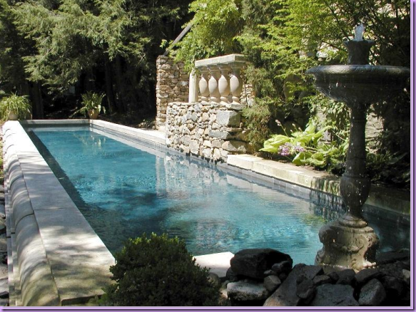
 

image_thumb171

The pool, looking back the other way with the stone wall fountain on the right.
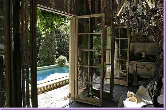
 

image_thumb151 

Inside the pool house  with it's old French doors and columns and non-electrified chandelier.
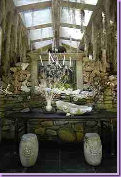
 

image_thumb224 

The back wall of the romantic pool house with a console and chandelier, giant clam shell, garden seats and mirror.
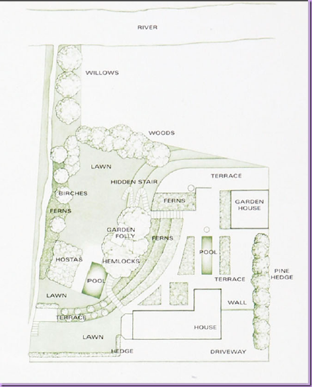
 

image_thumb130

A site plan of the property.

The Shop inside the House:
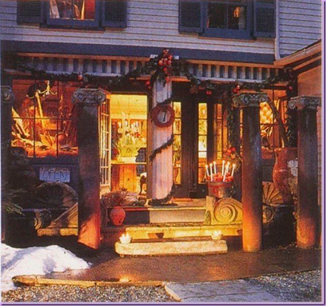
 

image_thumb18

The shop's entrance decorated for Christmas. 
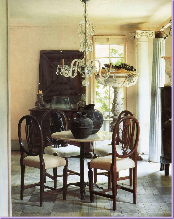
 

image_thumb177 

The shop - inside the house, this area was set up as a dining room.  I adore this chandelier and the large urn in the background.
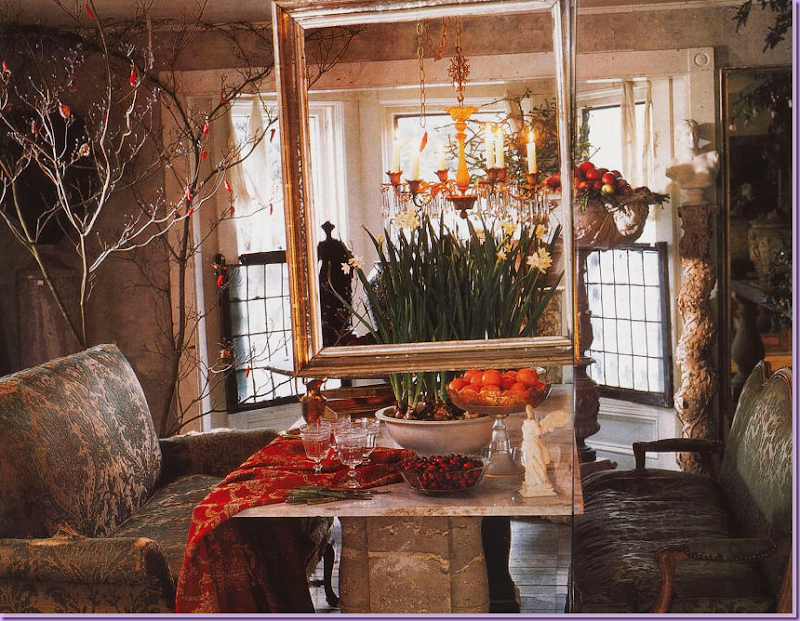
 

image_thumb121

Decorated for Christmas, Trapp was the first to feature beautiful, gold antique frames  without the paintings inside.  Today, this is a common trend.
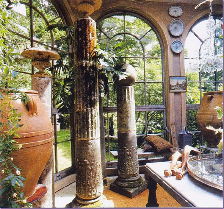
 

 image

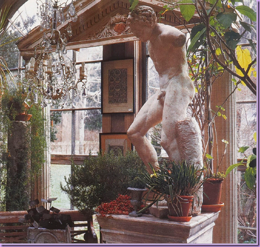
In the shop,  Trapp added on a conservatory and filled it with plants, old pots and urns.  Everything is for sale, Trapp says, downstairs in the shop and upstairs in his private living quarters.
 

image_thumb14

Pure theatrics, pure Trapp!


image_thumb205

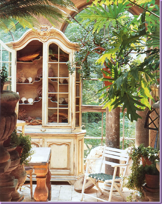
The conservatory - an antique armoire holds shells, another trend Trapp is credited with starting.  Trapp especially loves ferns and large leafed plants.
 

image

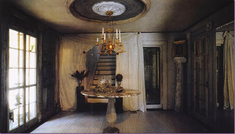
Inside the house, past the shop is the romantic entry hall to the private living quarters.  Stairs lead to the living quarters on the upper level.  The dining room/kitchen is behind the mirrored door on the right.  In the corner, atop a tall column, Trapp rests an oil painting.
 

image_thumb207

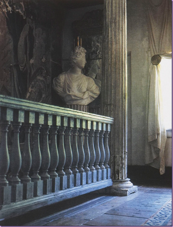
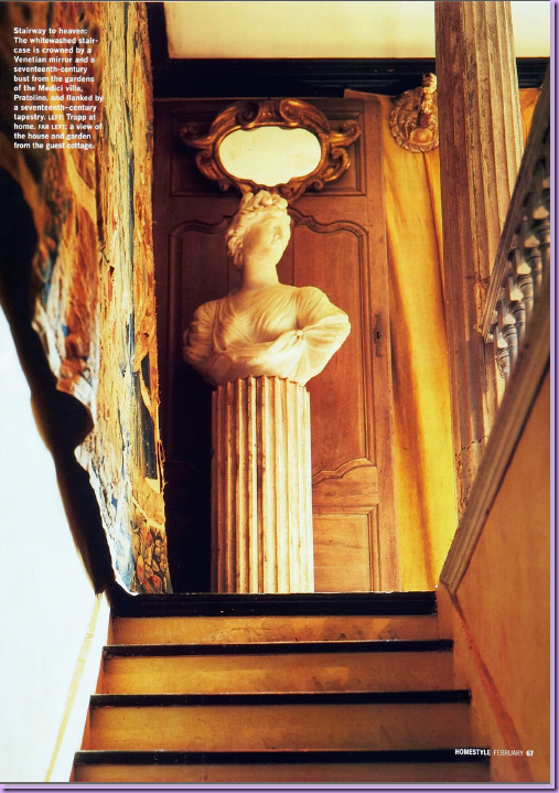
The stair hall in the house sets the tone for the romantic, Baroque style of decorating Trapp uses:  statuary, urns, columns, pedestals, mirrors, balustrades, and loose linens - all add to the look.  A huge tapestry takes up the wall space on the left of the stairs.
 

 image_thumb204 

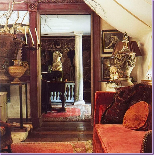
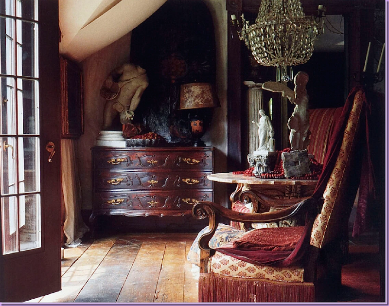
Upstairs, off the stair hall, is Trapp's living area and office.  Urns, sconces, old rugs, statues, finials, branches, and velvet - all  hallmarks of his "Baroque styled look."
 

image_thumb206

Trapp sells fine antiques as shown here and not-so fine antiques, also shown here.  Together the mix of the high and low combines to create Trapp’s vision of his romantic Baroque style.
 

image_thumb6

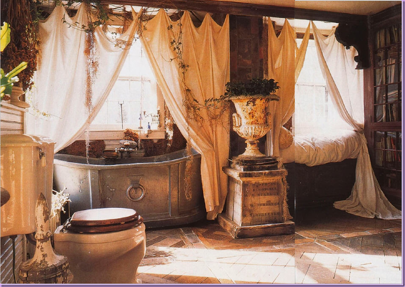
His bathroom - this  floor is his take on a Versailles patterned parquet floor.  The old zinc tub is shielded by linen sheets.   The large bathroom was once actually a bedroom.   On the right of the tub is a daybed.
 

Snap17_thumb1

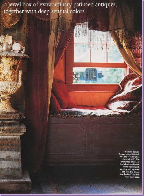
Styled differently with wintery fabrics, the daybed in the bathroom was made from French paneling.  Notice the urn filled with shells.  The base was taken from a Civil War monument.
 

image_thumb200

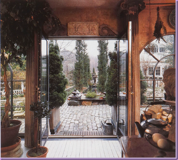
Inside the dining room/kitchen, looking out back towards the reflecting pool and the Garden House.   At dinner parties, guest will have drinks and appetizers in the Garden House then walk across the patio to the dining room for the main course.
 

image_thumb178

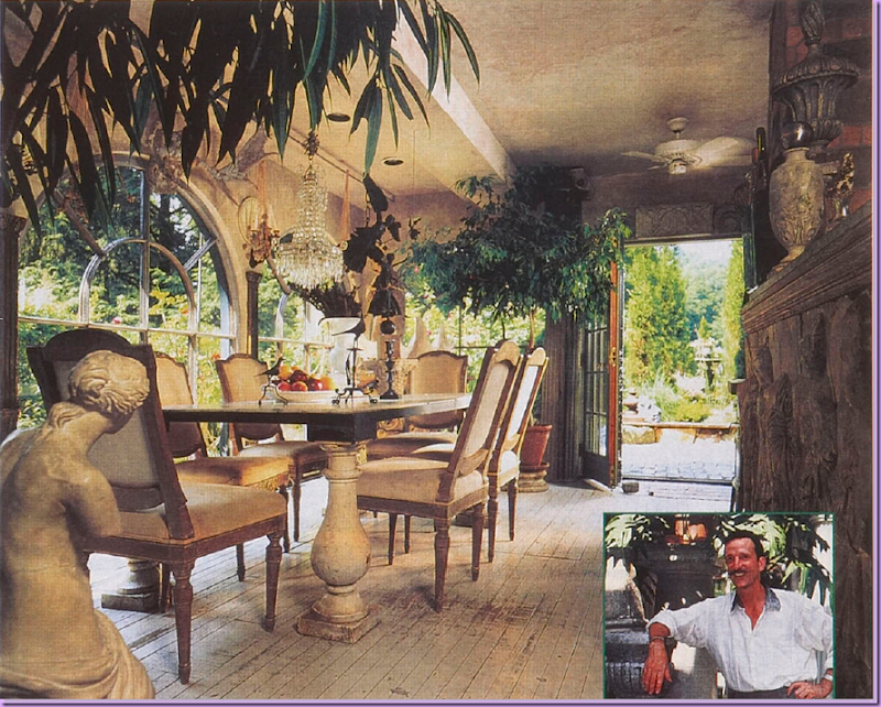
The dining room/kitchen.   Trapp never electrifies his chandeliers.  The large windows here also came from the Rhode Island Capitol building.    On the right is a picture of Michael Trapp, the antiquarian.
 

image_thumb190

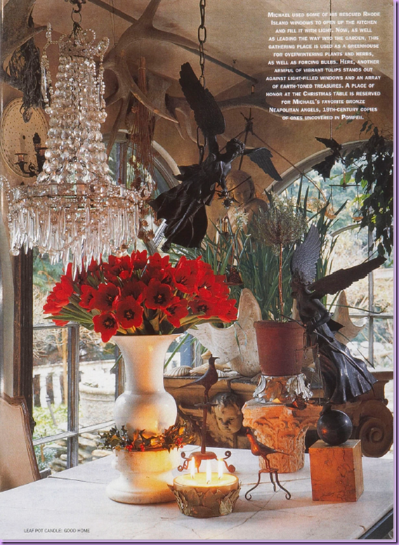
The table set in the dining room with various antiques.
 

 image_thumb202

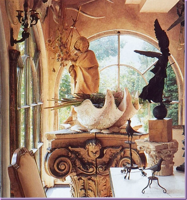
Again - the dining/room kitchen, Trapp was at the forefront of the shell craze years ago.  Large clam shells mix with small clams, statues, pedestals and capitals.
 

image_thumb11

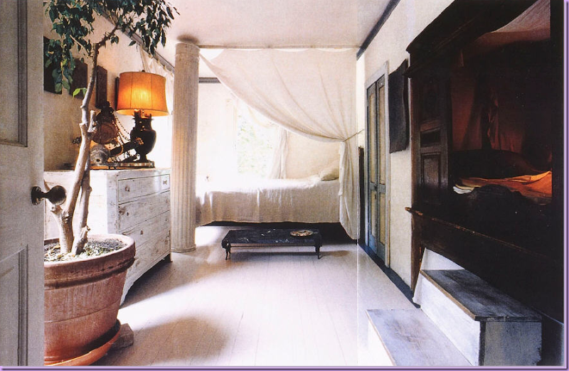
In a guest room,  Trapp uses linens to drape off the bed and to cover windows.  On the right, a bed from France is placed inside the wall.

The Garden House:
 

image_thumb191

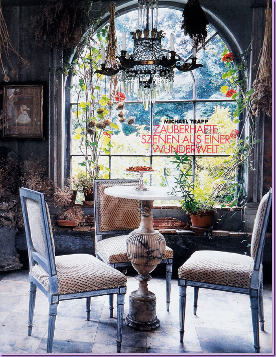
The Garden House:  built in what was once a garage, the Garden House is used for dinner parties, cocktail parties and overnight guests, who sleep upstairs.  Notice the charming marble topped table with French chairs around it. 
 

image_thumb152

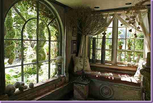
The Garden House - a charming window seat is built in. 
 

image_thumb8

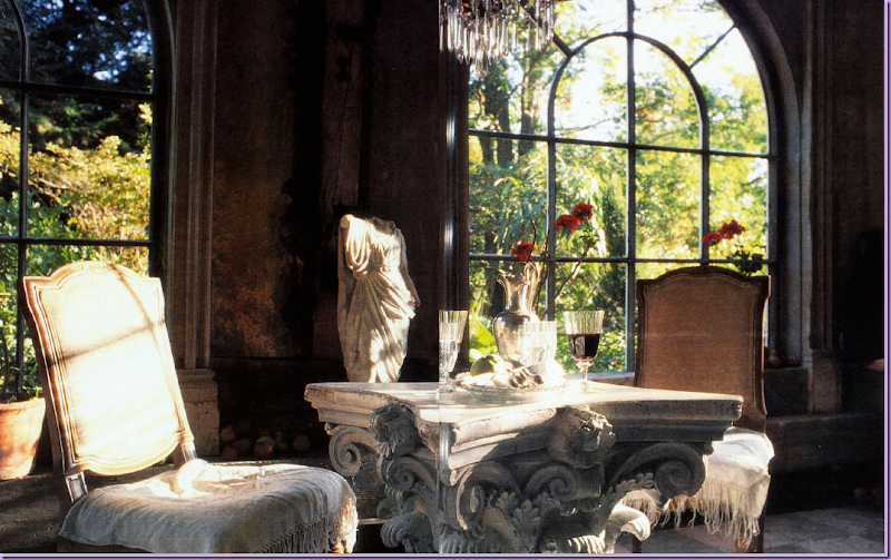
The Garden House:  a large capital takes the place of a table, again, a trend today.
 

image

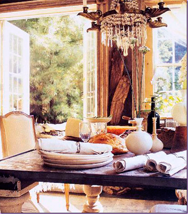
The table set in the Garden House – look at the huge napkins and plates he uses!


image_thumb15

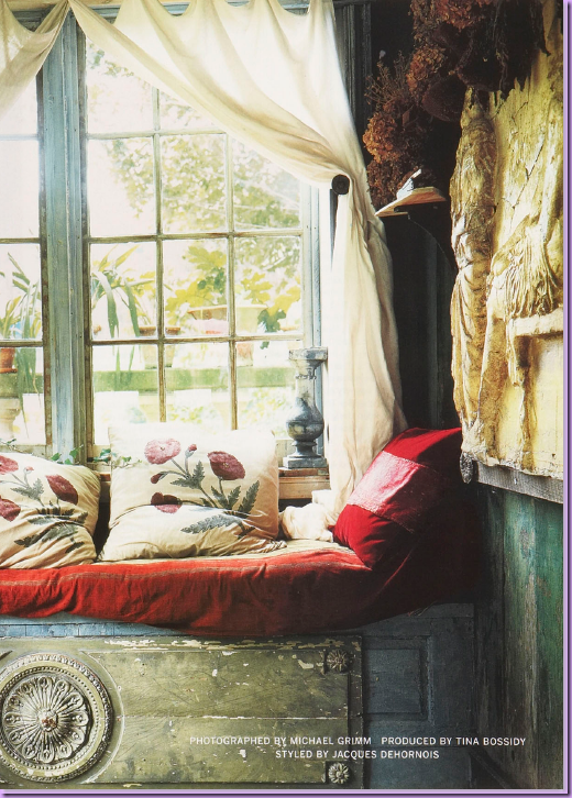
The Garden House:  Close up of the window seat made out of reclaimed wood.

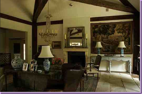
Besides gardening and selling antiques, Trapp does interior design for clients.  Here is a project of his:
 

image_thumb17

I love, love love this room - it's just a perfect blend of old and older!  Love the chandelier, the fireplace, the tapestry, the blue and white porcelains and lamps.  The best thing, though,  is the floor - hard to see in this picture, but it looks like large, old flags from England.  Gorgeous.
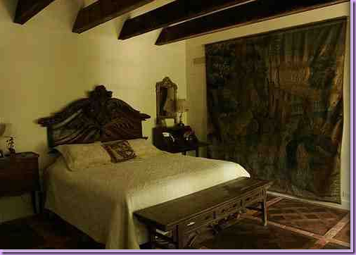
 

image217_thumb

The bedroom, using an architectural  fragment for the headboard, old flooring, tapestries.
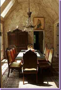
 

image220_thumb

Another wonderful space - the dining room.  Mismatched chairs, antiques, great chandelier.
 

image_thumb231

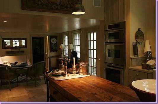
And finally, the kitchen and keeping room, again with the old flag floor.
 

image_thumb228

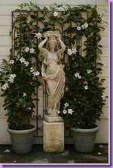
He still specializes in garden design and landscaping, mixing his love of statuary with plants.


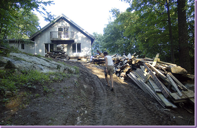
And now for something completely different:  Trapp Moves On:   A few years ago, the very private Trapp tired of living above the shop and having strangers wondering through his house and his gardens, even when the shop was closed!  He bought this spread below, with a view of the Berkshires.  Here is the ranch house before it was remodeled.
image_thumb232

The Berkshires property.  The ranch house before it was renovated.  Nothing special and totally unlike the famous West Cornwall property.
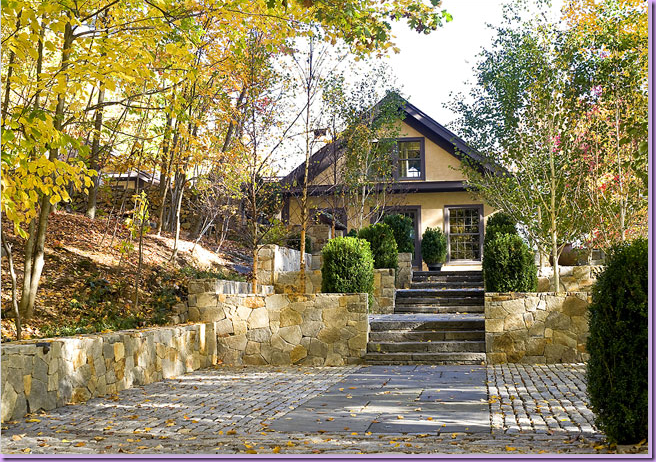
 

image_thumb233

The same view with the remodeled house and terraces.  There is also a large deck off one side of the house.
 

image_thumb234

The living room - totally different in feel from his previous house, but still quirky enough to be Trapp.  Large birch trees that had died were brought inside the house for their sculptural quality.  Empty frames hanging on the wall look like part of the molding.  Notice how the bottom part of the wall is painted black.
 

image_thumb235

Another view of the living area with a view towards the deck outside.
 

image_thumb236

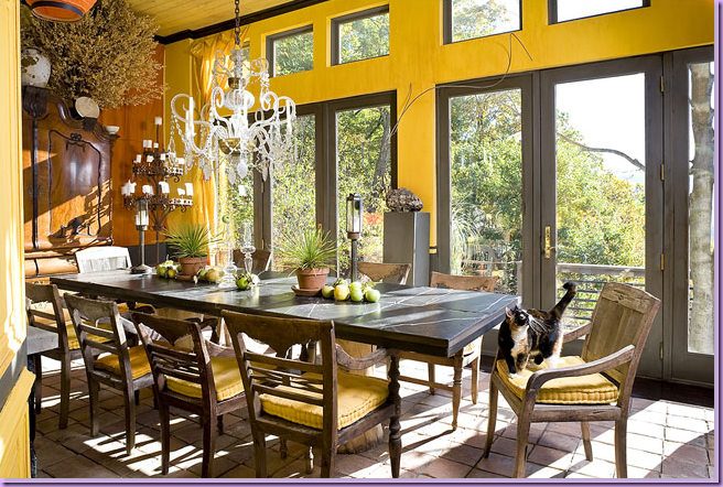
The dining room.   Again, such a stark contrast the old house.   Beautiful chandelier.
 

image_thumb239

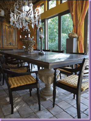
Another view of the dining room- I love the table with urns for its base!
 

image_thumb237

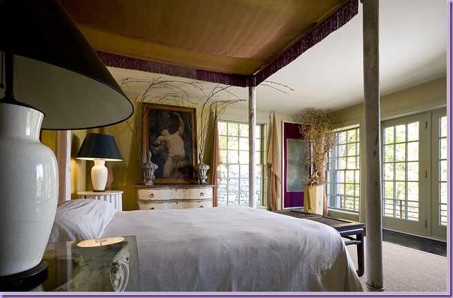
The bedroom design says:  Michael Trapp - all grown up.   With matching contemporary styled lamps, this space is as far removed from the Baroque inspired West Cornwall house as possible.  I think I prefer this look to the other more bohemian look. Which house do you prefer?  The old house or the new one?
 

 image_thumb240

The deck with the view that sold Trapp on the house - the Berkshires are in the background.

The Merchandise:
 

 image_thumb241

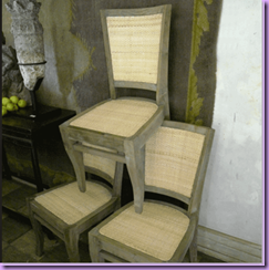
Michael Trapp has a wonderful, extensive web site with all his press available to read online.  He also sells select items from his store.  I love these cane and wood chairs.  Beautiful, and so cheap!
 

image_thumb242

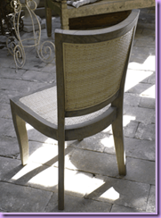
The back of the chair.


image

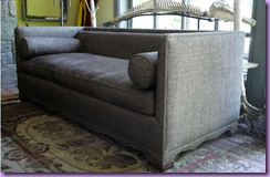
This sofa is for sale, pictured here in Trapp's living room.  Notice the dinosaur skeleton in the background. 


Besides furniture, Trapp sells tile floors, stone, and other goodies.  Be sure to visit his web site here and see what else he has for sale.  I hope you've enjoyed this look into Michael Trapp and you have come away with a better understanding of the trends he created.