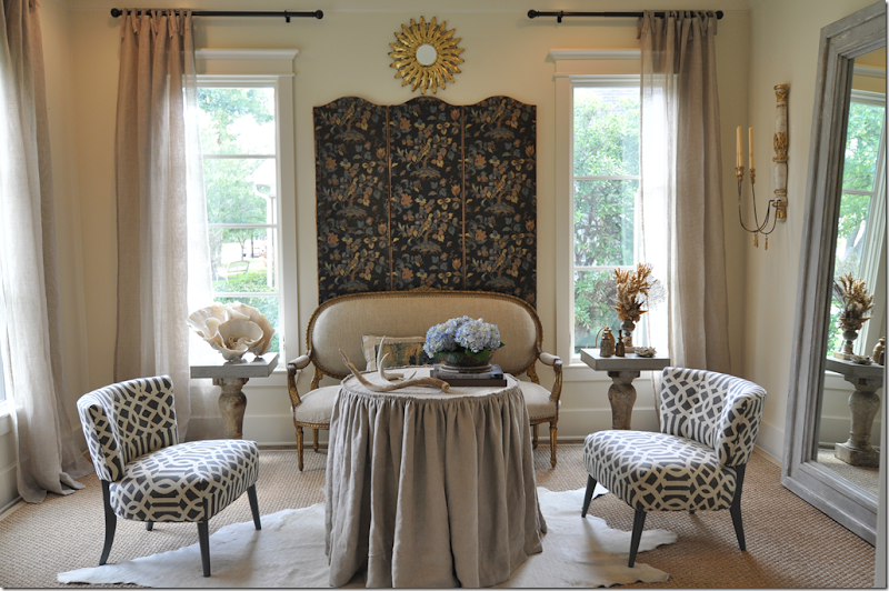
A house recently went on sale in Houston. It is owned by an upcoming young, talented and beautiful (the triple threat!) interior decorator. The designer has not lived in this house very long and as luck would have it, I have the photographs of the house from its previous sale in 2008. Both times, the house was beautifully furnished in the Houston style – lots of seagrass and linen. I love seeing how the house changed from 2008 to today under the two different owners and decorators. This house must really have a special designer vibe – it was also owned by another interior designer in the late 1990s.
Enjoy!
VERSION #I:
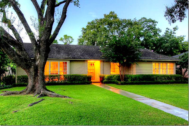
 This one story house, built in the 1950s, has a fabulous location – right off Weslayan between San Felipe and Westheimer.
Located in Oak Estates, in the shadow of River Oaks, the one story, 1950s house is small – with only 1,986 sq. ft - which makes it perfect for a young family or empty nesters. It’s kitchen has been updated with Carrara marble countertops, slate floor, new stainless appliances, and there is an expanded master suite with an adjoining study. The house was previously a 3 bedroom, but one of the bedrooms was turned into a master closet, making it now a 2 bedroom 2.5 bathroom. Listed at $775,000, the HAR information is available HERE.

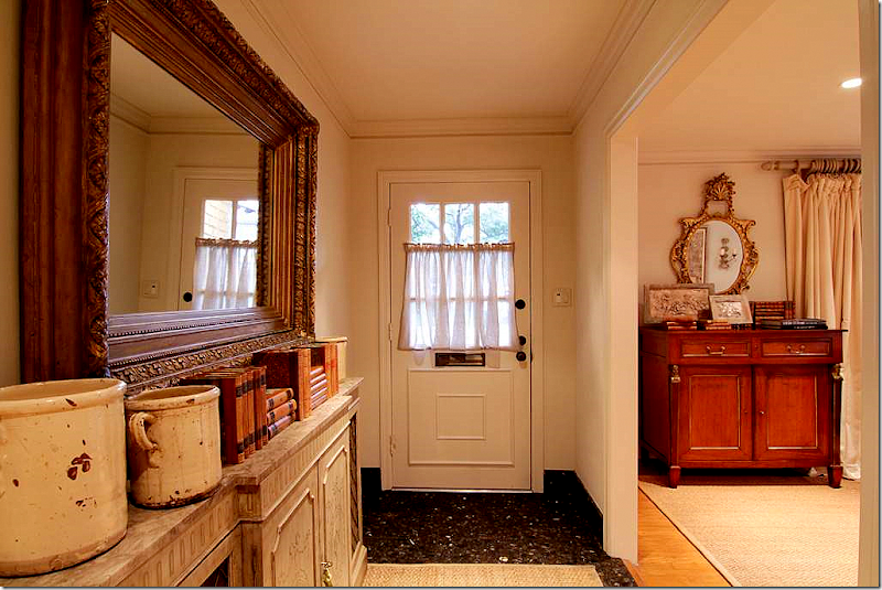
Walking into the foyer, it’s obvious someone with impeccable style lives here. A collection of antique French pots and books sit atop a painted console. A glimpse into the living room shows an antique buffet and mirror.
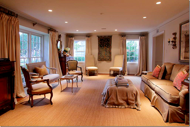
 YUM! Custom cut seagrass in the living room, along with beautiful creamy silk curtains. The curtains are perfect – reaching to the top, they are full and luscious – exactly how they should be. Notice on the left, there are two antique buffets and mirrors flanking the front window. I love the tufted ottoman and the French settee. Two Fortuny pillows sit on the sofa and a mirror and pair of sconces are hanging above. Note: Be sure to set your monitor on maximum view to see the entire picture.
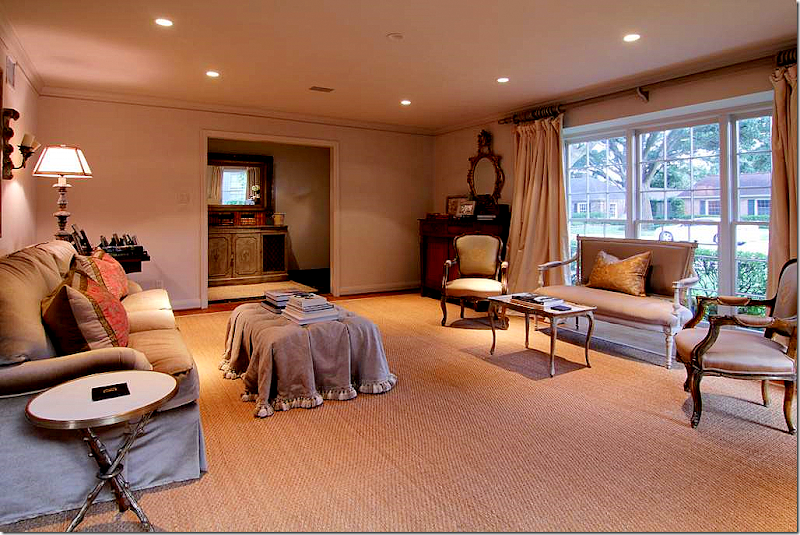
 The living room, looking back towards the entry hall.
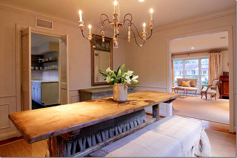
 The house has a nice, open flow to it. The dining room opens from the living room and the family room opens from the dining room. The kitchen is next to the dining room. The dining room has two benches instead of chairs. The linen slip, with its ruffled flange, is rough – perfectly matched to the table. There is also an antique trumeau and a painted buffet. The first time I saw benches used like this was in Pam Pierce’s house. See pictures at the end of this story.
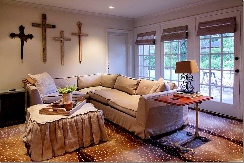
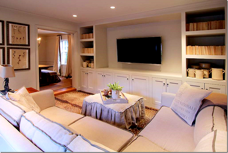
 Connecting through the dining room is the family room – here the owners used Stark’s antelope carpet – a favorite in Houston. The designer homeowner cozied up a sectional sofa with a custom made slipcovered ottoman in linen. What a great idea – especially when blending his and hers – the ottoman really makes the typical sectional look atypical.
 And looking the other direction – the bookshelves are filled with French pots and books, turned backwards to give a unified look. I know this is a controversial way to shelve books, but I love the way it looks, especially when the books are a collection of cheap paperbacks! I think it looks great. Notice how thick the shelves are – this is a great way to update a bookshelf. Notice here, you can see that the flange trim on the sofa is darker, giving a contrasting accent to the sectional. Pillows like this can be found all over the Ebay and Etsy or at Restoration Hardware.

Restoration Hardware’s pillows, similar to the homeowner’s.
 New Orleans antique dealer Karla Katz has a collection of these French pots on 1st dibs HERE.
 Off the dining room is the kitchen and breakfast room.

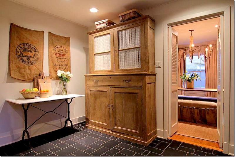
Vagabond Vintage sells burlap runners like those seen in the breakfast room. Order VV through Olivine HERE.
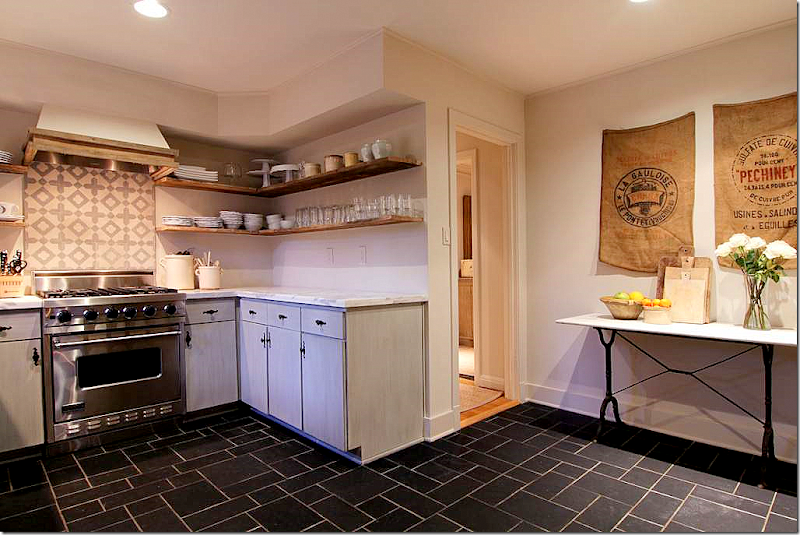
 The kitchen has stainless appliances and a new range hood. There are Carrara marble countertops and new open shelving. The backsplash appears to have come from Chateau Domingue HERE.

This collection of tiles from Chateau Domingue are late 19th century. They are actually colored cement tiles, called encaustic tiles. Mostly the tiles are used on floors, but in Houston – many have been using them as backsplashes in powder rooms and kitchens.
 Another view of the kitchen with its simple linen curtains. It looks like the wooden range hood was built around the steel one – which is a great idea to copy! The cabinets are painted a light gray to match the marble and encaustic tile backsplash. Notice how the shelves are a rough wood, rather than smooth. Great kitchen.
 The master bedroom was enlarged and has a small sitting area and expanded bathroom and closet.
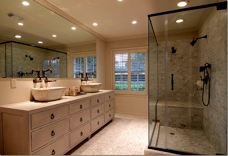
 Beautiful new bathroom – love the cabinet and the antique marble vessel sinks. Great Rohl hardware. Really well done. Walker Zanger tile.
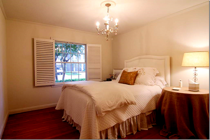
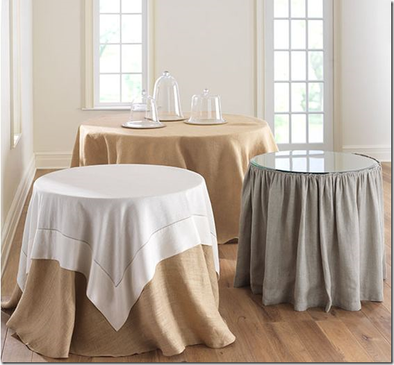
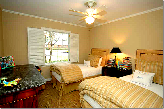
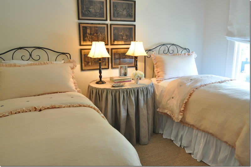
 The guest room is simple and sweet. I like the shutters opened like that. The skirted table is a simple burlap - Wisteria and Ballard Designs sell similar ones.

Wisteria sells these, so does Ballard Designs. HERE.

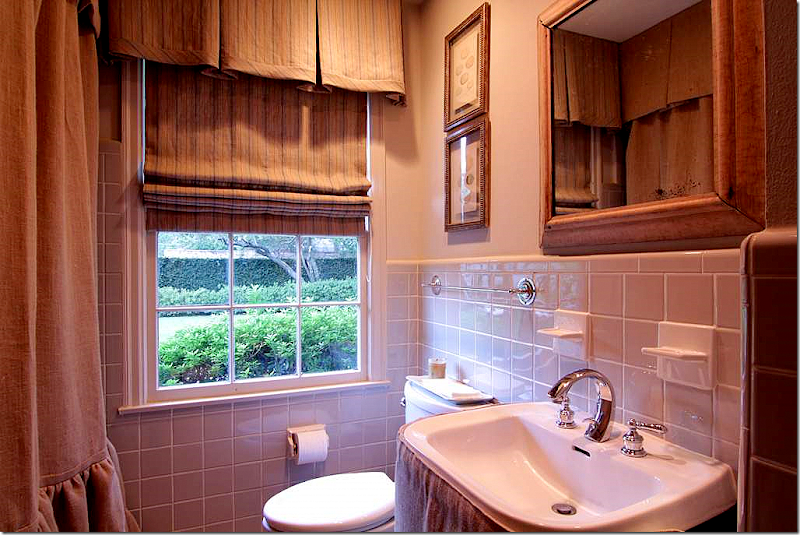
The second bathroom is softened with a custom made linen shower curtain and sink skirt. Another linen is used as a shade.
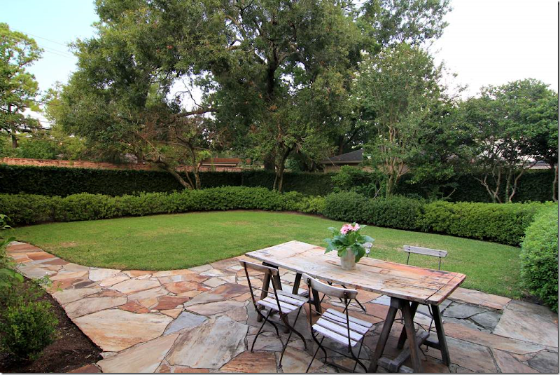
 Nice landscaping and patio, along with vintage outdoor furniture.

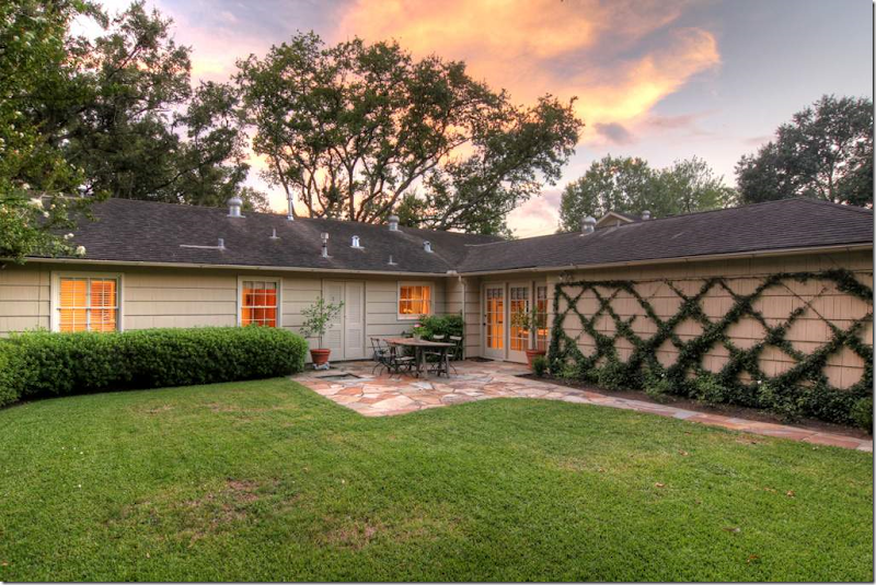
Another view of the back yard – the trellis is a great way to soften the garage’s blank wall.
VERSION: II
 Here are the HAR pictures from the house when it was sold to the current owner in 2008. Which version do you like best, I or II or a combination of the two?
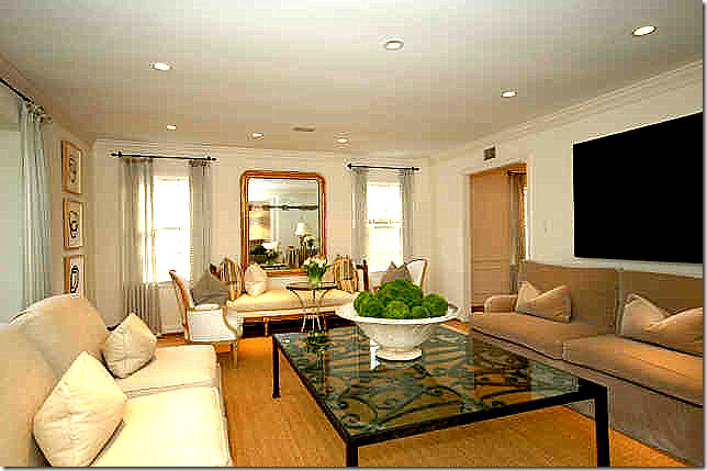
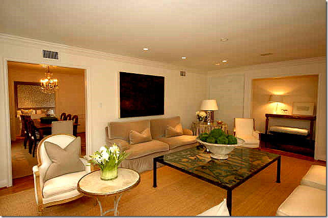
Version II: In this arrangement, there is a lot more furniture and the room looks totally different than Version I. I love the Louis Philippe mirror and the French day bed and chairs on the back wall. But, I am definitely missing the beautiful lush silk curtains from the first house.
 The living room from the other view. I love the French chairs and table.
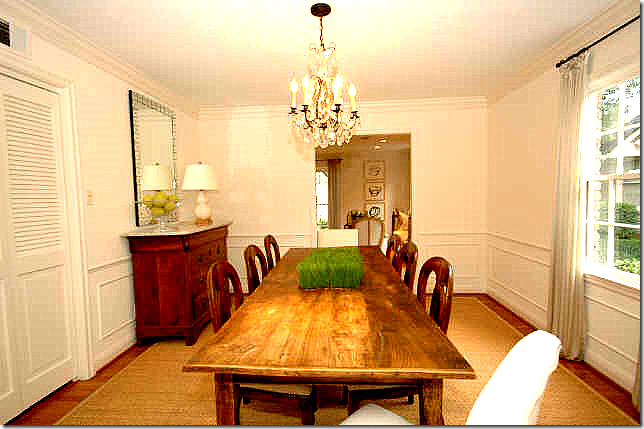
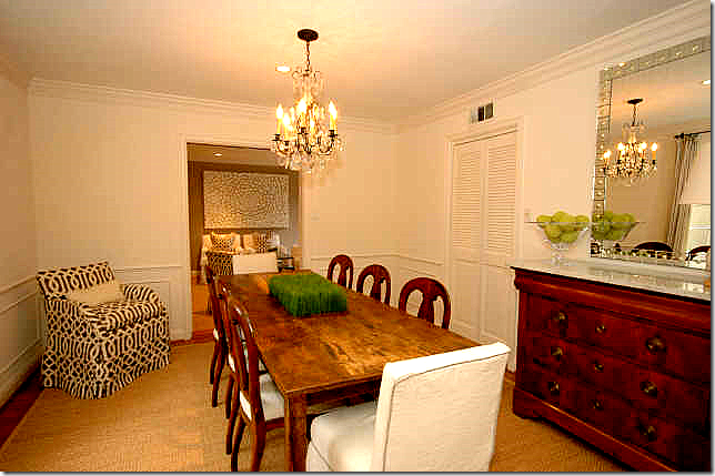
 The dining room is set up like Version I with a long rustic styled table and a buffet in the corner with a mirror over it. The chandelier is crystal here, as opposed to the Italian styled one in the current house. The same curtains are used here as in the living room.
 Here, you can see the host chairs are slipped in white linen with a gray trim. These owners have more contemporary pieces, like this mirror and the art work.
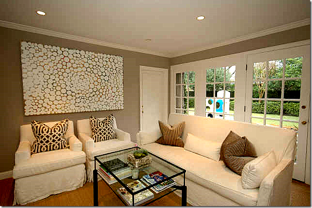
 The family room – I do really like this a lot. I love the KWID print and the white slipped furniture. The art work is perfect here. This owner chose to use baskets in the shelves instead of books. The walls are painted a deep taupe and there is wall to wall seagrass here.
 Another view – I really love this room! Very nicely done.
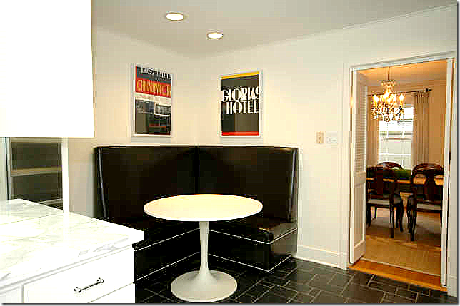
 This owner chose to use a leather banquette and a Saarinen table. Different, but very functional.

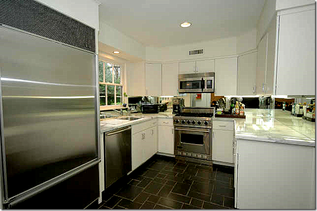
The kitchen is so different now in Version I with the open shelving and new hardware. Version I is such an improvement over all these upper cabinets. I also like the new range hood in Version I than here.

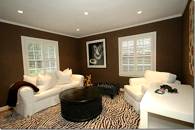
These owners chose to use the 3rd bedroom as an office. Great carpet, furniture, and I love the dark chocolate walls.
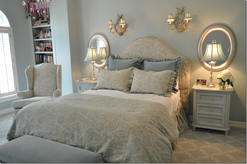
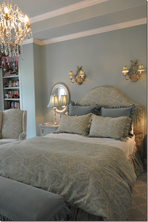
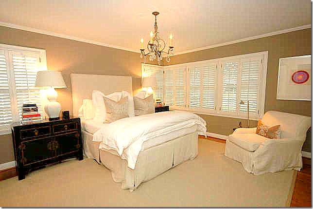
 The master bedroom with dark taupe walls has linen slipped headboard and chair with two Oriental end tables and a crystal chandelier. Totally different decor from Version I.

One of the bathrooms – nice and simple in gray tile. But I do miss all the linen – the shades, the shower curtain; I think it warmed up this bathroom in Version I.
 This bedroom is much more decorated than in Version I. Love the Rogers and Goffigon linen duvet and shams. Very cute!
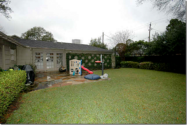
 The backyard is set up for kids under this owner.
So, which is better, Version I or Version II. Actually there are elements of both houses that I like. I like the updated kitchen and bathrooms in Version I better. And I like the living room and dining room in Version I. But I prefer the family room and the bedrooms in Version II over I. Agree???
Pam Pierce Slipcover Details :
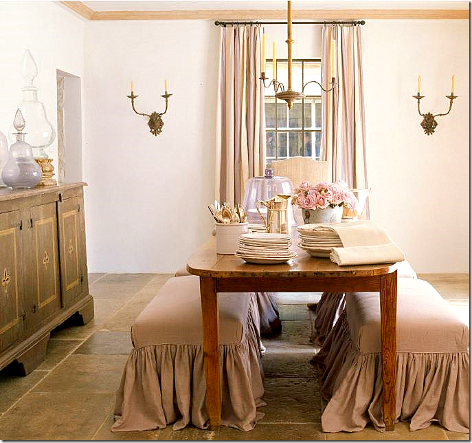
 Remember the dining room in Version I – with the two linen covered benches? I love this look, and credit is due to Pam Pierce for making it popular.

In Pierce’s own house photographed for Veranda, her dining room featured two benches slipped in linen. This was the first time I had seen this look updated for the 2000s.

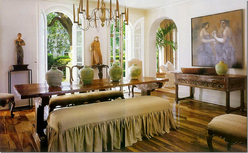
Chateau Domingue’s Ruth Gay has a similar look in her house. I love this dining room – notice the beautiful jars on the buffet. Gorgeous. And notice the tablescape. Just beautiful. AND, it was Pam Pierce, of course, who was the designer who helped Gay with her house.
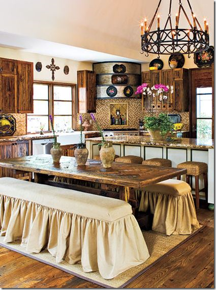
 Recently, Southern Living published this picture – with two linen slipcovered benches. My first thought when seeing these was they were inspired no doubt by Pam Pierce.

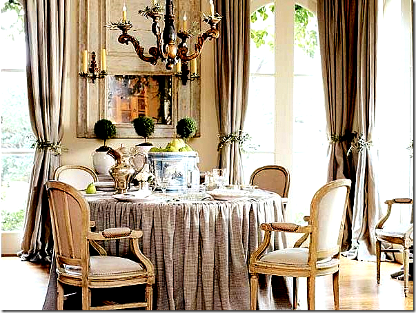
Another style that Pam Pierce first did and many others followed was her skirted tables. Instead of running the fabric with two seams up the side, Pierce gathered the linen on top of the table. It’s hard to see in this picture, but again, Pierce championed this look.

In The Stone House featured here, the homeowner’s skirted dining table is modeled after Pierce’s. The gathering is pulled onto the tabletop here.
 In The Bennison House, interior designer Jane Wood HERE used a similar type of skirted table, the seam is just at the edge of the table.

And in Sally Wheat’s living room, HERE, she used a skirted table with the seam running on top. FYI – Sally’s living room looks nothing like this today. Not one piece in this room is here today except for the curtains. Her new living room is contemporary!
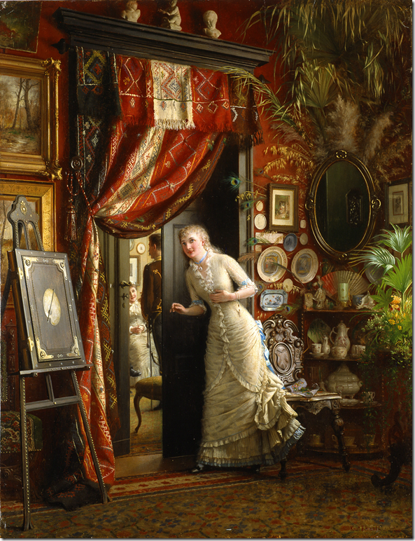 In this painting, you can a few intaglios that are shown hanging on the walls – not framed. I love this painting – the carved hall chair, the piece of masonware hanging on the wall, the oval mirror, the ironstone, the portiere, the easel and the book, the busts above the door – many things that are still used in decor today!
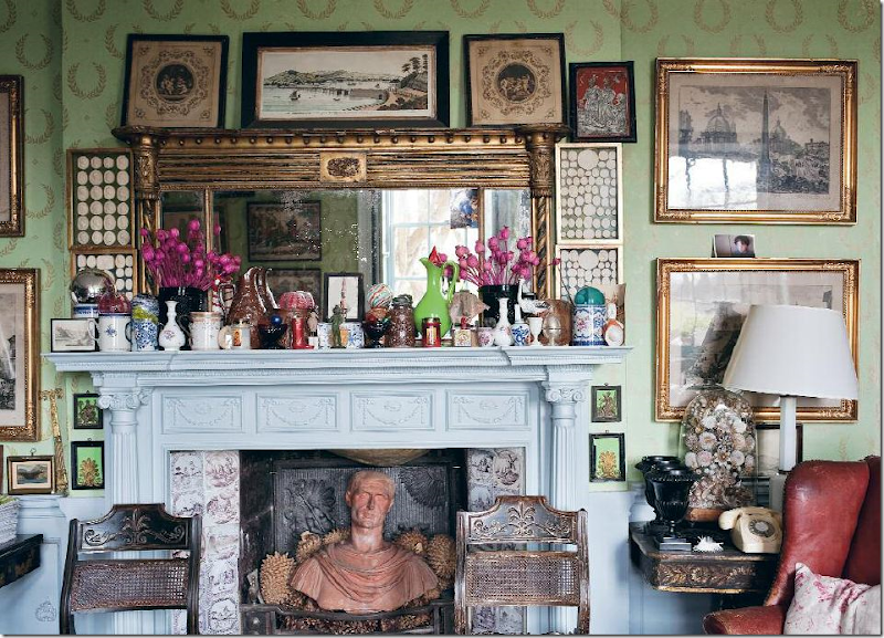 At Hanham Court in England, a large collection of intaglios are framed. Judging by the antiques in this room, I would assume these intaglios are all antique, not reproductions. At a recent Christie’s auction of Hanham Court items, these intaglios sold for over $3,000.
 I think intaglios look especially pretty next to grays and Swedish furniture. Here, these framed intaglios are on deep blue mats which bring out the blues in the gray painted corner cabinet. So pretty! Intaglios by Jon Freeman for Tiberian Design Framed Intaglios
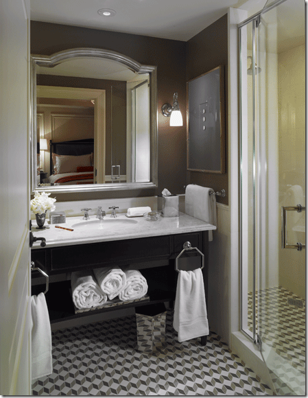 One large framed intaglio collection hangs in another bathroom. Notice the dark mats that blend into the paint color.
