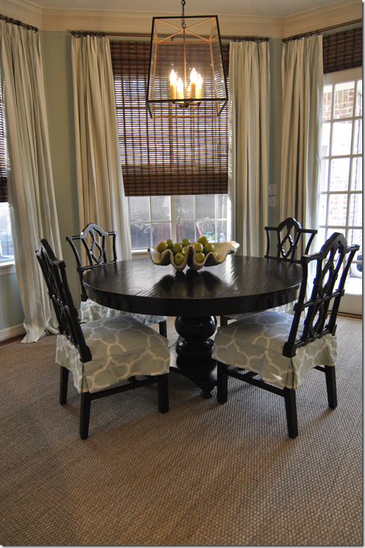
Last year I showed a house that I had decorated that was across the street from my own house. In the breakfast area, I used a large, contemporary styled lantern.
The lantern came from BROWN, a fabulous lighting and decor shop in Houston owned by the talented Jill Brown. Afterwards, Jill was kind enough to host a giveaway of the same lantern here on Cote de Texas. Needless to say, the giveaway was a huge success and many of you entered in hopes of winning.
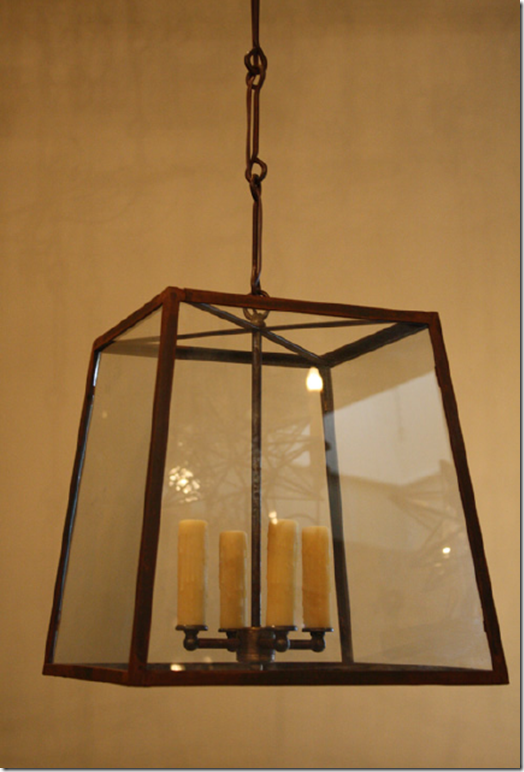
Here's the lantern we gave away. The winner had the choice of the 4 lights or 1 light with an Edison bulb. She chose the 4 lights, if memory serves me correct!
BROWN is located in Houston in a charming house-like setting with Zen styled landscaping.
Jill has a certain aesthetic and everything about her and her store reflects it. She is a true original, with a great sense of style and presentation. Here, for a party for the magazine Garden & Gun, she set up an old-timey store on the covered front porch. These were the goodies for the guests.
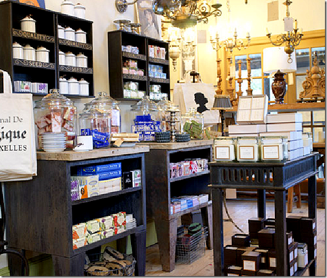
Although BROWN's specialty is lighting fixtures, one area of the store is set up for general goods. It seems as if Jill sells everything - from antique copper pots to candles.
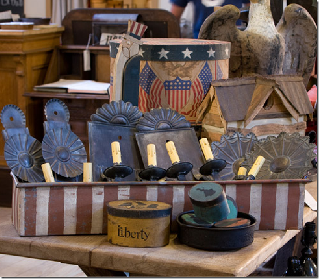
As always, everything has Jill's "look" about it. She loves Belgian styling, but she also very much into American antiques.
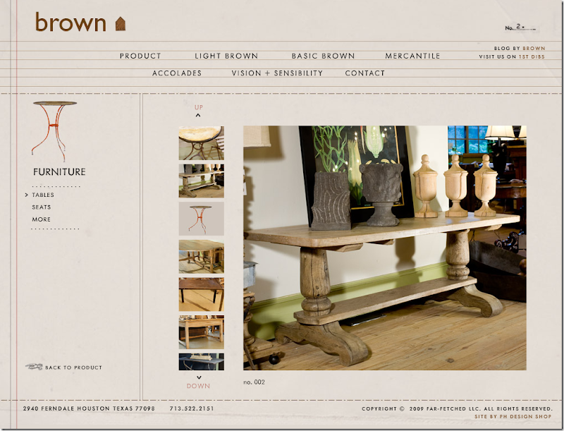
Even the design of her web site is uniquely Jill. You can view her web site at www.shopbybrown.
Or, you can choose to enter the website by the fanciful THING-FINDER, located HERE.
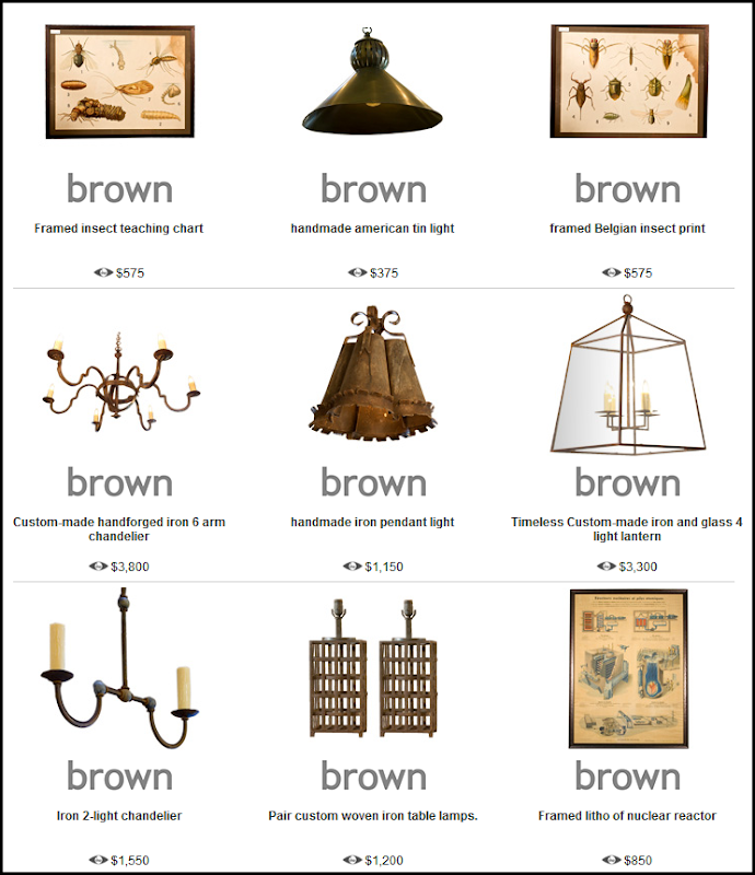
Here is a small selection of her wares, as sold on 1st Dibs. Jill sells antique light fixtures and a line of new ones that she designs herself under the label Far-Fetched.
The store changes often - it never looks quite the same from one day to the next. It's like visiting a magical place, you never know what fabulous treasure you are going to find at BROWN.
So, what is the giveaway you ask? Have I tortured you enough?
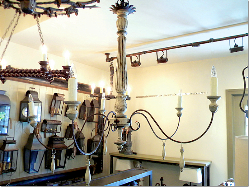
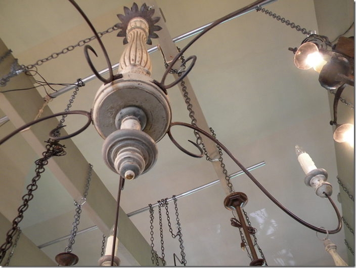
The giveaway today is this original light fixture from BROWN. It's a little hard to see exactly - but it's made of hand carved wood, painted a distressed light gray - perfect for today's trendy look. It has five lights that extend from the center column on gracefully carved iron arms. Each arm has a hanging tassel, also made of painted gray wood. The light fixture is hand crafted of antique wood and iron and has a retail value of $3,100. Yes, $3,100.!!!! And it can be yours - if you win the giveaway!
Another view of the gray wood and iron light fixture.
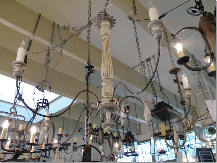
And looking up at it from the bottom. Disregard the chains - they are just used to hold up all the chandeliers.
HOW TO WIN:
All we ask that you do is visit www.shopbybrown and go to either the store or the 1st Dibs site or both. Look around at what is for sale and pick one item that speaks to you personally. Then, come back here to the blog comment section and tell me what you picked and why! That's it!!!
If you really want to be nice and you have a twitter account, please be so kind to tweet about the giveaway as a thank you to Jill.
Remember, if you post anonymously, be SURE to leave your name and email address in case you win!! If there's no email address, you can't win. :(
The contest will run this week and close on Friday at 11:59 p.m.
Good luck to everyone and a huge, huge thank you to Jill Brown for hosting this wonderful giveaway!!!
For a peek at Jill's house, read a story I ran several years ago HERE. The pictures were taken before I knew what I was doing with a camera, so be kind!!
Wednesday, September 28, 2011
A HUGE AND FABULOUS GIVEAWAY FROM BROWN!!!
Posted by home&interior at 12:07 AM 0 comments
Saturday, September 24, 2011
Reaching Outside The Box and Getting a Decorating Inspiration
NOTE: So sorry to have been away so long. I’ve had a rash of computer issues this week including Writers Live blogging issues, a computer virus (which is going around and is very serious!) and a crashed hard drive. Makes me hate Windows and PCs and Sony Vaio. I would love to switch to Apple, but Apple doesn’t support my blogging platform – so, unfortunately, I’m stuck with Mr. Bill Gates, a poor imitation of Mr. Steve Jobs.
So, on now to decorating!
A few weeks ago, I wrote about regional decorating – or, a design look that comes to define a city, an area, a country. Certainly, reading this blog, the “Houston look” of slipcovers and seagrass is well known. I’ll admit it, I am in a rut, stuck deep in a certain “southern” look associated with magazines such as the late Southern Living and Veranda. Some days, the appeal of Faudree and Carithers, et al, seems more rooted in familiarity than approval. In truth, I rarely step outside my box. I look at décor in NYC by all the latest and greatest, still the Southern bred Charlotte Moss holds the most appeal to me of that lot. Design in faraway environs like Seattle leaves me cold, just as mountain décor holds no appeal. I’m a southern girl through and through, but do include the South of France in that equation. So, I was surprised to find the work of a Canadian interior designer so appealing. Canada?
While reading the blog of a fellow Texan, Get Grounded, I was introduced to the work of Jill Kantelberg, a designer who works out of Toronto. Besides design, she also runs a popular décor shop that’s a must stop for all the decorators in her area. Her merchandise is also found on the trendy 1st Dibs, which insures a certain cachet.
Kantelberg’s work is eclectic, it’s rustic mixed with antiques and contemporary shown before a backdrop of rough textures. The cover of this issue of Canadian House and Home features the work of Kantelberg. It’s appeal is immediate. I was instantly drawn to the mix of the cool blue and white stripes against the raw wood walls and beams. Is it a beach house or a country lake retreat? Certainly, it’s not anything familiar rather it’s a totally new look and I find it irresistible. Apparently, so did the Texas blogger Get Grounded and so do the Canadians. Kantelberg is very popular and respected as an innovator with her rough luxe looks that predate the term and Restoration Hardware, both.
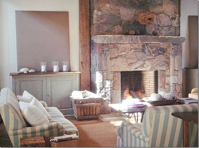
The house is located on the water, but whether it’s a beach or a lake is not specified. This view of the family room with the blue and white striped sofas shows the ceiling is heavily timbered with planks and beams that run down the walls to flank the dark stone fireplace. The walls, in contrast, are painted a stark white. The floors are naturally shaped stone mixed with heavily distressed wide wood planks. A wonderful antique console table divides the family room from the dining area and kitchen.
This view of the family room shows the matching painted cabinets that flank the fireplace. Above each is a canvas painted a soft brown that picks up the color of the stone. Now, if this was a southern decorator, there would be mirrors over those cabinets and the stone fireplace would replaced with a French limestone mantel. Sometimes, it really makes sense to step outside the box, for once.
This view shows the family room with the stairs behind the love seat.
Behind the family room, an oval wood table is matched with wicker chairs. The focal point, though, is the light fixture – a simple iron form with a crown of bleached limbs.
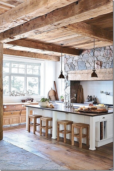
The plank and beam ceiling continues into the kitchen where the range is located under a mantel that resembles the great stone fireplace in the family room. On the left, an antique store counter sits under a bank of windows.
A view looking straight onto the range hood.
In the master bedroom, the wood lined headboard resembles the design of the great fireplace and the range in the kitchen. Brown and white and tan bedding continues the colors found throughout the house. Beams are also found in this room, as is the heavily distressed wide planked wood floor covered in part by a soft cow hide rug. The organic side table with wispy branches adds to the look.
A closer look at the unique headboard.
More rustic wood makes up the mirror and dresser.
The bathroom features bluestone and a white vessel sink. Antlers are made into sconces.
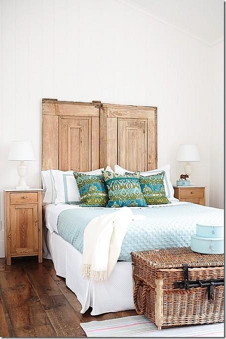
The guest room features a headboard made of old pine doors.
It’s hard to piece together the pictures of Kantelberg’s work found on the internet, as the stories that accompany the photos are no longer available. But, Kantelberg owns a 200 acre property in the Niagara escarpment outside of Toronto – whatever that means!!! This gorgeous house and attached wing I believe is most likely her property. The chateau’s design is influenced by both France and Belgium and it’s utterly charming.
Inside, there is a great room with a gorgeous stone mantel. The room is a living area, a dining area and a kitchen – all in one. A large iron fixture sits over the dining table. Notice the French windows on the right and how on the left it is connected to a hall which links to another building. The ceiling is a mix of timber planks and beams – so beautiful.
Here, a closeup of the wood beams that surround the French doors. A large antique trumeau sits over a makeshift bar. In the mirror’s reflection, an antique armoire is seen.
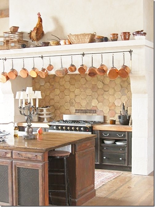
Past the dining table is the kitchen with its own large mantel over the range – which resembles the fireplace at the opposite side of the room. An antique store cabinet acts as the island. The refrigerator is hiding within an armoire on the right.
A close up the range with its backsplash of terra cotta tiles. I love the collection of pots hanging from the mantel.
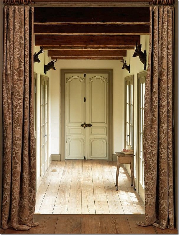
The hallway that leads from the great room to another part of the chateau. Damask portieres divide the two spaces. Notice the faux deer heads that sit above each French window. The door at the end of the hall is beautiful carved. The repeating beams on the ceiling resemble steps. Such a quiet, beautiful space.
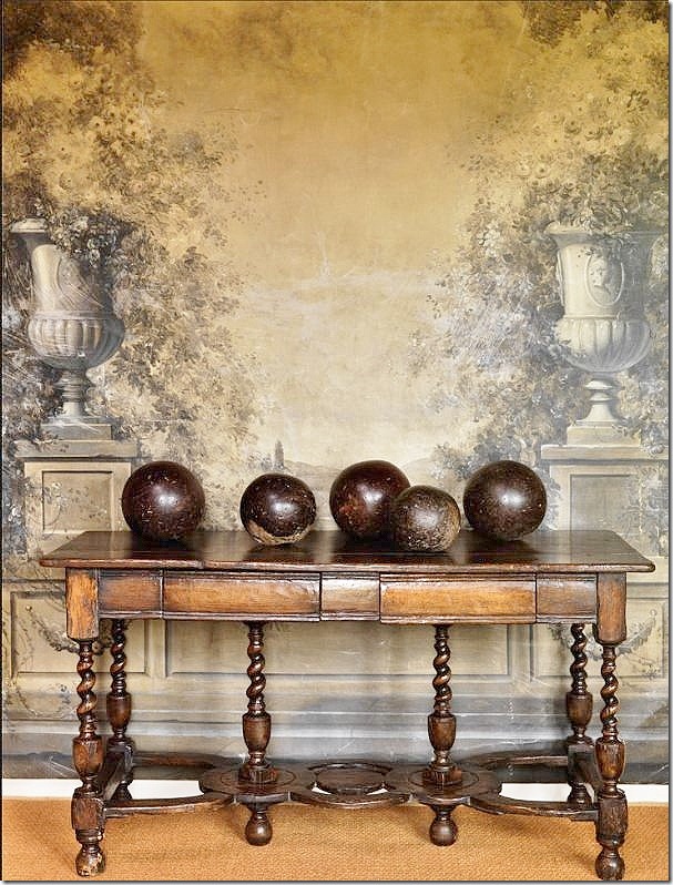
Well, wow. What can I say? This is too pretty for words. The antique console has such a gorgeous patina – its just stunning. Atop is a collection of wood balls. The romantic and feminine mural behind is in contrast to the masculine vignette. I could look at this photograph all day. It must be so gorgeous in real life.
Another gorgeous vignette, an entry hall perhaps with a skirted table and a French armoire. A beamed and wood plank ceiling above with a terra cotta tiled floor below.
The master bedroom has its own fireplace. Again, a beautiful wood and beam ceiling. A dressy antique English dresser mixes with a rustic canopy bed. These two wing chairs are now for sale on Kantelberg’s 1stDibs store.
A terra cotta tile floor, a Persian rug, a wood ceiling, and a large mirror made from an antique door.
Another beautiful bathroom that could be a sitting room. Feminine and rustic at the same time.
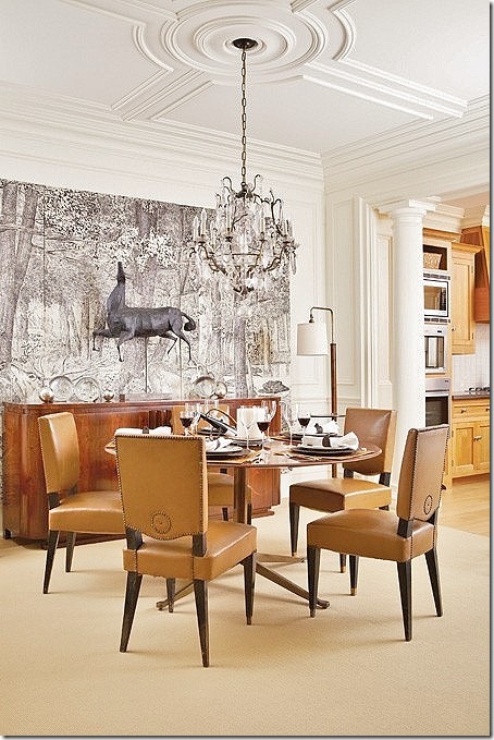
Just when I thought I had Jill Kantelberg’s look down, I spied this wonderful French moderne dining room.
A close up of the wonderful chairs and table, and the triptych hanging behind a horse sculpture. Totally outside my box, I find myself just loving Kantelberg’s aesthetic.
I mentioned before that I had first seen this picture on the blog of a fellow Texan, Get Grounded – where Robin writes mostly about landscaping. Robin had first seen this photograph a few years ago and immediately fell in love with it. In fact, she gasped when she first saw it. I have to admit, I did too. What makes this room so appealing? Robin writes:
“The striped couches! The incredible architectural barnwood ceiling and doors! Sisal rug over wood flooring. My signature aqua colors. Minimal accessories. The rustic, beachy, comfortable feel, oh my.”
Robin contacted Jill Kantelberg who was kind enough to email her back and forth with ideas on how to get this look. Robin lives in a 1979 builder’s tract house in Austin that looks nothing like this expansive lake house in Canada. Yet somehow, she wanted this look for her own. How to emulate it? How to do it on a strict budget? Robin looked at all the elements and decided that rough wood was important to the décor.
And of course, blue and white stripes were very important to the look. Let’s take a look at how Robin is putting together all the decorative elements in order to get the atmosphere of this room in her own home.
Here is what Robin started with. She loves the Shabby Chic look and had already started decorating in that style.
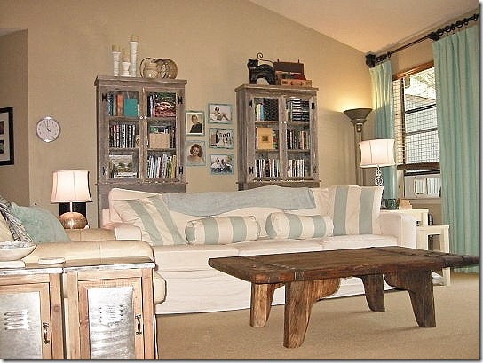
First, and what I think is a stroke of genius on Robin’s part., she added the two rustic wood bookcases to the back wall. This is how she brought in the wood element into her room! The bookcase doors have chicken wire which further adds to the rustic look. She found them at this store and they were very price friendly. Now, if I was Robin’s designer, I would tell her to add one more cabinet and place them side by side to get more of the look that the wall is paneled. Perhaps she could save up to add one more. I think these cabinets are so very important to the look, I would go the extra distance and add another one. On the floor, she installed Shaw’s sisal look alike carpet to mimic the seagrass look in Jill’s room. Now, you know me, I love the real thing, but Robin told me in person this really looks like seagrass!
Next, Robin needed the striped fabric. She found this striped fabric at Calico Corners, and then found someone on Etsy who made the pillows! So far, she really is getting the look of the lake house. Luckily her curtains match the striped fabric perfectly.
And, here, without her beloved ottoman that she knows has to be replaced to continue on her journey.
And here is the table she bought at Cost Plus which really fits the look perfectly. It almost looks like driftwood. Robin says she wants to get new lamps and blinds which she’ll do soon.
I was really impressed with Robin’s drive. She saw something she loved with all her heart and decided to claim it for her own. Faced with a limited budget, she shopped carefully. The striped fabric is perfect and really brings in the feel of Kantelberg’s room. And, the bookcases with their rough wood and chicken wire doors go a long, long way to further that atmosphere.
Have you ever seen a picture that you loved and then tried to copy it for your own? I did, about 20 years ago. I’ve showed this before, but one more time won’t hurt! I fell in love, really deeply love with this Dan Carithers’ room, which I STILL love to this day!!!
The original inspiration – taupe and white linen fabric, slipcovers, sisal rug, and lots of blue and white porcelains.
I was lucky to be able to get the exact fabric in taupe and white linen stripes. Hey Ben!! Hey Reggie!!(Poor Reggie was run over and died a few months later.
)
I bought this coir rug – they hadn’t heard of seagrass in Ft. Worth at this time. I had the chairs slipcovered in the same fabric. I used to LOVE those candlestick “lamps” that I got at Bombay. Loved them!
I added this wicker chair – the cushions in the striped linen hadn’t come in yet. To the right you can see my two French chairs upholstered in the same striped fabric. Those chairs are still used in my living room today. Instead of blue and white porcelain, I used my budding blue opaline collection. I wish I had a picture of the entire room, it was really kind of cute for its time. I was proud of myself and thought I had come pretty close to my inspiration room – considering that my house lacked any of the gorgeous architectural details of the Carithers house.
Have you ever used a designer’s photograph to decorate a room? Send in the pictures – I would love to see them!!! I think working off an inspiration picture is still a good idea. When I meet with a new client, I always ask them to bring in photos of rooms they love.
I hope you’ve enjoyed seeing Jill Kantelberg’s work and stepping out of the box with me. To see her web site, go HERE, and to visit her 1st Dibs store, go HERE. And a HUGE thank you to Robin of Get Grounded for sharing her newly decorated living room!!! To read her story, go HERE.
Posted by home&interior at 8:31 PM 0 comments

