Thursday, January 22, 2009

Toto: We’re Not in Kansas Anymore


image

The Stone Schoolhouse, built in 1870, now home to Peeking Through the Sunflowers’ Deserae


Emails, I get emails.  One of the first readers of Cote de Texas who ever contacted me asking for decorating advice was a blogger herself, Deserae from Peeking Through the Sunflowers.  She sent me a picture of her bedroom, asking for my opinion on how to change it up.  I remember I emailed the picture to Beach Bungalow 8 and together we discussed what I should tell Deserae to do to her bedroom.   It was my first blogger design consultation and I wanted to get it right.   I took that first consult very, very seriously.   


blog175

Before:  Deserae’s Red Fabric Bedroom


Back then, Deserae’s style was all about reds and toiles and white slipcovers.   She was definitely a more-is-more kind of girl and had all sorts of knick-knacks everywhere, and then some.  I gave her my ideas for her bedroom:  add drapes, get rid of the valance and substitute woven blinds for the white shades, add seagrass, slipcover the chair, etc. – all standard Webb Design advice.   Des surprised me when she responded very favorably to what I had to say – she had already thought of all those same ideas.  She was up for a change, but worried about her prior investment in her new red bedding.   I visited her blog and discovered that we had similar taste, except there were a few years between that similarity.  You see, some time ago red toile was my favorite fabric too, but I had moved on while Des was still in it’s throes. 

After that initial consultation,  we established a routine.  She would send me pictures of her decorating and I would give her my opinion.   What I soon learned though, was that Des really didn’t need my advice, she was quite talented all on her own and very adept at home remodeling.  She and her husband lived in a stone schoolhouse built back in 1870 somewhere in the middle of the Kansas countryside.  Together they had redone their house, including adding a new kitchen and bathroom – all on their own!   Even the maple hardwood floors were installed by Des and her husband – they bought the old planks from a nearby gym.    I was in awe of her boundless energy.    And so, although Des really didn’t need my ideas, she continued to send pictures, showing me whenever she moved an accessory, or a chair – which she did – often.  She actually liked to change her furniture around even more than I did.  After the initial bedroom advice, she turned her focus on to the living room, which she was particularly unhappy with.  She wanted a change, but was in denial about how much of a change she really wanted.   She had so much invested in “red” – that going with her heart was going to have to be done in stages. 


blog187

Before:  white slipcovers, red toiles and plaid.  I suggested she get matching plaid drapes in both the dining room and living room – that’s the dining room behind the sofa.  The walls in the dining room were red then.  Deserae soon started a major editing process.   She wanted seagrass matting but worried about her husband’s reaction – he didn’t like them.  And, finally, I suggested she hang something on each side of the door opening that matched – symmetry is always a good decorating tool. 


des

Before:  On the other side of her living room, is the study.   The three rooms – the dining room, living room and study, are all on a straight line, enfilade style.  I suggested she move the two white slipcovered chairs together to the living room, as opposed to splitting them up.  Again, there is always power in symmetry.   Des’s house is wonderful, it has very high ceilings and vintage decorative elements.  The decor looked like a page out of Country Living Magazine – it was very attractive with the mix of white slipcovers, red toiles, plaids and yellow walls, and her blog readers absolutely loved it just as it was.   They didn’t know that Des yearned for a change.  Slowly, she began selling the excess knick-knacks piece by piece, advertising the sales on her blog.  Almost weekly, she would have something to offer her readers from her endless supply of accessories.  With the money she made, she bought replacements for her new, cleaner style.


blog419

During:   Deserae moved her furniture around, almost daily, it seemed, sending me pictures to document the changes.  Here is what it looked like with the sofa moved along the wall.  By this time,  the red toile pillows and skirted tables have been long gone, replaced by two red print pillows.  She ordered additional panels of the red silk plaid curtains for the dining room to replace the toile curtains that once hung there.  She bought a set of botanicals to hang symmetrically next to the dining room door.  But, the biggest change came when all the red rugs were put away or sold – replaced by seagrass matting.  The seagrass immediately brought a more calming, less cluttered look to the house.   The section of wall behind the sofa changed the most.  Here, the black baker’s rack looked pretty enough, but it didn’t stay like this for long.  She tried an assortment of other pieces of furniture there.  Different mirrors were hung, switched out at different times with paintings, prints, and plates.    That one wall was a constantly changing vignette.


blog 239

Here she tried her hallrack, which made sense – the front door was right next to it!


blog189

Here Des tried some botanicals and ironstone.


image

During:  As the year wore on, more changes occurred, the set of prints flanking the dining room opening disappeared when she found these wonderful triple arm sconces.  She added textured window shades behind the drapes, getting rid of the white blinds – another great change – the natural shades complemented the seagrass rugs.  The two armchairs and ottomans added a calming symmetry.  All the country style accessories were sold one by one.  Deserae added a beautiful gold framed mirror behind the sofa and she bought white slipcovers for her dining room and study chairs – even monogramming them herself.  I thought the room looked lovely as shown here. 


And then…..her blog disappeared into the black hole of the internet.  Gone.   Along with it went her spirit for the stone schoolhouse that she had worked so hard on, for so long.  Being out in the country was taking a toll on Deserae.  She felt isolated.  The area is so windy, she couldn’t really enjoy the outdoors – she decided she wanted to move back to the city.   And so, along with all her knick-knacks she had for sale, her house too, was now included.  Des started a new Peeking Through The Sunflowers blog, but for the first time, nothing much changed in the schoolhouse for her to show her readers.   After all, why would you change anything?  The old schoolhouse finally looked like Des had imagined it.  Streamlined, less cluttered, with seagrass and white slips.   It was all so pretty with just the touches of red and anyway, the house was for sale - it would be silly to change anything now.    I heard less and less from Des during this time while she sat idly, waiting for her house to sell.   I thought our days of redecorating via the internet were over for now.

Until, that is, the other day, when I glimpsed something strange on her new blog – a white wall!   What????  Where were the rich yellow walls?   Deserae confessed she couldn’t sit still any longer and she just had to paint.  You know that feeling, you’re all bundled up against the cold weather, nice and toasty inside, and you decide to jump up and paint your entire house white!    I know, I know.  I can’t relate either – that feeling has never quite happened to me before, but then, I don’t have Des’s energy.  In the end, she may not live in her house for a long time with it looking exactly how she had wanted it to look, but she doesn’t care.   She’s happy now.    Enjoy!
 

photoshoot037

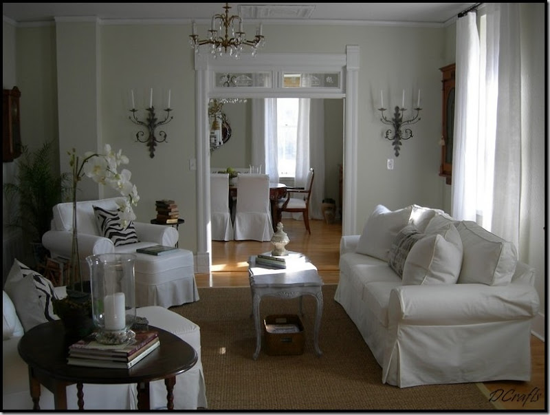
After:   No, this isn’t Sweden, this is still the middle of Kansas, but isn’t this just beautiful?  I love what Des has done to her house!  In fact, I’m green with envy over her white!!!   


First, she painted all the walls in a flat white* with a semi-gloss white on the trim.  The red plaid curtains were replaced with long, flowing linen curtains layered over the textured shades.  The red pillows are now gone, replaced with a large French feed-style pillow and two plump white ones on the sofa, along with two zebra pillows on the chairs.  The brown wood coffee table was faux painted gray by Des, of course (that was my idea!)  The new all-white look extends into her dining room and through the study.  This is so dreamy – it’s hard to remember it all red toile and country-fried.    And this is the hottest look going right now – Swedish white. 

But even more important is how Des chased her dream.  We’ve talked it over how she could get her husband to agree to all the changes she wanted to make, like the seagrass, and the curtains, and yet – her worries were unfounded.  In the end, her husband absolutely loves the new look!   Piece by piece,  tchotkie by tchotkie, she sold what she no longer needed or wanted – not for a lot of money, but just enough to buy her the new  look.  She didn’t spend a fortune, she chased sales in catalogues and on Ebay, watching each dollar she spent, until she got the exact look she wanted.   The house is still for sale, though Des knows it might be a while before it sells in this economy.   And anyway, after living in such an romantic home - a century old stone schoolhouse -  the new houses she has toured in the burbs don’t hold much appeal.   It will be a special house that catches Deserae’s heart and that might take some time to find.   Until then, she’s very happy to be living in Sweden, sort of.   

* The paint is Antique White by Pratt and Lambert.


whitelivingroom003

And at night with the chandelier on and the candles lit.   So romantic.


photoshoot027

The antique buffet-a-deaux is now behind the two chairs.  The stairway was redone by Des.  When they bought the house, there was industrial carpet here, so she installed the beadboard and added the wood treads. 


whitelivingroom006

Looking towards the sofa with the new gray French pillow.   Des’s ironstone is stored in the wood cupboard. 


photoshoot044 

The dining room with the slip covered chairs and her new Venetian mirror.  


image

The dining room this Christmas, with the real estate brochures on the table, ready for possible buyers.  Del has since sold the black terrarium in the corner. 


image

The study, newly white and sparse.  I love the wooden rocking horse on top of the antique armoire.  


photoshoot030

The antique long clock in the study.   Something tells me that Deserae is going to be on the lookout for a Mora clock now!


What Deserae’s redecorating teaches us is that there is power in paint.   It’s been said over and over again, but the cheapest and quickest way to change a look is with a simple coat of paint.  Once the yellow paint was gone, the look in the schoolhouse changed dramatically.   With the white paint on the walls,  it became clear that the last remaining touches of red had to finally go, replaced by more whites and grays.  Drastic changes don’t have to happen overnight, as Des shows by example.  A slow, evolving process, makes it less painful on the pocketbook and easier on a husband who is against change (aren’t they all?)  Deserae persevered, she didn’t quit until she got her house looking picture-perfect – exactly as she imagined it, a long time ago.

Friday, January 16, 2009

An Updated Kitchen

We starting building our house when our daughter wasn’t quite 3.  She’s almost 18 now.    We were young (well, not that young, we married late), and had just moved back to Houston after living a year and 1/2 in Ft. Worth for Ben’s job.  We bought a lot in West University to build our dream house on and in order to save money on architects, we drove around the neighborhood and found a house we liked and copied it.   We made a few changes – put in a bathroom where there was originally a laundry room, and added a bank of French doors to the back wall – where before there had been only one, along with a few windows and a bay for the breakfast room.  The bank of French doors really added value to our house and picked it up a notch, design wise.  The rest of the windows were aluminum – I begged Ben to let me put in wood windows – he said we couldn’t afford them, they cost $10,000 extra.  Now, I was naive back then, and didn’t think to figure out how little $10,000 over the life of a 30 year loan would have cost us.  He did promise me though, that once we moved in we would slowly replace them, one by one.  We actually did replace one – a year after we moved in we took out the aluminum windows in our dining room and installed a set of  French doors.  But the rest of the house, 15 years later, still has all the old windows!   I did hold my ground on the hardwood floors  and Ben actually agreed to put them in, both downstairs and up.   A baby, two cats and a dog were his incentives.


My kitchen 045

Before:  white tile countertops and a taupe & white tile backsplash.   When we moved in , our walls were taupe and perfectly matched the taupe backsplash color, but that has long since changed.  Even then, I wasn’t a granite girl for some reason.  I was going for an informal, country look with the tiles.


Most houses in our revitalized inner-city neighborhood are newly built, taking the place of the old house on the lot.  Today, they are building beautiful stuccos in West University, but back then, the typical new house was a red brick Georgian, with a living room and dining room flanking  a center hall with a staircase; the family room and kitchen made up the back and brass hardware was a must.  We prided ourselves that our house was different because our floor plan wasn’t like the Red Georgians.  The ceilings in our front room were quite tall and we had a large entry hall with a winding staircase.  The back wall off the entry hall is angled, which causes my kitchen to have an angled wall.  You can guess how much I like that angled wall today!   I look at it and wonder - what was I thinking?    Over the years I have decorated, God, have I decorated, and changed the furniture and paint and window coverings, to0 many times to count.    We’ve made other small changes, but we have never updated, our house always seemed new to us.   Until, that is, the hardwood floors’ stain started to go dull and white in paths around the house like a dog does to the grass outside.   Overnight, it seemed, our house became dated  and in need of a major overhaul.  Writing a blog and seeing everyone’s newly bought and remodeled houses didn’t help  much either. 


  My kitchen 053

Before:  back and white appliances mishmash.  Last year, we finally replaced all our brass hardware for iron.


The problem is we love our house, despite the fact that there is no storage and the bathrooms are terribly in need of a fix up and that Elisabeth’s room is about a foot bigger than a jail cell, and our backyard is actually a courtyard.  Poor thing – Lizzy never had a trampoline or a swing set, or even a place to chase her dogs around, instead she’s had a life of hiding from the neighbors’ prying eyes, a hazard of living on a town lot just 50 x 100.  Yet, we’ve been happy here, very, very happy and hopefully we’ll be happy here for quite a few more years, even though I am a different person than I was then.   I’ve changed dramatically in what I want in a house and what my design aesthetic is and sometimes that and my house don’t gel.  We aren’t poverty stricken anymore like we were back then when we begged my parents to buy our lot for us.  We could move now,  we could probably afford something a little bigger and something a little nicer and more Kurt Aichler-ish.  But, our house is like an engagement ring – today, you could afford to buy more carats than you could as a newly wed, but it’s your ring, and it means something deeply to you, more than just bling.  Like Ben says, in another one of his favorite sayings, the only way he’s leaving this house is in a big box.  It’s us. 


 My kitchen 054

Before:  the bar area.  The cabinets had to be painted after the marble went in. Though they were gray, they had too much of a yellow tone for the marble.  Love that checkerboard backsplash!!    When we moved in – I thought my backsplash was the coolest thing.


So, if we are going to stay here, I want marble in my kitchen and bathrooms.  I want nickel faucets and stainless appliances and I want a new window in my kitchen too, after all, it was promised to me 15 years ago.  Ben admits it’s time for a little remodeling and he agrees to let me update my no-straight-wall kitchen that really could use a total gut job.   We should gut it, I know in my heart.  We should add new cabinets and remove the island, close off the opening to the family room and put in a gorgeous range with a hood fashioned after a fireplace, but really, why?   We barely use the kitchen as it is and who wants to spend the money to fix up something that would be overkill for a house?   I mean, truthfully, I want that magazine-ready kitchen as much as the next person,  but with today’s economy, I feel grateful for a small makeover.   Very, very grateful.   So, that’s what we decide on, a minor remodeling.     A hunt for white Carrara marble began and began and began and lasted over six months.   I’ve written here before that quarries aren’t producing the crisply veined, white Carrara right now and in Houston there wasn’t a decent slab anywhere.    I was beginning to think the remodeling wasn’t going to happen until one day I was out and ran into the talented, interior designer Lisa Epley.   Telling her how much I loved her just published kitchen and it’s beautiful Calacutta slabs, she tells me that she had just seen a new shipment of  gorgeous slabs across town.    I sped off to go see them for myself and once at the stone yard, seriously  hyperventilating over excitement, I signed off on three slabs off Calacutta Ora that cost 3 times the price of the Carrara.   Yikes!   Over budget before we even begin.  Lisa also gave me the name of her fabricator and after six months of waiting to find the marble, her Jorge changed out my tiles for the Calacutta in just one day.  Even more amazing was that I ordered everything for the kitchen makeover online and never had to leave my house:  the appliances, the sink, the faucet and the window were all bought on the computer. 


image

Lisa Epley’s dressy kitchen with her beautiful Calacutta Ora countertops – a chance encounter with her led me to my marble slabs.


The entire process took just a few days and the only mess was the dust left in the cabinets.  It was amazingly easy going.   Sweet Erika from Urban Grace helped me immensely with the decision to hone the marble and I’m so glad I listened to her.  White honed marble is much easier to maintain as it doesn’t etch, or lose it’s polish, because there isn’t any!    Now that the kitchen is finished, we would like to update our bathrooms and put the white marble and nickel there too, but with the economy, the bathrooms are on the back burner until things turn around.   Ben is really happy with the kitchen and proudly shows it off to anyone who comes over.    I am thrilled too even though I still go over the debate of a total gut job vs. minor remodeling in my head.    In the end, I’ve moved on.  Now, I’m obsessed with our floors that are badly in need of refinishing.  There’s always something that needs to be fixed in an older house, because, after all, our house isn’t new anymore.  I start to think, maybe it would be easier to move.    I’m just not ready for that big box yet.


AFTER:

kitchen2 048 

My very favorite part of the kitchen – the  Shaw farm sink, the Perrin and Rowe polished nickel bridge faucet, and the new casement window – that I can actually open!!


kitchen2 069

The wall with the sink.  My new dishwasher is extra quiet, which I love.  And we got a new, extra quiet food disposal too. 


kitchen2 078

Looking from the island to the sink wall.


kitchen2 115


And looking across the island towards the family room and bar area.  This was the major decision -  should we remove the island, close off the opening to the family room,  and create a range with a hood alcove where the bar area is.  It certainly would update the look of the kitchen.   The project would have been much larger if we did this though – the gas line would’ve had to have been moved and we would have lost much needed storage space, all while incurring high carpentry costs.   I go over this in my mind and seeing how easy our makeover was, I think maybe we should have done it after all.   But truthfully, not a lot of cooking goes on in this kitchen, so why bother?  Plus, it’s nice and open now, whereas it would be so much more closed off the other way.   Oh well – we’ll never know!    And yes, I hear you – what do you mean, not a lot of cooking goes on here?   Well – Ben likes, make that loves, to eat cereal every night for dinner.  So I eat a salad while he eats his cereal.   Writing this, I know I’ve just totally aggravated and disgusted my father – sorry Dad!!!!


kitchen-new 052

At dusk, looking towards the breakfast area. 


kitchen-new 066

At night, looking towards the appliances.


kitchen3 008

My bar area.


 image

The breakfast room.


Now that the kitchen is done, we’re facing the next big project.  The stain on our hardwood floors is gone, done, finished.  Something needs to be done about it and soon – we’ve put this job off for a while now and each day, the situation gets a little worse.   When we first stained our floors I never thought they were dark enough and for years and years I’ve dreamed of ebony stained floors.   But now that the reality is here, I want a change - I’m thinking that I want light floors, painted floors, to be exact.  Like this:


image

Suzanne Rheinstein painted these floors – I love this look but without the checkerboard pattern.    I  would paint my walls like this, a more creamy and less yellow tone to go with the floors.   I would steal this furniture too while I’m at it.  I love everything about this room!!


image

Another painted wood floor, also by Rheinstein, though I would paint mine without the stripe.  I like each color here – the gray and the cream.  That’s the big decision now, go with more gray or more cream?


So, the floors are the next  Cote de Texas project.  Oy!  The problem is – the hardwoods are downstairs and upstairs, so the job will be large, rather we paint or restain.  So, we procrastinate and live in denial.  We’ll have to move out for a week while the job is done.  We’re thinking we might rent a room at the hotel in the Galleria.  Can you imagine how much fun that would be for Elisabeth to just walk out the front door and be in the Galleria!!!  Maybe too much fun, on second thought.   I dread this project, and wish I could be Samantha and just twitch my nose and have it all finished in a second.  But the more I look at these pictures, the more excited I get!   The change would be so great, I think it would be like living in a new house – without having to leave in that big box!

Thursday, January 8, 2009

Another One Bites The Dust


image 

Meredith Corporation announced today that Country Home magazine’s last issue will be this March.  Stunning.  Country Home, with its modern take on the country and cottage lifestyle was a very popular magazine with a readership of over 8 million.   Today Meredith claimed a poor advertising climate forced their hand.   What wasn’t said was that the writing has been on the wall since  Editor Carol Sheehan, author of the popular book “Living with Dogs” left the magazine last year.  Sheehan started at Country Home in 1997, but since her departure the quality has suffered.  While at the helm, Sheehan recruited her friend, author Mary Emmerling to join her at Country Home, and this duo was formidable.  But Emmerling quietly disappeared shortly after Sheehan and the magazine couldn’t survive both their absences.  LuAnne Brandsen took over for Sheehan and after a rocky start, the magazine was finally getting back on tract, but it couldn’t have been easy for her with the two looming ghosts of giants Sheehan and Emmerling.   Brandsen persevered and the last few issues have been some of her best ones.   What a shame.  


  image The latest issue of Country Home featured this beautiful kitchen.


This freefall of discontinued magazines is getting a little scary.  Cottage Living and O Home are two of the latest to shut their doors.   Vogue Living is gone now, too.   House and Garden, finished.   Who’s next?   Along with announcing the death of Country Home, Meredith said 350 employees are getting pink slips.  They predicted that this is not the end – that other magazines are rumored to soon follow.  Hopefully – they won’t be other design titles.


image

It wasn’t your mother’s country at  Country Home – it was a hybrid of Americana, English and French, with a little Swedish thrown in.

Magazines need to get with the digital explosion.   Lately, I’ve been subscribing to as many magazines digitally as are offered.  But, it’s still slim pickings.  Meredith should place their inventory for sale online – it might help.  Digital magazines are green, they save paper, shelf space, gasoline, printing expenses,  distribution expenses and landfills – how more 2000 can you get?  One other advantage to reading digitally is that all references are clickable to their websites – a  huge timesaver.  Digital magazines are the future, so why hasn’t Meredith signed on? 

All I can say is House Beautiful, Veranda, Southern Accents, and Elle Decor better be safe!  


image

And,  in a bit of blogging business and shameless self promotion, I want to thank Terry Sapienza for naming Cote de  Texas to the Washington Post’s Blog Watch:  Top Ten Clicks for 2008!  Thanks Terry so very much!  I am flattered and honored to be named alongside such a great group. 

To read The Washington Post article, please go here.

Wednesday, January 7, 2009

Carleton V


image

Here come the men in pink!  Famous interior designer, Carleton Varney, stands in the middle – celebrating the publication of his book “In the Pink” written about his mentor Dorothy Draper.


image

“In The Pink” – Varney’s best seller and a favorite with design bloggers.  The cover shows the famous Draper Door.


image

Varney’s newest tome is “Houses In My Heart.”  Did you know he has written over 17 books, mostly on design and now, mostly out-of-print?   A few books he wrote are novels – one is titled “Kiss the Hibiscus Good Night” while another novel is simply “The Decorator.”  My favorite out-of-print title is, of course for my husband, “There’s No Place Like Home.”   Most of these  books are available on Amazon.   Despite Varney’s success as an author, he is decidedly more famous for his interior design. 


  image  

The lobby at The Greenbrier – Dorothy Draper’s largest and most famous commission.  Varney recently completed a renovation of it’s interiors.  Draper’s famous black and white marble floors remain in place, as does the white plaster over mantel seen here - another  Draper trademark.


Carleton Varney took over the helm at Dorothy Draper, Inc. after Draper, his mentor’s, death.   He continues as owner/president to this day.  Draper was famous for her Neo-Baroque design style, along with her use of bold colors  in, then odd, combinations such a “pink and aubergine, with a splash of chartreuse and a touch of turquoise.”   She favored huge cabbage rose chintz along with stripes, black and white checked floors, and fantastic plaster moldings – everywhere.   Draper’s influence is still felt today and her designs are as in vogue as ever.   The popular Hollywood Glamour style owes a huge debt to Draper, as do all the white ornately framed mirrors on the market today.  


image

The sweeping stairs at The Greenbrier.  Varney’s restoration was faithful to Draper’s original design.


Today, Varney runs his successful business with one eye on Draper’s legacy and another on his own.   While some of his work is a direct nod to Draper, he also designs the Carleton V way.   Make no mistake though, Varney adores Draper’s eye – and her playfulness and saturated color schemes can often be seen in his present day interiors.  Published repeatedly in Architectural Digest, Varney is at the height of his career, still creating and still active, even after almost 50 years at it.  Remarkable!


image 

Carleton Varney’s latest work, the restaurant Union Prime,  is located on East 16th Street in Manhattan and is set to open next week.  The menu is a marriage of contemporary American steak and modern sushi.  The restaurant’s owners hired Varney to deliver a chic, fashionable and glamorous interior.     With a backdrop of lipstick red, the playful lights, reminiscent of a woman’s hat, are eye catching.  The white scrolling cartouches along the walls are pure Draper.


image

The large cabbage roses, Draper’s famous Princess Grace Rose fabric, provide more chic drama.  This fabric remains one of the most popular and recognizable of Draper’s designs.    To tone down the atmosphere at eye level, Varney uses a modern check in taupe and oatmeal colors.   The deep colored floor and leather chairs forces the eye upward to where all the action is. 


image

A close-up of the row of pendant lights, designed by Varney.


image

The white plaster mirrors are a further example of Draper’s lasting appeal. 


image

The bold black and red stripes are a design element that Draper made famous.   The architecture of Union Prime was created by Scott Bromley, of Bromley-Caldari Architects PC.   And the talented Chef Duhame is behind the menu’s fusion of sushi and steak.    If you plan to be in New York next week, be sure to stop in for drinks and a meal, or just to take a glance at Carleton’s latest greatest.


image 

Draper’s famous Princess Grace Rose chintz is everywhere these days.   This year, I saw it at Two’s Company showroom used with beautiful, pale turquoise walls.  Without a doubt, this showroom was the prettiest one I saw this season – solely due to the Princess Grace Rose.

image

Here Carlton Varney designs without the influence of Draper.     This is my favorite Varney room, a French inspired guest room in a New York apartment.  I love the yellow wallpaper used with pink toile and a red indienne fabric.  Just try and count all the different fabrics used in this room – yet it’s effect is serene.  The ability to use a multitude of fabrics in a pleasing combination is a gift of a talented designer. 


image

Another bedroom in the same apartment uses Scalamandre’s Oriental toile paper on the walls.  The owners later moved and Varney designed another apartment for the couple – both are published in Architectural Digest.


image

Another recently Varney designed space in lower Manhattan is Ella Bar whose owner is a nephew of Varney’s.  Here, red, black and white, along with a vintage Draper chintz, are used to create an homage to Draper.   


image 

The black and white checked floor and striped ceiling is all Draper!


image

The white mirrors with their shell motif and large red leather booths create a perfect backdrop for this stylish bar. 


For more on Carleton Varney, pick up his latest book, Houses In My Heart, from Amazon here.   Varney has a charming web site here, designed in a Draperesque style.   And if you plan on being in Manhattan, be sure to stop in at Union Prime on East 16th to experience Varney’s wonderful new design in person!