 I am drawn to two different design looks: the cluttered look and the uncluttered look. My house presently is definitely done in the cluttered look. I love the cluttered English Country Home look where slipcovers are the norm and seagrass was first used. I love textiles - the suzanis and the ikats, once so fine and unusual until Target and Pottery Barn discovered them this year. I love blue and white porcelains and blue and white striped dhurries, and books piled high on everything except the bookcases. Show me a room with a crystal chandelier and a cotton indienne fabric used together and I'll show a room that is perfection. If you mix in a piece of chinoiserie and some papier mache furniture from the Victorian era, I'll be in love! Thrown in a few French antiques to mix with the dark English antiques and the brew is delicious!
That is, until, the new Veranda comes out with some achingly beautiful, sparse, uncluttered pseudo Swedish or Belgian interior with a heavy dose of French furniture, done all in shades of soft aquas or celadon greens or just plain whites and creams. And then, it never fails to happen, I want to chuck everything I own, have collected and saved for for years - chuck it right out the door and start over fresh with a home that looks like it could be in the middle of Provence.
Actually, the two interiors - the cluttered vs. the uncluttered, the English vs. the French, share some similarities and I suppose that's why I drawn to both: both looks are heavy with antiques. Both use seagrass and striped dhurries. Both use checks and linen fabrics, but the uncluttered French look eschews patterned fabrics on the whole. The uncluttered palette is serene and calm, no jarring reds or yellows. And so, in truth, both looks are beautiful. and I'm in a constant state of flux: I want both looks and yet it's impossible, short of having two homes, one cluttered and one, pristine. Hmmmm......not a bad idea! Actually, it would be a lot cheaper to just cancel my subscription to Veranda and Southern Accents. Can you relate to this? Are you torn between two looks, one cluttered, one not? Do you suffer like I do? Do you lose sleep over this dilemma?
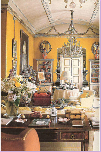
Above, is a picture of Nancy Lancaster's famous butta yellow library in England - this room is the epitome of the English Country Manor's cluttered style. To the right, compare Lancaster's library to a library in a French country chateau. And hence, the question: to clutter or not to clutter?
Here are examples of both styles of decorating, cluttered vs. uncluttered, English vs French. While older, established designers favor the cluttered English country manor look, many younger designers have taken up the cause. Below are examples of the younger generations' interpretation of the English Country House style:
The Cluttered Look:
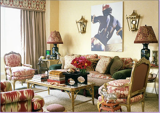
The "cluttered" look: By Alex Papachristidis. Here, a beautiful mix of textiles and fabrics: Fortunys, indiennes, ikats and suzanis all mixed together. This Anglo influenced look is stolen from the English country house and dressed up for the American home. No English country man0r would be so perfect and orderly as this. This is stylized clutter - everything is placed here by design, not accident. The elder statesman of interior design, Mario Buatta, perfected this look. Notice the wonderful mix of fabrics and especially note the exotic sconces.
The dining room with a suzani covered table. Books and porcelains vie for eating space. Notice how even more books are piled high on the spare chair on the left. The antique crystal chandelier pleasingly shares the space with the inexpensive indienne fabrics.
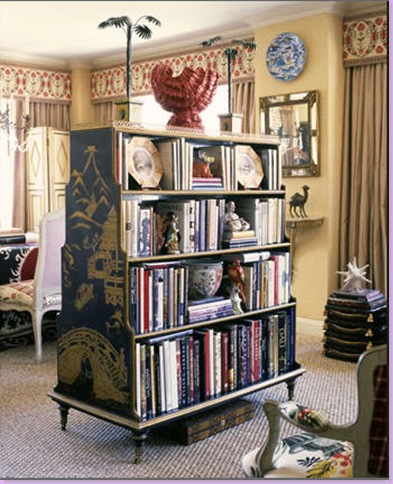
A chinoiserie bookcase separates the living area from the dining area. No English manor house is complete without a piece of chinoiserie or black papier mache furniture somewhere.
Seagrass - a staple in England for decades - has finally become accepted in America, thanks to Pottery Barn. The fabric lampshades recall the English workhouse Colefax and Fowler.
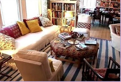
Vogue editor Carolina Irving lives in this NYC apartment with her art-collecting husband. White slipcovers, textiles, blue and white striped dhurrie rug, seagrass, and books all play an important part in this apartment's design. The cluttered effect is much more "real" in this apartment and is less stylized.
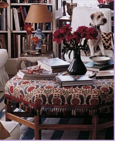
A close up of the ottoman/coffee table in the Irving apartment. The fabric and ottoman is by England great, Robert Kime, interior designer to the Prince of Wales.
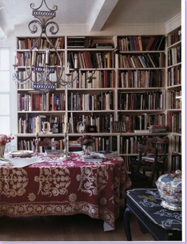
The dining room shares it's space with the library. An antique suzani covers the dining room table.
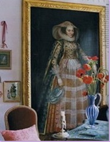
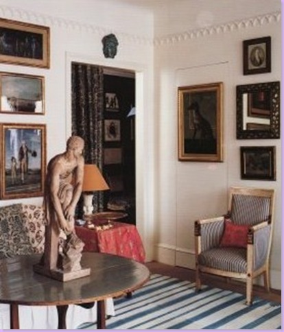
The apartment is home to grand art work, similar to what would be found in English country homes.
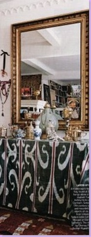
Here an antique ikat covers a table. Jewelry hangs off the walls and an assortment of accessories clutter up the top of the table.
Art work covers every inch of wall space that is not already covered by bookcases in the Irving apartment.
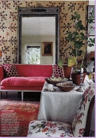
A glimpse of Carolina Irving's own country home. Rather than decorate her second home in a different style, Irving stays true to her cluttered roots. An antique textile hangs behind a mirror.
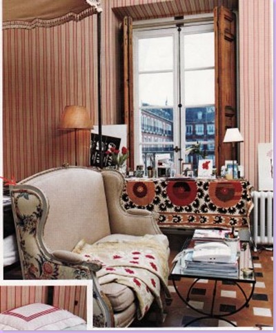
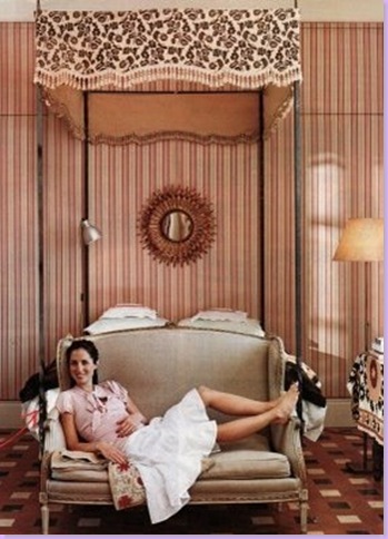
Another devotee of the cluttered look, also named Carolina, is Ms. Herrera, Jr. Here is her city apartment's bedroom: all textiles and fabrics and clutter. Again, the look is not stylized clutter, but a normal outcome of it's owner's lifestyle. Note how two different fabrics cover the french settee. Antique suzani covers a cluttered table top.
A close up of the bed, with it's textile canopy. Carolina Herrera Jr. sits in the French settee.
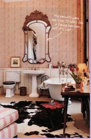
In sharp contrast to an uncluttered all white tiled and carrara marbled bathroom, Herrera's is, instead, a study in clutter. Red patterned wallpaper covers the walls and a large cow skin covers the floor.
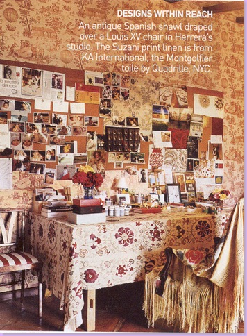
Herrera too has a country home, an estancia in Spain. Here in her studio in the country, a suzani covers the desk, while an antiquw shawl covers the chair. The walls are wallpapered in toile.
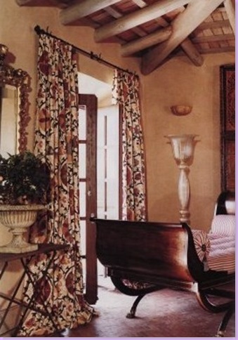
Another view of Herrera's estancia in Spain: a suzani inspired fabric from Brunschwig & Fils hangs at the windows.
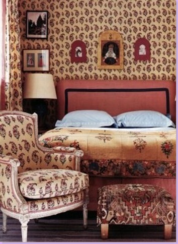
English born, now living in California, fabric and interior designer Peter Dunham practices the cluttered, English country manor look. Here, his paisley fabric covers the walls and the french antique chair. Other textiles cover the bed.
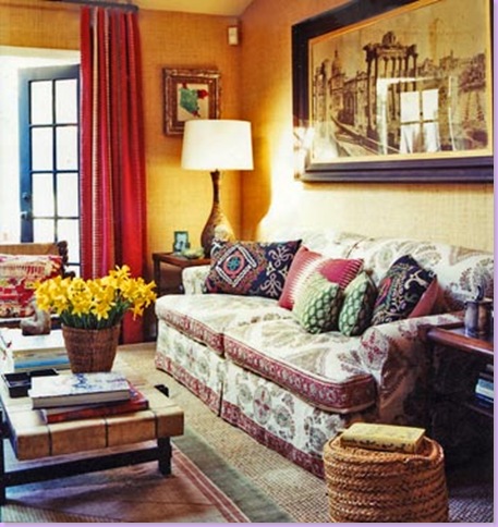
Here Dunham uses bright yellows and red, typical of a cluttered design. The sofa is covered in his indienne inspired fabric. Seagrass layered with a dhurrie completes the look.
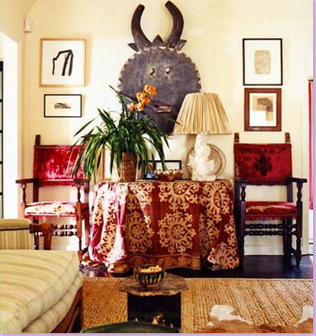
Here, Dunham mixes African art with contemporary art. Apple matting is on the floor, layered with a cow hide. An antique suzani covers the table, topped with the clutter that adds to the charm of this room.
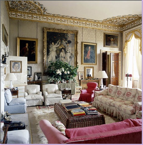
The real deal: Chatsworth, a quintessential English country manor home. Here, the private living quarters are a study in what Americans try to emulate with their cluttered look. Slipcovered furniture, fabric ottoman piled high with books, and paintings cover the walls. Nothing is styled here. Every generation adds their own stamp on the castle, so that layer upon layer of clutter is piled high.
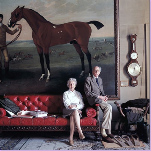
The former Lord and Lady of Chatsworth sit waiting by the back entrance underneath a gorgeous portrait of one of Chatsworth's horses.
The Uncluttered Look:
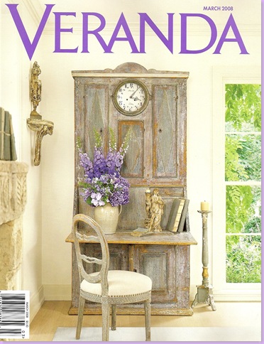
Veranda, the magazine that brings such pain! Here on the cover, a home designed by Houstonian Jane Moore for her daughter and husband who live in Dallas. A pseudo Swedish design, heavy with French antiques, this home is in direct contrast to a cluttered, English country home inspired interior. Sparse, devoid of clutter, pattern, and bright colors, the look here is soothing and tranquil.
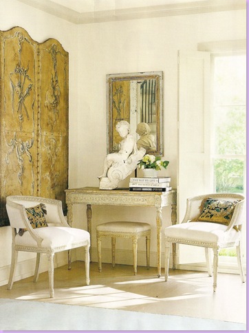
The walls are stuccoed white and the wood floor is bleached white - both provide a calming canvas upon which the furniture sits. Here, two Swedish chairs, upholstered in white, sit beneath an antique screen. Note how the accessories are sparse and oversized.
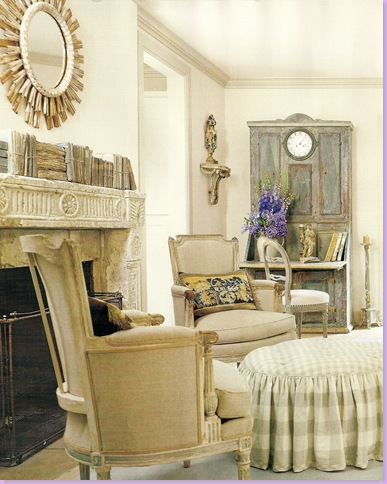
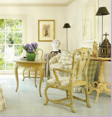
The living room - French chairs upholstered in linen. The only pattern used is a muted seafoam green and cream check from Chelsea Editions.
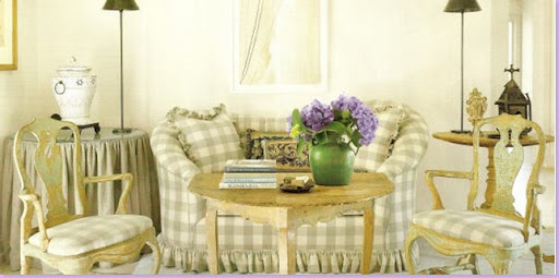
The other side of the living room, with its antique Swedish chairs and tables and Chelsea Edition checked sofa. Even the rugs are serene and plain - here, an antique celadon green dhurrie.
Close up of the living area, serene and uncluttered: you won't find any jarring reds or bright suzanis in this house. Note the choice of lamps here. Somehow, the contemporary pieces are just the right touch.
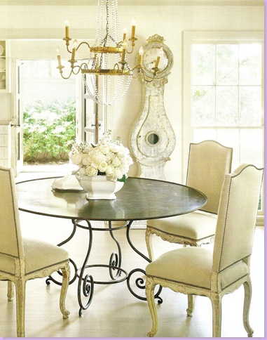
The dining room with a french inspired iron table, french dining room chairs and a french light fixture. Hard to call this Swedish, though a Swedish Moro clock stares down over the scene.
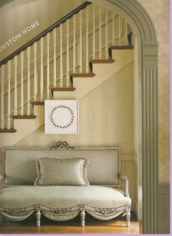
In the entry hall of this Houston home designed by P. Joe Shaffer, a French settee covered in a seafoam linen sets the quiet tone of the home.
Another French settee, this time in the living room.
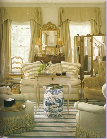
Another view of the living room. The only pattern is the antique Fortuny curtains.
The dining room - an iron table similar to the one in the previous Dallas home wears a cream slipcover. Blue and white striped dhurrie rug - similar to one used in a cluttered home, here the rug calms rather than stimulates.
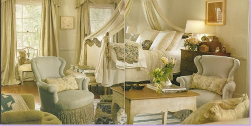
The beautiful bedroom - French draped bed, blue and white garden seat, blue linen fabrics - all add to a serene, quiet interior.
Another view of the sitting area of the bedroom. Though sharing in elements with a cluttered look - the blue and white striped dhurrie and porcelains - here the lack of pattern and color gives the room it's quiet and restful appearance.
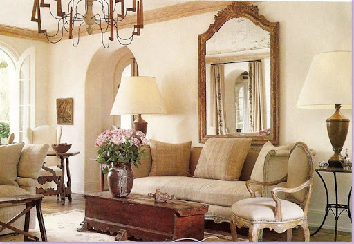
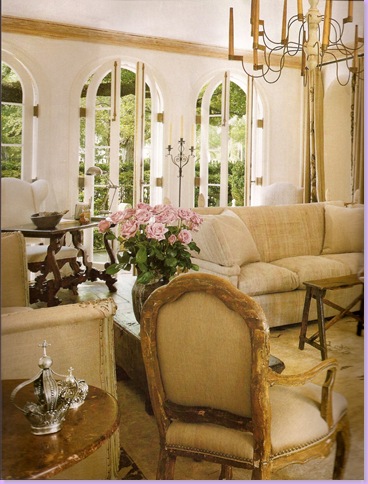
This Houston house, also featured in Veranda, is the home of designer Pamela Pierce. Again, white walls, plain linen upholstery, and oversized accessories, combine to make an interior that is a complete opposite of the cluttered, patterned, and stimulating English inspired interiors.
Another view of the living room in the Pierce house. French day bed is seen on the left.
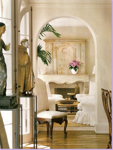
View into a sitting room with white slipcovered chairs and antique French fireplace mantel. Large santos on the left.
In the library, Pierce hides the cluttered books behind a drape. Seagrass matting. Again, the only pattern is a Chelsea Edition brown and cream check on the slipcovers.
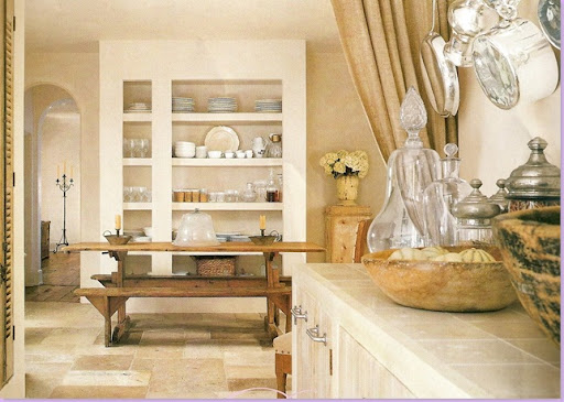
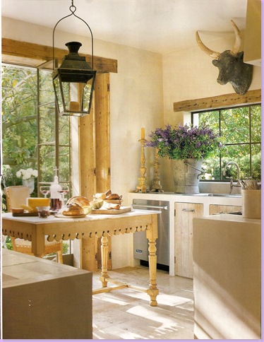
The breakfast room with it's light limestone floor and antique table and benches.
The kitchen. Plain, uncluttered. Large lantern and cow's head are accent pieces.
Pamela Pierce's daughter, Shannon Bowers lives and designs in Dallas. She, too, favors the French inspired country home look. Here in a client's living room, large accessories and plain fabrics lend an air of uncluttered serenity.
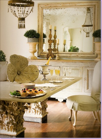
Bower's client's dining room. All creams and whites, slipcovers, linens, and pale painted woods - this room could just as easily be in a French country home.

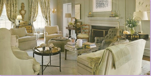
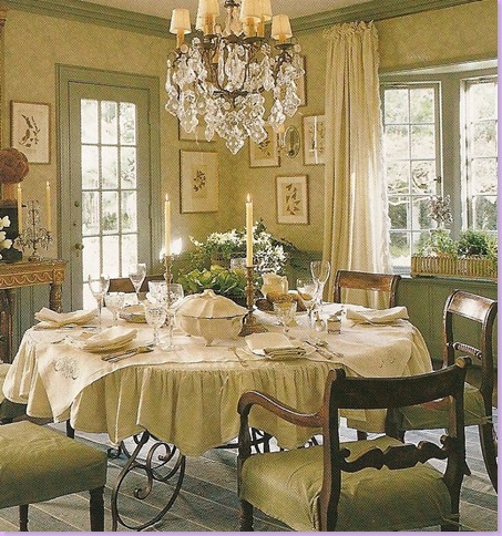
The Real Deal: A French Country Home that inspires the spare, serene, and cool palette of the uncluttered homes of America.

The dining room in the French Country Chateau. Limestone floor and mantel, all creams and white, crystal chandelier and rustic furniture living happily together. Spare, oversized accessories are in direct contrast to the clutter of the English Country Manor.

The living room in the French Country Home. Cream upholstery on antique French chairs. The armoire is painted in whites and creams. Linen curtains and creamware dishes.
Which look do you prefer? The patterned, suzani and ikat textile interiors with it's vibrant reds and yellows, cluttered with small accessories and books piled up everywhere? A look that take its cues from the English country manor? Or, do you prefer the uncluttered, patternless, white walls, soothing greens, blues and aquas, linens and checks, cream painted furniture and oversized accessories? Interiors that are based on country French homes, homes with a Swedish or Belgian influence?
Myself, I can't decide. Can you? I'll let you know if I make up my mind.



0 Comments:
Post a Comment