I received a thoughtful email the other day from a reader in Sweden who is very amused by what Americans consider Swedish design. She wrote me that the Gustavian interiors we create in the states bear little, if no, resemblance to actual homes in Sweden. Further, she said that while Americans think Gustavian is Swedish design, it actually represents only a small part of true Swedish style and it correlates to only a short period of time in Sweden's history. True Swedish design, the reader told me, is about using the materials that come from the land - the stones, the dark granites, the green marbles, the wood from the trees - the oak, beech, maple, pine and spruce. The mines produce the tin and iron and other metals that influence authentic Swedish style. True Swedish style is wood floors and brick tiles, simple lines, and touches of nature everywhere - as in paintings of flowers and branches. Tile stoves are an important part of Swedish style and clay in its natural color is often seen in the home. Crystal and glass also represent Swedish design, but it always come back to nature, nature truly defines Swedish design. The Swedish people have a great love of their land and its landscapes and this is always reflected in their homes. Put simply - my new friend said - Swedish Style is about simplicity, light, and natural elements.
Since the Gustavian period that Americans hold up to be the "true" Swedish style actually lasted for such a short period of time, my new Swedish friend finds it amusing that this is what we Americans think of as Swedish. But, truly, in defense of Americans, can't that be said of each decorative period, in each country? For how long did Empire stay fashionable in France or Louis the XV or XVI? And the same can be said for Hepplewhite in America or George III in England. Each significant part of historical design usually lasted as long as the ruler did. Perhaps Americans are so enamored of Gustavian design, because it is so beautiful - the pale colors, the white washed woods, the crystal chandeliers, the mirrors, the delicately painted murals of sprigs and vines. And since it is so beautiful, we long to recreate the look, to emulate it and make it our own. Surely American lovers of Gustavian style realize that this is not the only style of Swedish design, but apparently, it is the style we love. And since we do love Gustavian, perhaps we aren't as interested in other aspects of Swedish interior design. There is nothing wrong with that. Just as the rococo period, among many others, is largely ignored, Gustavian is a period that we Americans choose to celebrate. And while we are on the subject, just what exactly is Gustavian?
Named after the Swedish King, Gustav (yes that name again!) III, Gustavian refers to the decorative style that began after the king first saw Louis XVI or Neoclassical interiors in France where he had lived for a short time. Gustav was so enamored with the French court at Versailles that he wanted to recreate it in Sweden when he returned home to rule. Gustav lived in the late 18th century and was a great lover of the arts, both decorative and theatrical. His love of not only the arts but the sciences too, prompted Gustav to form the Swedish Academy and the Royal Swedish Opera. The sophistication he brought to the court pulled Sweden into social prominence and it's royal court became known as the Paris of the North. Long rumored to be homosexual, he did marry and produce two heirs, though their paternity was always in doubt. He was an advocate of the European Enlightenment movement and his patronage of the arts secured his place in history as one of the most beloved Kings of Sweden. His passion for the Neoclassical style he had seen in France was infectious and the style swept through the upper classes who sought to favor their King. Gustavian was a reaction against the excesses of the previous Rococo period and the wealthy were eager to emulate the King's love of all things Neoclassic. Gustav built a number of palaces and country homes in the Neoclassical style for himself and his brothers and other members of the royal court. His interpretation of the Louis XVI style was light and elegant, with columns and pilasters, gilded ornament and laurel festoons. Tall wood framed mirrors graced the Gustavian room as did crystal chandeliers and urns and vases. The woods of the paneled walls and furniture were painted in light grays and pale blues and greens. A popular decorative shape was the oval backed chair with straight fluted legs. Later in his reign in 1783, after a visit to Italy and the excavations at Pompeii and Herculaneum, an Italian influence can be seen, especially in the popularity of the Klismos styled chair and in other decorative motifs such as gargoyles. This Italian period is referred to as Late Gustavian. Gustav III ruled for only a short period of time and was killed in 1792 by a group of assassins, attacked while watching one of his beloved operas. His influence in Sweden today can still be seen in the many Neoclassical palaces and country homes that dot the Swedish landscape. And he remains one of the most admired of all the Kings of Sweden.
Gustav III, 1746-1792
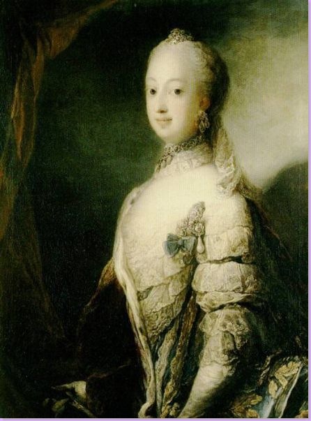
His wife, the long suffering Sophia Magdalena of Denmark. The couple were promised to each other as toddlers, yet Gustav mother's never liked his wife and she was behind much mischief making in the marriage. They had two sons, one who died in infancy and the other who followed Gustav on the throne. Gustav's mother never accepted that he was the father of these children.
Count Hans Axel von Fersen, a Swedish diplomat, was one of two rumored lovers of Gustav.
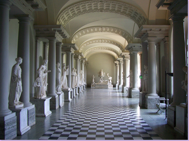
The Gustav III Museum in Stockholm was created to display statues Gustav bought in Italy during his tour of the ruins. Here is a view of the museum, all in shades of beautiful gray and white, traditional colors of the Gustavian style. Other statutes were scattered about the English Garden at the Royal Family's castle that Gustav created.
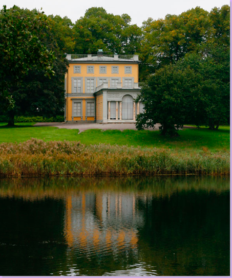
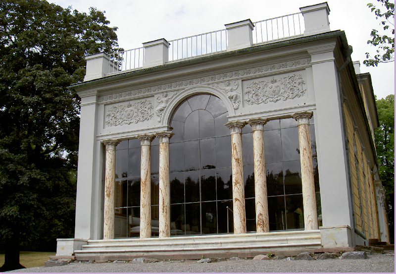
Haga Park is the base of Gustavian design in Sweden. The park was developed by Gustav III for himself and his family. Plans for a grand palace were commissioned by Gustav but he was assassinated before it could be built. The building above, pictured in the dead of winter, is known as the Gustav III Pavilion and is where he lived for just a few years. The famous Hall of Mirrors is located in the one story section to the right of the building, above. Haga Park is considered the oldest city park in the world. It is a large complex with several mansions and follies commissioned by Gustav. Located on a bay of the Baltic, Haga Park is a very popular tourist destination.
The Gustav III Pavilion photographed in the summer. The Pavilion overlooks a bay on the Baltic and is reflected in the waters. The Hall of Mirrors is inside the one story portion facing the waters.
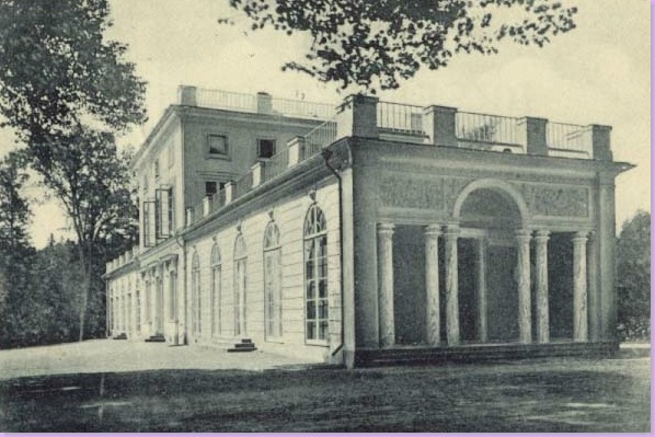
An early, romantic photograph of the Pavilion, showing the Hall of Mirrors.
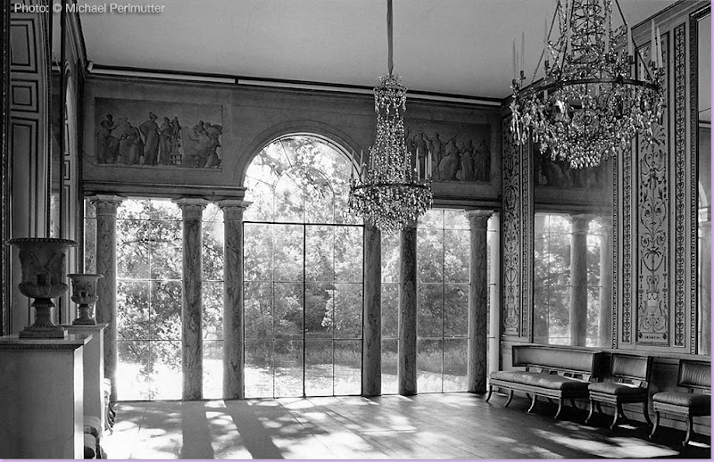
Michael Perlmutter took this hauntingly beautiful black and white photograph of the Hall of Mirrors inside Gustav III's Pavilion. Decorated in the Gustavian manner, the room has all the elements of the style: columns, pilasters, crystal chandeliers, mirrors, Klismos styled chairs and settee, urns, and painted walls.
A view from the outside in, you can see the furniture just inside.
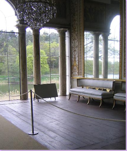
Another view of the inside of the Hall of Mirrors.
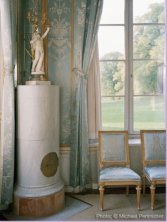
This photograph, by Michael Perlmutter shows the pale blue bedroom of Gustav. Most notable is the beautiful, diminutive columnar fireplace topped by a candelabra. The walls are covered in silk damask, which was also made into curtains and is covering the furniture. The chairs are Louis XVI inspired Swedish. The interiors were created by Louis Masreliez who became a trendy interior designer of his time. The trees captured by Perlmutter outside the window look almost like a beautiful , hand-painted mural. Perlmutter, an American architect, is also a noted photographer now living in Sweden. Many of the photographs pictured here are his, taken from a book he recently published. (More information about Perlmutter is at the bottom of this blog.)
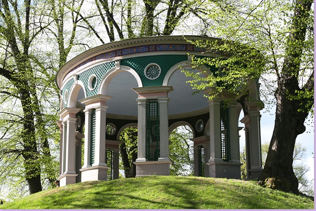
Haga Park is home to several buildings designed for Gustav III. Here, The Temple of the Echo was built for Gustav to enjoy meals outside. Today it is a popular site for weddings.
The grounds of the park are frequented by the Swedish people. Haga Park is also one of Sweden's most popular tourist destinations. The yellow painted Pavilion can be seen just to the left, above.
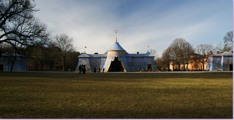
The most unusual buildings in Haga Park are the three copper tents built for Gustav III's guards and their horses. Today, one houses a museum and another is a restaurant. In this picture you can plainly see the middle tent while the left and right tents are just barely seen. The vision of Gustav III was that the tents would represent an encampment in the park. The tents were designed by noted architect Louis Jean Desprez.
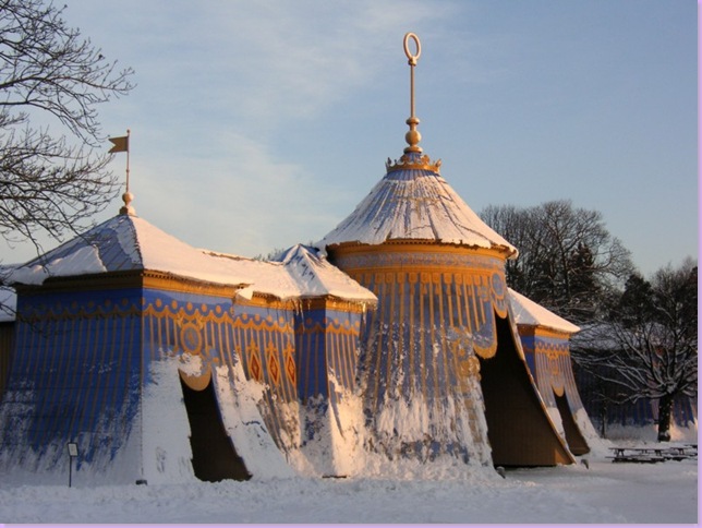
One of the copper tents gloriously photographed in winter.
The restaurant inside the copper tent. This must be a freezing place to be in winter!
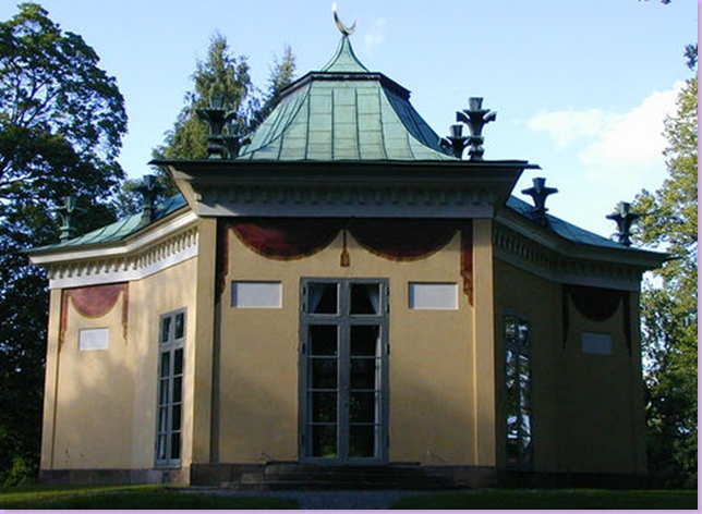
The Turkish Pavilion, pictured above, is also on the grounds of the park, along with a Chinese Pavilion, both erected in Gustav's vision.
The model of Gustav III's palace that was to be built in Haga Park. Only the cellar was started before his assassination. The remains of the cellar today are still visible and are called the Ruins of Haga. Gustav commissioned Louis Jean Desprez to design the building in his beloved neoclassical style.
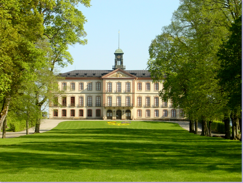
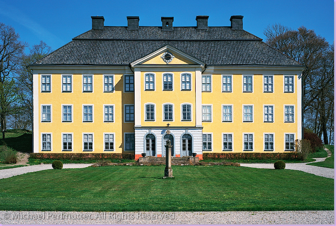
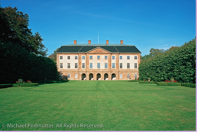
Tullgarn, the summer palace of the Swedish royals. Gustav III gave this palace to his brother who redecorated it in the Gustavian style. Notice the large clock tower on the roof.
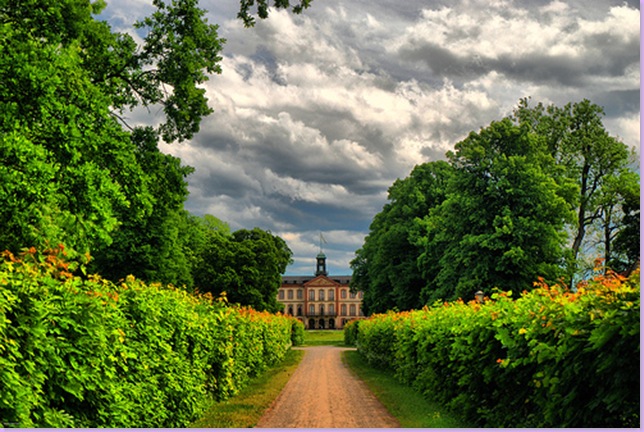
The long approach to the palace, beautifully captured on a balmy, sunny day in Sweden.
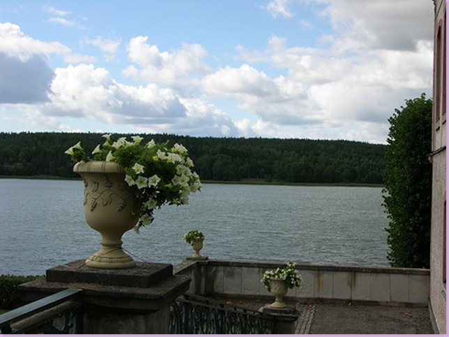
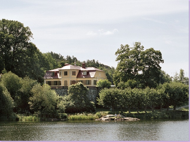
The back of Tullgarn faces a lake.
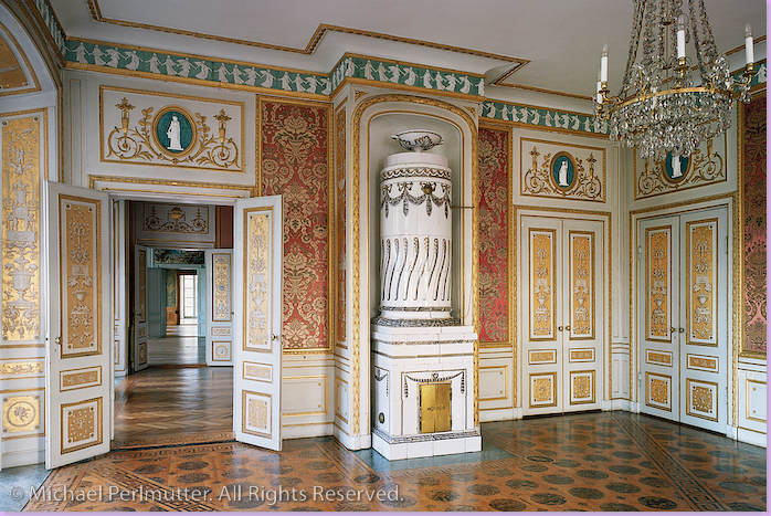
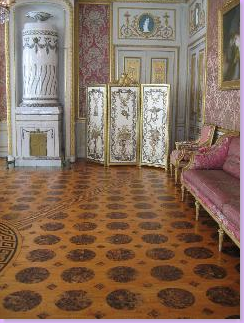
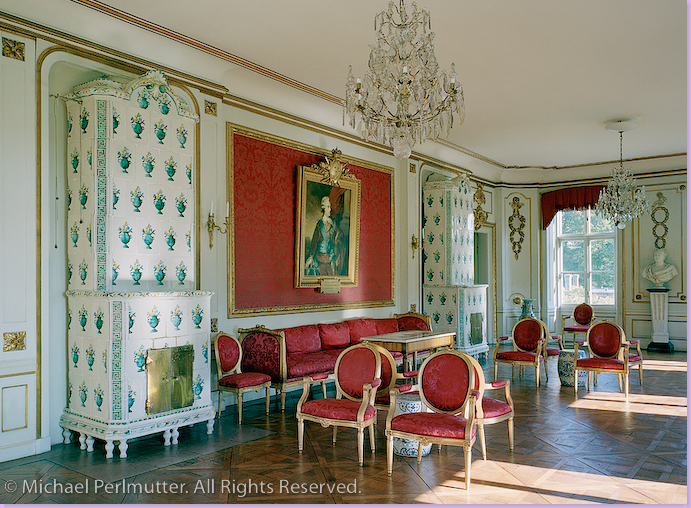
The interior of Tullgarn, as photographed by Michael Perlmutter. Through the doors on the left is a long enfilade. As always, there is a beautiful Swedish crystal chandelier and a tiled fireplace. Notice the intricate painted wood floor.
Another view of the same room at Tullgarn, this time showing the furniture and a decorative screen.
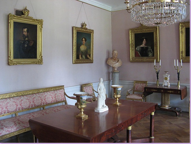
Another room at Tullgarn is much less decorated. Painted a pale shade of pink, portraits of the royal family line the walls. Notice how the gilt wood frames are topped by a crown. Silk damask covers the gilded furniture. Damask is the fabric of choice in homes of the royals and upper class.
Svindersvik was a private home built in the Rococo manner. The interiors have been preserved and the home is now part of the Norvistic Museum. The interiors transcend the end of rococo period and the beginning of the Gustavian style and are considered among the best preserved interiors of the Gustavian period.
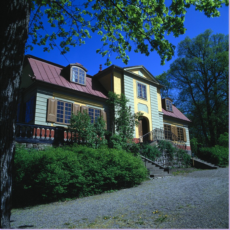
Svindersvik is located on a bluff overlooking a lake. A simple home, it is comprised of just seven rooms.
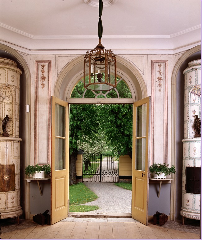
A door in the vestibule at Svindersvik is flanked by two columnar faience tile fireplaces. Except, one fireplace is fake! Symmetry is an important element in the Gustavian style and fireplaces were often used as an end to that purpose. Rather than have two expensive fireplaces, one would be made out of painted wood. Can you tell which is the real one? The tiled fireplace on the right has retained its colors, while the painted wood fireplace on the left has faded over the centuries. It is used as a storage cabinet.
Svindersvik again, a room outside a bedroom has a painted ceiling, along with painted canvas walls. The gray Swedish Gustavian chairs are covered in red and white checks. A beautiful clock made of gilded wood hangs on the wall. The secretary is made of walnut.
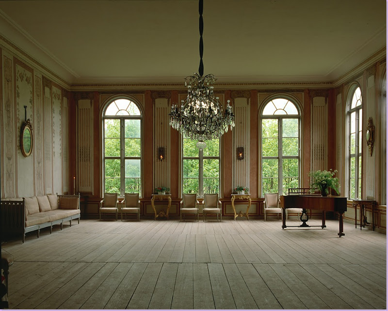
Svindersvik: A beautiful Gustavian room as it was decorated several hundred years ago. This room is a pavilion that was added to the property by the owners to entertain Gustav III. Fluted pilasters with lighted sconces line the walls. The floors are plain, unstained wood. Gustavian chairs and sofa share the space with the ubiquitous crystal chandelier.
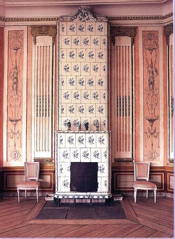
A beautiful blue and white tiled fireplace at Svindersvik's pavilion.
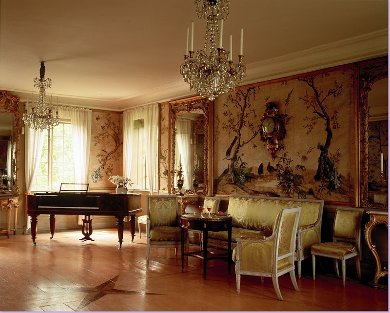
Svindersvik: This room is famous for its chinoiserie styled handpainted wallpaper imported from China. Also in the room are mirrors and crystal chandeliers, along with a set of silk damask covered neoclassical furniture signed Jacob of Paris. Another gilded wood clock hangs on the wall. The floor in this room is polished with a painted pattern in the middle.
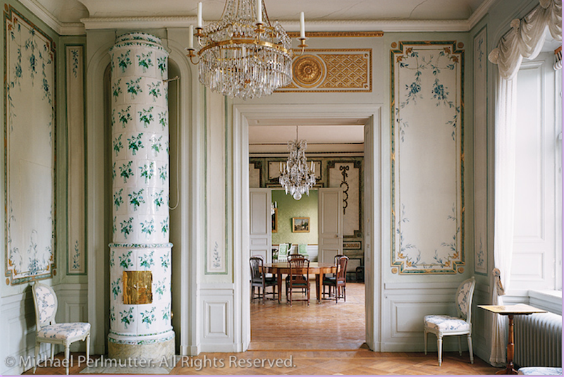
Another important Gustavian home, Sturehof is a summer manor house remarkable for its faience tiled fireplaces. The owner of the home, Johan Liljencrantz, Gustav III's Minister of Finance, owned the Marieberg faience factory which constructed the 20 tile stoves here, one for each room. The fireplace tiles were made in bright colors and shiny glaze. They became the focal point of each room and served as the inspiration when decorating the interiors. Sturehof was designed in the Gustavian style and artisans such as Lars Bolander (the original!) and Louis Masreliez helped with the decor.
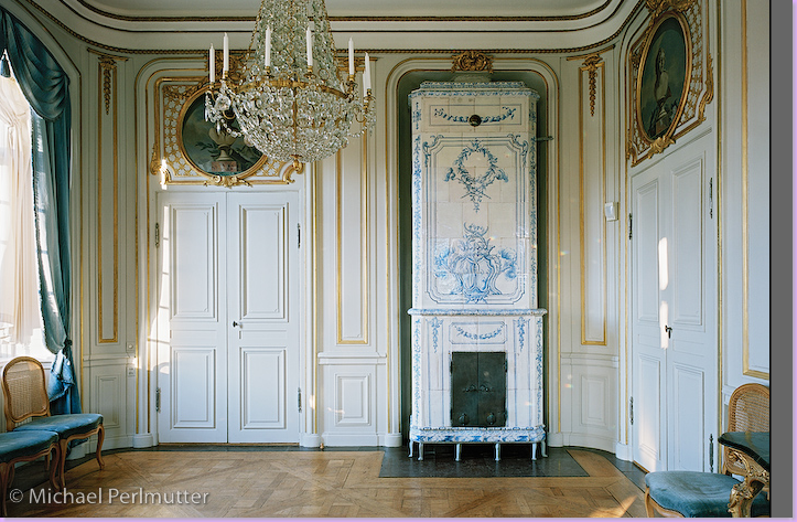
Sturehof has not only its unique collection of 18th century Swedish tile stoves but also, lovely preserved Gustavian interiors. Here, a pale blue bedroom looks into the dining room and another room past that. The decor at Sturehof was very costly, from the parquet floors to the stoves, to the furniture and chandeliers. This fireplace is a columnar style in blue and white tiles. The chairs are styled after Louis XVI.
A close up view of the the blue bedroom above. Here you can see a jib style door hidden in the molding and painted canvas. Through the door you can see a typical Swedish style sofa.
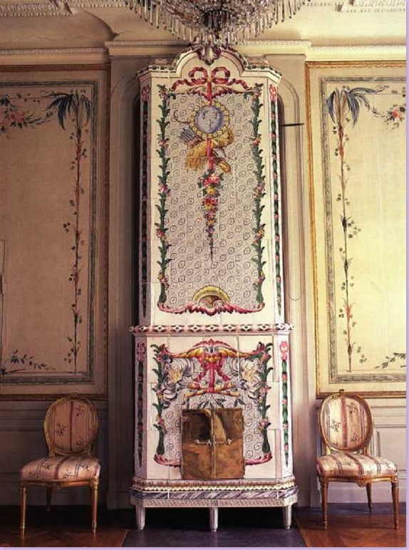
A guest room at Sturehof, this tiled stove is considered one of the most magnificent ever made. The walls of the guest room were handpainted, though it is believed because there are gilded wood moldings around the sections that silk was intended to be hung instead.
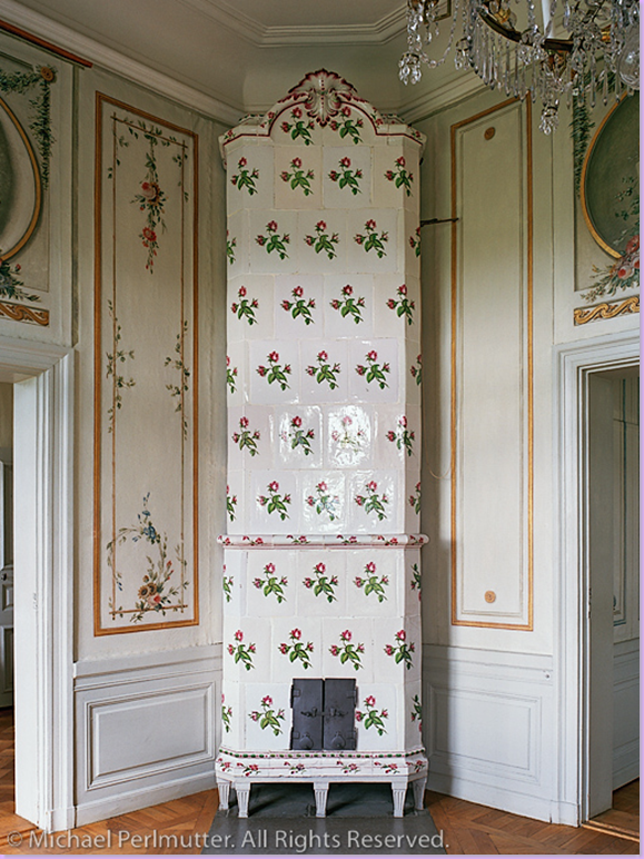
Sturehof: This corner stove has lovely deep pink flowers on the tile which in turn set the room's decorative theme.
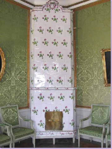
Sturehof: In a green room with silk damask wall hangings, the stove again is decorated with deep pink flowers. Sturehof with its 20 fireplaces has the largest collection today of the tiled stoves that came out of the Marieberg factory.
Bjorkslund, another Swedish neoclassic manor house, photographed by Michael Perlmutter. Notice the clock on this house, just above the center windows.
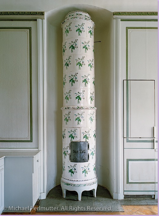
At Bjorkslund, an elegant, columnar fireplace, placed inside an oval space. The walls here are very plain which is unusual for the Gustavian style.
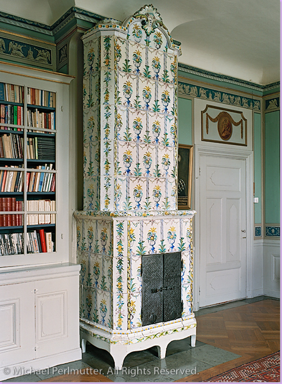
Bjorkslund: This library has the green walls associated with Gustavian design.
Maltesholm, a great Renaissance castle built surrounded by a moat. One redesign of the interiors was completed in 1780, in the middle of the Gustavian period. The year the castle was built is noted in giant numbers on both sides of the house. And in the center section, is the ever popular clock!
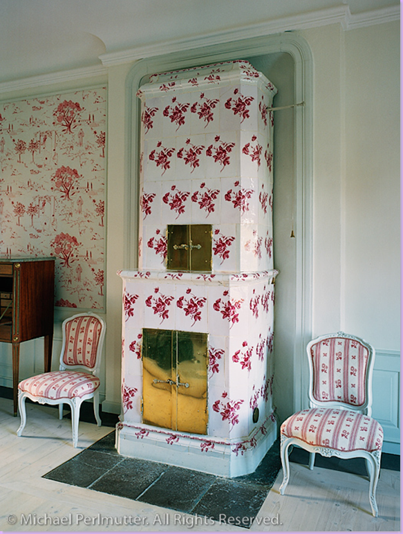
One room at Maltesholm features this lovely red and white faience tiled fireplace with red and white toile and upholstery. Charming!
When Gustav III first visited the newly built castle Ovedskloster, pictured above, he said it was "suited for a King, not a nobleman" and turned his back in anger. What a baby! Built in 1771-76 by the famous architect Carl Hårleman, it is said to resemble the castle Drottningholm where the Royal family of Sweden still live today.
Michael Perlmutter captured the drawing room at Ovedskloster, which is still a private home. I'm not sure if both of these fireplaces are real, but it appears they are. The colors in this room are just beautiful Rich red silk damask covers the walls and the furniture. The floor is an elaborate parquet pattern. What I especially love are the blue and white garden seats being used as tables!
Stora Vosby, an 18th century manor home remarkable for its absence of an exterior clock!
At Stora Vosby, the fireplace sets the tone for the decor in blue and white. Here the fireplace is set in place to balance the double doors. It would be interesting to see if there is another fireplace across the room. The tiles of the fireplace are somewhat different here - they comprise an overall design, rather than each tile being the same. Notice the large oval paintings over the doors.
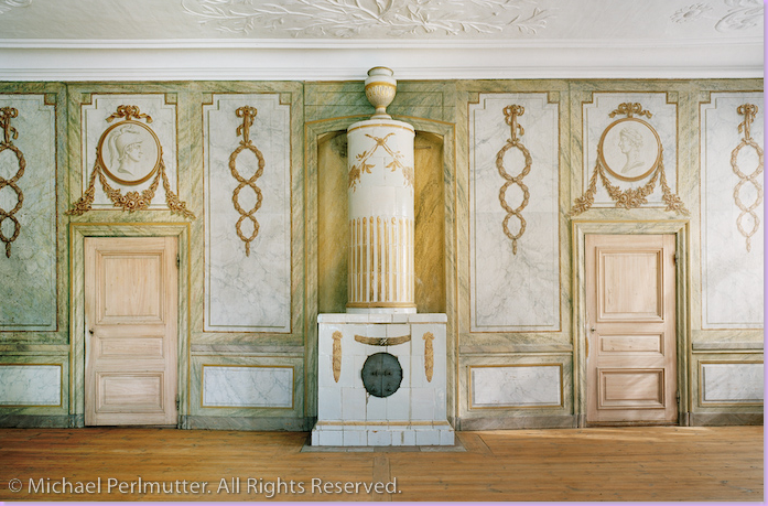
This gorgeous room in Hasselbyholm is a vision in gold and white. The walls have been faux marbled. Notice the great symmetry at play in this room. There are cameos facing each, again in symmetry, above the two doors. The fireplace is quite different than most others, combining both the columnar and rectangular shapes. It is truly a piece of art.
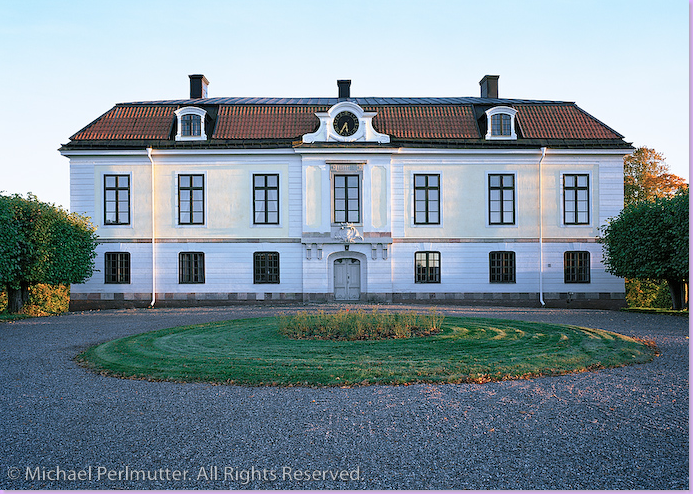
Heby, a manor house. Beautiful in white, the house has a red tiled roof. The ever present clock is set into molding. The facade is a lovely symmetrical design.
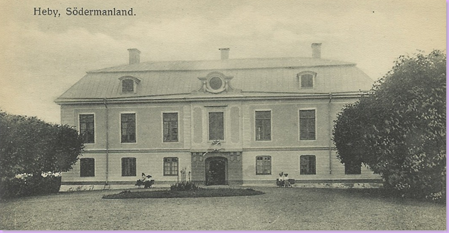
The same house many, many years earlier. Notice the house isn't white and the roof looks completely different. The center part of the facade is both dark and light.
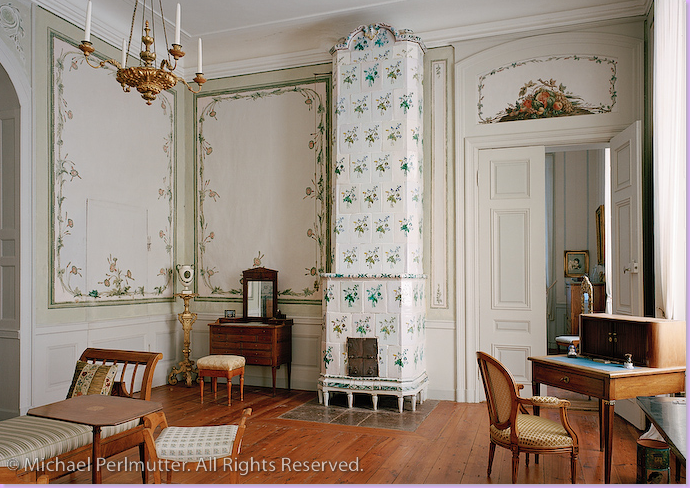
The white exterior of Heby matches the interior here. Notice there isn't a crystal chandelier! The furniture is all stained wood also as opposed to painted wood.
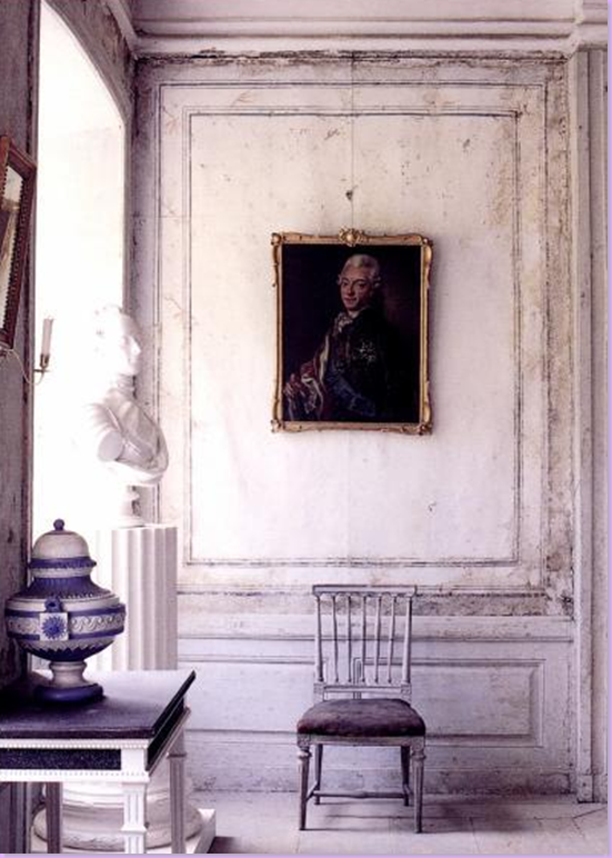
During renovations at Ekensberg Manor, the wallpaper was removed to reveal the rather plain wall decorations of the Gustavian era. The portrait is of Gustav III. The bust is of his brother Carl XIII. The furniture is neoclassic.
So, how DO the Swedish live today, those who love Gustavian design? We have seen lots of examples of how Americans do Gustavian in Veranda and Southern Accents magazines. But how do the Swedish do Neoclassical?
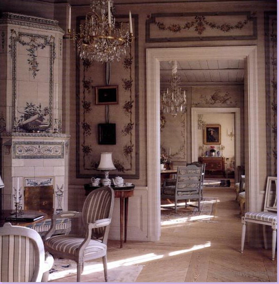
This home is an original Gustavian era home that is still lived in. It is not a museum, although the decorations have been very well preserved. The furniture is not strictly Gustavian, rather there are reproductions of both Swedish and country french design. It is a comfortable looking room and appears well lived in. Rugs cover the plain, unstained wood floors. This house is a good example of how you can mix 18th century design and take it into the 21st century. Just beautiful!
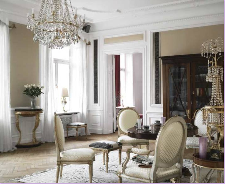
How do the Swedish live who can not afford period Gustavian antiques or who live in a newer home of the 19th or 20th century as opposed from the 18th? In other words, how do "regular" Swedish people do Gustavian? This modern day room is Gustavian in feel with it's light colors and painted and gilded furniture and unstained wood floor. It has the crystal chandeliers and the Louis XVI styled chairs so important to the Gustavian look.
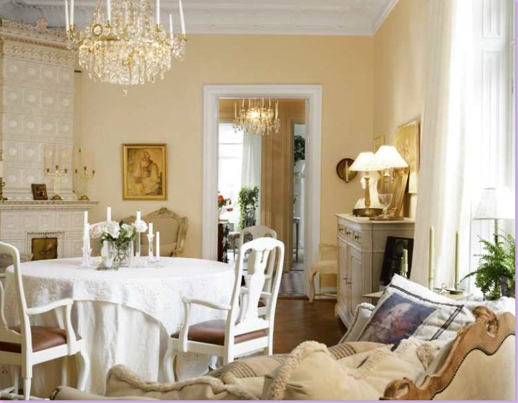
This modern day Swedish interior boasts a lovely tiled fireplace and lots of painted wood furniture. Crystal chandeliers add to the Gustavian mood as does the pale, wood floor.
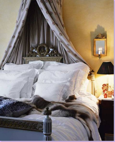
A neoclassical styled bed brings a Gustavian feel to this Swedish bedroom. The canopy is made of Chelsea Editions embroidered fabric. Small mirrors with lighted candles are typically Swedish.
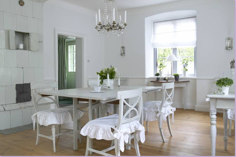
The younger generation of Swedes love white and gray interiors. Here, this dining room reflects that love of the Gustavian style. An ancient, plain white tiled fireplace warms the room, while an antique Swedish table is surrounded by painted neoclassical styled chairs with flouncy white slips. As always, there is a crystal chandelier and mirrored sconces and pale wood floors. Lovely!
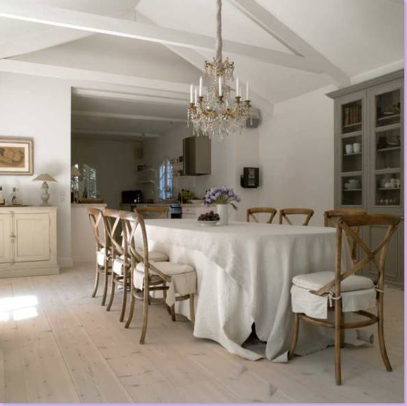
Another dining room from Sweden, with Gustavian elements - white washed floors, crystal chandelier, gray painted furniture. The chairs though are not Gustavian, but rather OKA Direct catalogue orders from England!! The look is effective though. I like how the Swedish cover their tables with two white tablecloths so that the legs of the table are hidden. I use this trick to when entertaining.
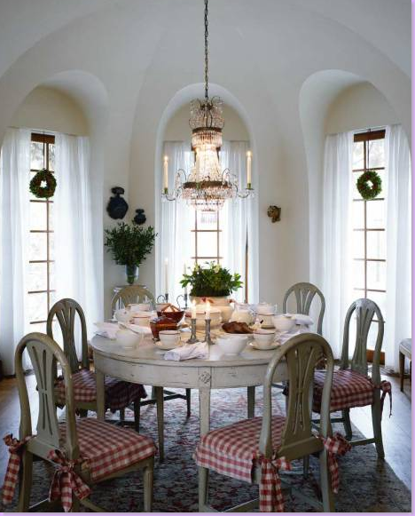
And finally, one last Swedish room with traditional gray painted authentic Gustavian designed chairs and table.
As these modern day interiors show, the Swedish can enjoy the Gustavian look without spending a fortune unlike our counterparts in America. There are a number of companies who make fine reproduction Swedish furniture, Chelsea Editions, for one, comes to mind immediately. The look is fresh, light and youthful. The mirrors and crystals of the style add just a touch of elegance and bring light into the room, something the dark Swedish winters needed. The Gustavian style lends itself to inexpensive fabrics such as checks and white linens. The pale blues and grays and greens are a soothing alternative to the warm colors of the Tuscany look once so popular, but which now seems suddenly dated. Amazon has several wonderful books on Swedish style and if you are interested in reading more about the subject, go here.
And lastly, I could not have completed this blog without the kind cooperation of the photographer Michael Perlmutter who so graciously agreed to lend me his gorgeous images of the Swedish tiled fireplaces and houses. I happened upon his web site and was overwhelmed by the beauty he had captured in the many 18th century manor houses across Sweden. An American architect now living in Sweden with his family, Michael practices architectural photography. His images seen here and on his web site were published in a book, “Swedish Tiled Stoves from the Eighteenth Century,” which was nominated in 2007 for the prestigious August Prize for best non-fiction book of the year. The book was three years in the making, and is based on over ten years research by the author Susanna Scherman. Unfortunately the book is only available in Swedish, but you can find it under this name Den svenska kakelugnen. To visit Michael's web site and see more of his images, go here. Thanks, Michael for everything!




0 Comments:
Post a Comment