 I’m slightly obsessed with this tall, handsome and elegant man named Loi Thai and his store Tone on Tone. Thai and his partner Thomas Troeschel own the ultra chic antiques shop in Bethesda where everything is light and airy, gray and white, Swedish and French, divine and heavenly! Oh, to live in Maryland, I would haunt this place until they would have to call the police to have me removed for loitering. But since I don’t live anywhere near there, I have to be content with their fabulous web site, which is updated weekly with the best of their inventory – drool worthy for sure. And then, there are their houses. Last year Traditional Home showcased the house that Thai had lived in for years and recently had totally remodeled. The pictures showed up all over the blogosphere and for good reason. So imagine my sheer delight, and slight shock, when my bestie blogger friend, Things That Inspire (who has been turning out the best on the blog lately) told me that Thai’s NEWEST house was on the Washington Post web site. After a brief conversation over who was going to blog about it, because of course I was salivating all over the story, TTI most graciously said she wasn’t going to write about it – I could have it. That’s what friends are for. Keep smiling. I owe you one, TTI! So, to refresh your memory, let’s look first at the house that Thai had lived in since 1996, then recently totally remodeled. Then, we’ll look at his newest house – and you can decide which one you prefer. Before or After?
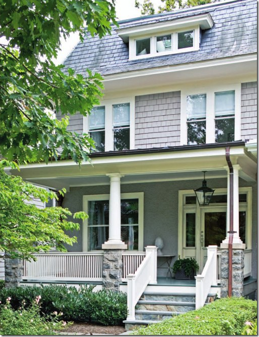
The early 1900s Edwardian townhouse in Washington D.C. was just a short 5 minute drive to Tone on Tone in Bethesda. The couple moved in in 1996, lived with its dark woodwork and floors until 2002 when they began a major overhaul of the townhouse. I love that lantern on the front porch.
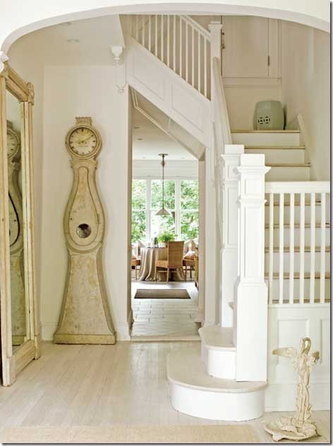
Everything was stripped down to the basics. Moldings were removed and all was painted white or gray or a combination of the two – tone on tone. The floors were treated to a whitewash paint treatment used mostly in Sweden and Europe. A large mirror and the Swedish Mora clock are the main attractions in the entry hall.
A “before” picture – hard to imagine the couple lived with such dark woods for so long!
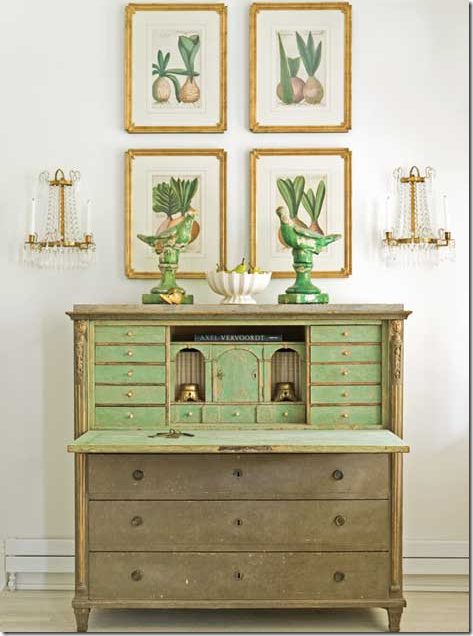
A 19th century Swedish secretary becomes a focal point. The green is picked up in the porcelains and the 17th century Dutch botanicals. This picture may be one of my favorite vignettes photographed last year! Just stunningly beautiful and perfect in its symmetry Love it!!!!!!!
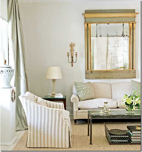
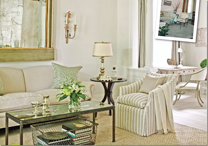
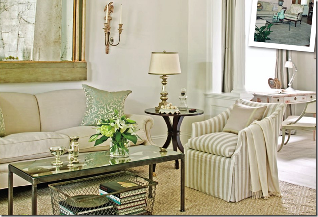
The living room is pale green and gray. The green painted mirror is fabulous – as are the sconces flanking it. I really love the wire basket underneath the coffee table – the hint of industrial is a nice mix.
A large view showing the cream and khaki striped linen slipcovered armchairs. Notice the Swedish desk and chair in the library next door. Inset is another “before” picture.
Another view of the library – between the living room and the dining room. The chair is antique Swedish from Tone on Tone – as are all the antiques.
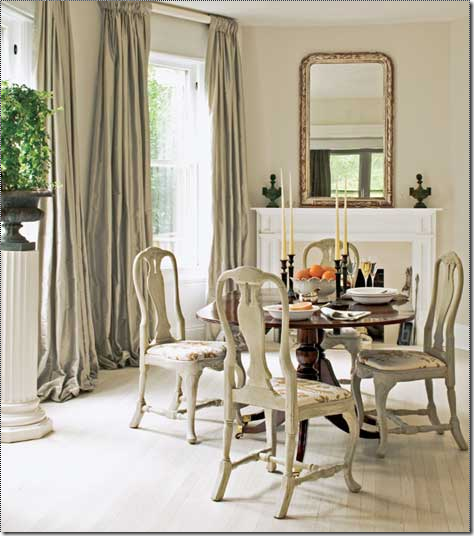
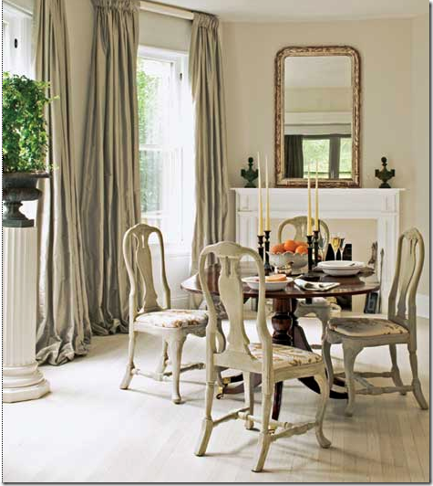
The dining room has antique Swedish chairs and a redesigned fireplace with limestone tiles. I love the curtains and the white column pedestal – so Swedish – usually there would be a white bust on such a pedestal.
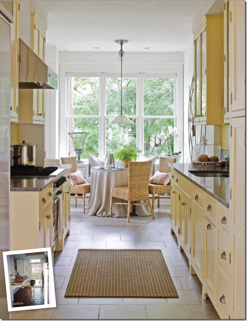
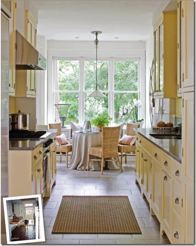
The kitchen was completely redone with new cabinetry, though the hardware was replated in nickel. The tile floor was replaced with limestone pavers. The kitchen was expanded to make more room for the breakfast room.
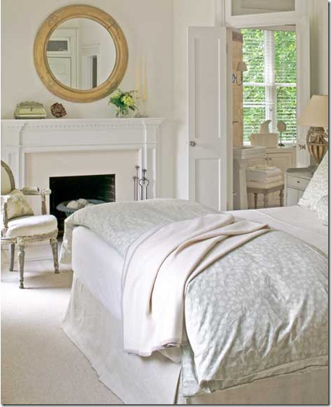
The master bedroom with an Italian mirror and new limestone tiled fireplace.
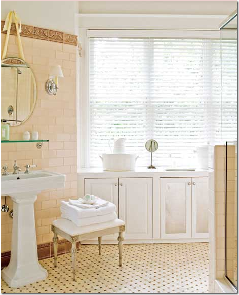
The sleeping porch became the master bathroom with apricot tile – a colorful surprise in the mostly white and gray house.
So, last September – after being featured in Traditional Home - you would think that Thai and his partner would be happily settled their remodeled house forever, right? Well, two months after the remodeling was completed, Thai spotted this unusual for the neighborhood, 1916 Mediterranean stucco house with a green glazed tiled roof and large wraparound porch. Besides all that, the French doors and the house’s location on top a small hill, privately set back from the street, sealed the deal. Thai and his partner immediately bought the house and spent the next 18 months taking it down to the studs and totally reconfiguring its layout to suit their lifestyle. Four bedrooms became two, a large addition was added to the back to incorporate a new dining room, kitchen, sitting room and a much needed mud room for their two dogs. Additionally the front door was moved from the center of the house to the left side and a large terrace was added for them to enjoy the back yard.
New House: The green glazed tiles and Mediterranean style attracted Loi Thai to the house, just two short months after a long exhausting remodeling of his previous house was completed. The roof is very beautiful, isn’t it? And I love the white stucco. Which facade do you like better? This one or the other one:
Former House: The new house does seem more sophisticated doesn’t it? And it does somehow seem more suited for pale, Swedish antiques. OK, I can understand why Thai was drawn to it.
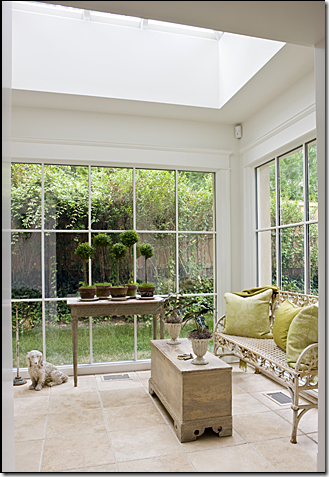
New Entry Hall: The entry hall – a new addition – surrounded by windows and a skylight. Is it prettier than their first house?
Former Entry Hall: it doesn’t seem fair to compare the two entry halls – the older one is prettier with all the antiques and the staircase. I’ll wait before I pass judgment!
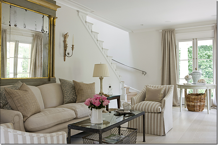
New Living Room: Thai used all the same furniture which is wonderful – the furnishings are what I really loved about the house in the first place. This is very beautiful – the softly winding staircase with sisal – notice the beautiful iron handrail. The large French doors overlooking the front porch. Yes, this is prettier, I think, than the first house – but not much! Both places actually look beautiful to me. I’m beginning to think the privacy of the yard was a big selling point.
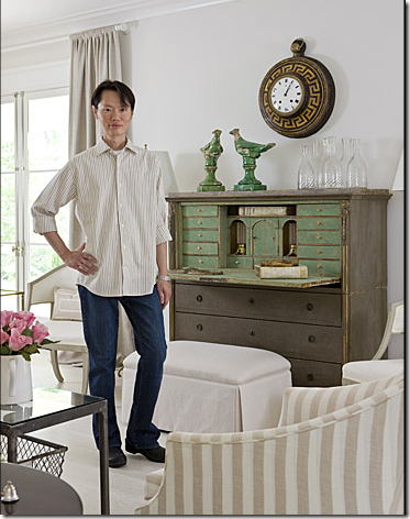
Across from the sofa is the Gustavian secretary with the birds and an antique clock which replaces the botanicals. Isn’t Thai the most graceful, elegant man?!!! He “fits” so well into this house! Notice the two Swedish chairs that were in the library are now flanking the secretary. Hmmm. This living room seems more sophisticated than the previous house – was that the attraction?
Which living room do you prefer – the new one or the former one:
Former Living Room: Hmmmm. Hard to say. I think I prefer the new one. I like the French doors leading outside. It seems more chic, larger and more open to the outdoors, which I like.
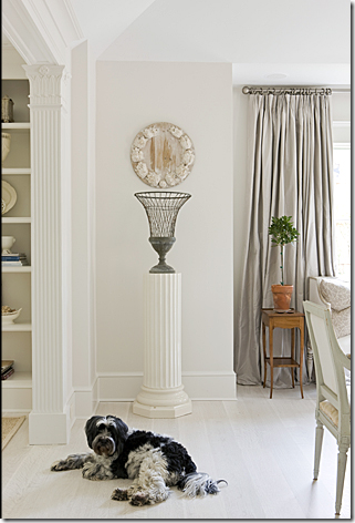
New Dining Room: The white column with a wire urn atop it now. The gray silk curtains made the move. Notice the beautiful column on the left that divides the dining room. Cute dog too!!!!
The new dining room with French doors leading to the back yard. Love, love, love! Notice the gorgeous console and mirror and the wonderful antique chairs. The picture above this one shows the left side of the dining room with the curtains and a Swedish day bed. Just beautiful!
The Former Dining Room: This is REALLY getting hard!!!!!!!!!!! I love these Swedish chairs too and this is a different table. I love the windows and curtains. And the fireplace – the old dining room might be prettier!! Do you agree? Well, don’t listen to me, because I am conflicted.
The New Kitchen: The new kitchen is all Carrara marble. Love that Swedish cabinet on the left. And those green industrial lights are fabulous. Thai mixed high and low – the chairs are from Crate and Barrel and the hardware came from Expo! I love this passage from the Washington Post interview with Thai about the Carrara marble:
"It's not for everyone, especially if you're worried about staining, because it's porous. But because we like things like that, things that are not perfect so we can put our own marks on it, we don't mind," he says while fastidiously wiping part of the countertop that appears spotless. "We're not there yet," he says with a laugh. "Give us six months."
The kitchen is no contest. The new one wins, hands down.
The Former Kitchen: No contest in my opinion. You may disagree!
New Breakfast Room: In the breakfast room – Thai mixes Target white dishes with antique creamware – a man after my own heart.
New Guest Room: With it’s corner Swedish cabinet and mercury glass, the room is so pretty. The desk chair came from Ikea! Wow! Isn’t this beautiful? Again, this room wins over the first house – though I do like the fireplace in the other house.
The Former Master Bedroom: Who knows? This might be prettier if we could see more of it. It could be a draw, I guess!
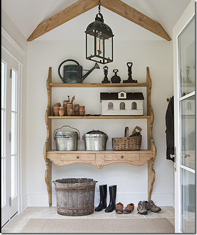
The New Mud Room: Thai’s favorite part of the new house – the wood beamed mud room where the dogs get cleaned up and fed. This is so charming.
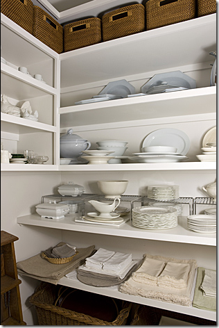
The linen closet in the new house – are you surprised? Thai seems very fastidious to me, so this neat-as-a-pin area is what I would expect. Doesn’t he seem like an perfectly organized person? OK – time to judge, which is it?
The older house with the more traditional interior, smaller rooms, higher ceilings, and a front porch?
Or the newer house with the more updated interior, unique staircase, larger kitchen, mudroom, and a wrap around porch?
I vote for the new house myself. I want to make Loi Thai happy and I think that is what he would want me to say! In truth, both houses are gorgeous and I would be happy in either one!
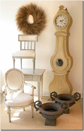
Tone On Tone has a wonderful web site that is updated weekly. They also have a large Press section if you want to read all about the store and its owners. Go here to read it. Below are a few things I saw that I am lusting after:
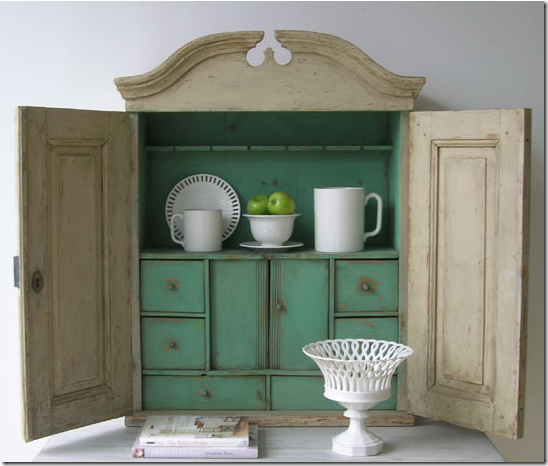
19th century wall cupboard with green paint. Love this – want this!
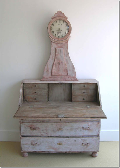
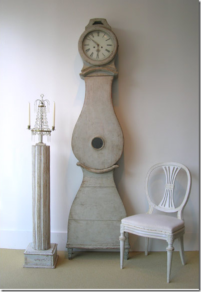
Swedish clock cabinet – one day, one day!!!!
Vignette from Tone On Tone – don’t make me choose! The painting and statue look good enough, but that day bed – to die for!
French baker’s table – just like Lauren Ross’ – what a great side or coffee table!
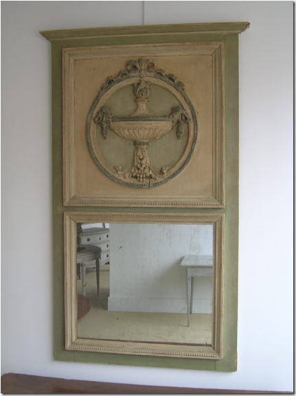
Thai’s eye is incredible. There is not a stinker in the bunch. Just look at trumeau – it’s gorgeous.
Wrap up all four pieces, I’ll carry them out myself!
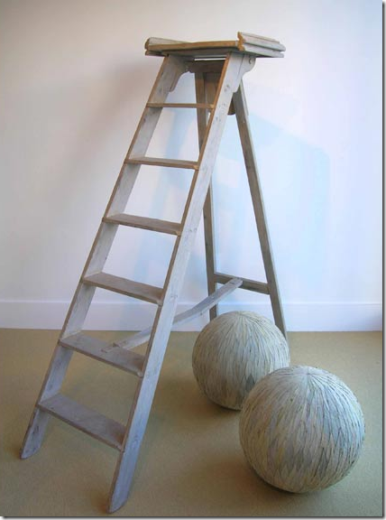
When I ever get my library, the first thing I want is a French library ladder – just like this. Not sure what those balls are??
I hope you’ve enjoyed learning all about Loi Thai and his fabulous houses and shop. I’m currently obsessed with the man and his taste which I think is superb and totally unique. I can’t wait until they move yet again – I’ll keep you posted!
To read the original story by Terri Sapienza in the Washington Post, go here. And there also is a fabulous side story with very interesting tips about decorating from Thai – including paint colors. A must read here!!!! Photography of the new house by Gordon Beall. Photographs of the older house by Erik Johnson.











0 Comments:
Post a Comment