Architect Bobby McAlpine’s former house in Montgomery, Alabama was modeled after Edwin Lutyens’ Homewood.
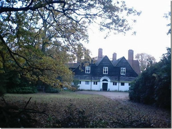
Homewood was built in 1901 for Dowager Lady Lytton, who was to soon become his mother-in-law. The Luytens children spent summer holidays at Homewood, so it truly was a family house – held by the Luytens until 1973 when it was sold. Today it is a bed and breakfast inn. In this picture of the back side of Homewood, you can see the three large windows which McAlpine used as inspiration. Also notice the two wings that flank the windows, another feature that McAlpine incorporated along with the lilting silhouette.
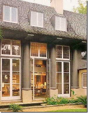
The three large doors that McAlpine used to emulate Homewood’s three large windows. Like Homewood, there are two small wings that flank these windows.

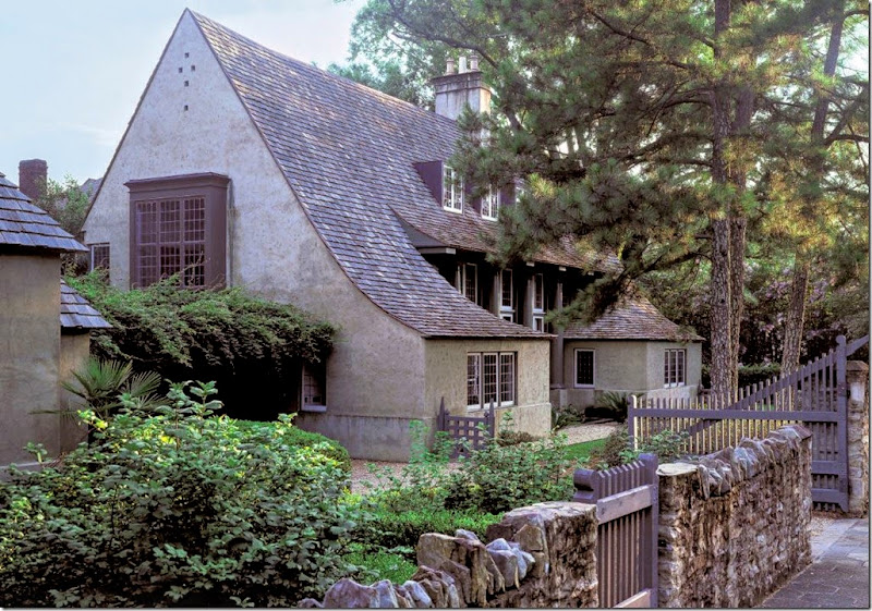
The front of Homewood. Notice how McAlpine’s roof mimics the left side of Lutyens’ house.
Montgomery, Alabama. Notice the shadow of the huge tree! The photographer probably waited all day for this shot! Above the doors is the window of one of the bedrooms. Another matching bedroom is on the other side’s window above the pergola.
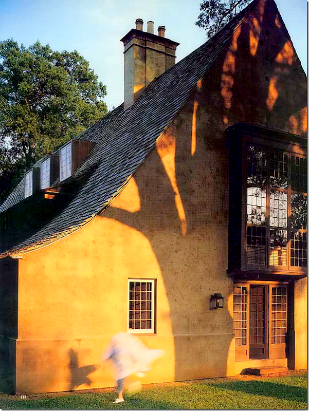 View that shows the small wing that flanks the three windows/doors on the side. One wing holds the kitchen, another holds a bedroom. (Is that a headless ghost running there? What IS that?!!!)
Bobby McAlpine, a recent guest on The Skirted Roundtable, started out early. He began drawing floor plans at age five. When he was 12, he designed an addition to his house that his parents ultimately had built. McAlpine was to oversee the contractor when he got home from school. The contractor balked at taking instructions from the precocious 12 year old but McAlpine’s father told him to do so, or they would find another contractor who would. His first commission came a year later when he was 13 and he designed a ranch house for a woman, complete with floor plans, all for under $100. At 16, he designed a new house for his parents which they built – an experience that bonded the two men forever. All amazing stories, but not really surprising, given the genius that is the man. A gift from God like he possesses isn’t something one learns at college, you are either born with it or not. And Bobby McAlpine was born with his talent, in spades.
The first house that McAlpine built for himself is located in Montgomery, Alabama. Receiving much press, this house is usually the one that most first took notice of McAlpine, and it remains a favorite among the legions of his devotees. Built in 1995, McAlpine was 36 and single at the time - he took inspiration (one of the few times he ever did so) from Edwin Lutyens’ Homewood. McAlpine revealed on The Skirted Roundtable that he has visited the original Homewood and his house is “so much better!” Of course it is. Though the Montgomery house resembles the English Cotswold style, McAlpine calls it “Monastery Modern.” The floors are concrete tiles of irregular shapes. There is no molding and no window trim., details left out to make the house feel “permanent and resonant.”
Although McAlpine had remodeled the house three times, the house was still missing something – a happiness that can only come when its shared with someone else. He eventually sold the house to a “beautiful” young architect who works for his firm. Today that architect, his wife and two children happily live in the 3 bedroom house which Bobby admits was designed for a bachelor. There is true love in the house now, something that was lacking at the time for McAlpine. It’s fascinating to follow the three decors that McAlpine installed – each is completely different from the other. This story is about those three different stages of the same house. Enjoy!
NOTE: Bobby’s last name is not pronounced Mc-AL-Pine, accent on the Pine. Instead he pronounces it Ma-CAL-pen – accent on the CAL, so much harder to say it that way!!!! And, Edwin Lutyens is a name I have also always mispronounced! Ma-CAL-pen called him Lutch-ins. Don’t even ask how I always pronounced Lutyens.
STAGE I: A Self Portrait in Warm Greens
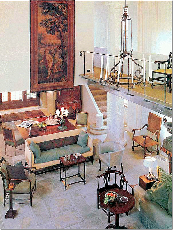
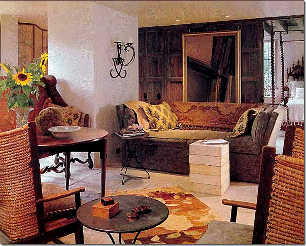
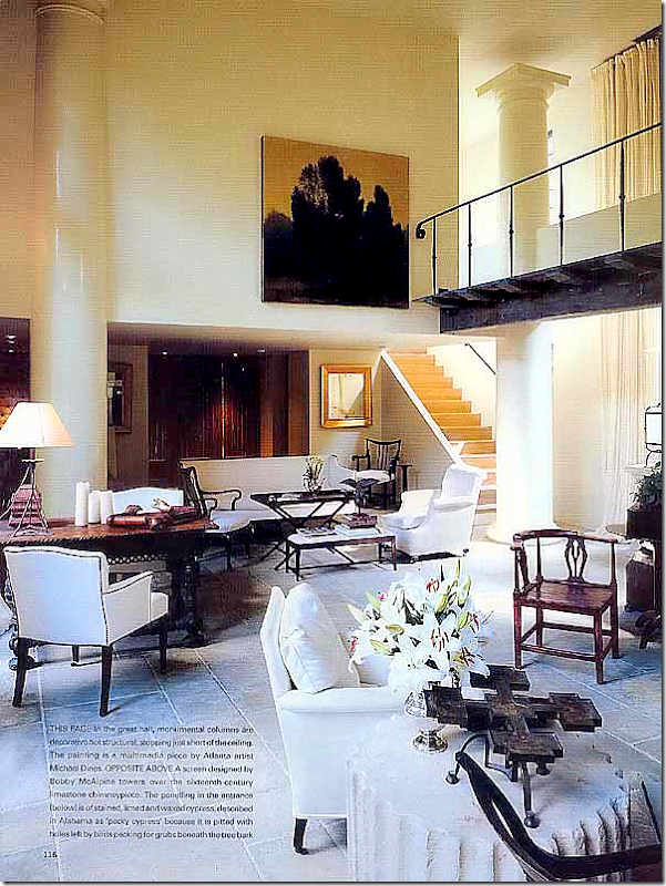
Stage One: Here how the house first looked when McAlpine moved in. A mixture of beautiful antiques chairs and tables, the main living area is colorful in many shades of green. The salon is two stories high, with a 70’ aisle or landing that connects the two bedrooms upstairs. The bottom of the front door is seen on the very upper left. McAlpine calls this first stage his “self portrait.” During this self portrait phase, he filled the house with things he loved and had collected: An antique Flemish tapestry, a Dutch chandelier, a collection of corner chairs. The dining room doubles as a work area: the table is behind the sofa. Alas, this decor was not to remain. He states that he cycles every 3 years when he must either move or redecorate.

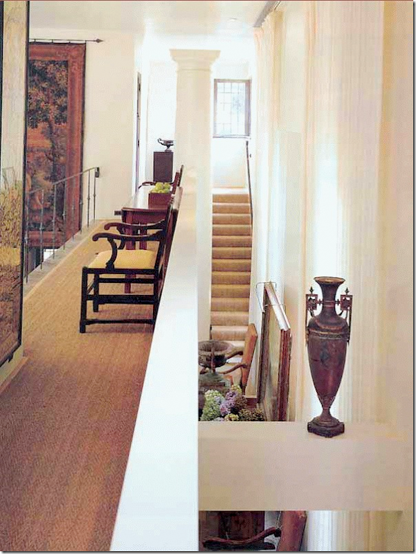
A view from the upstairs bridge overlooking the tapestry in the main living area below. Notice how the huge column does not reach the ceiling!
Behind the fireplace is a small sitting room. The cypress paneling here is on a grid, and is repeated throughout several other rooms. You can see a bedroom through the paneling that opens like a door.
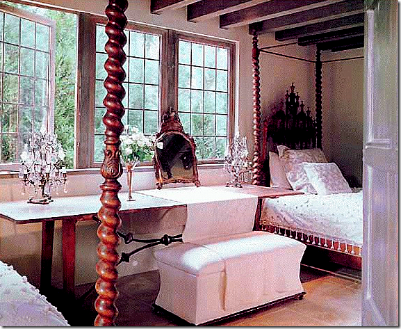 One of the three bedrooms (this one is downstairs in the wing) with its gorgeous twin beds and the long table between. A modern bench is the surprise here. Notice the beautiful trio of windows here that give the house its English Cotswold feel. These windows are repeated in the kitchen which fills the opposite wing.
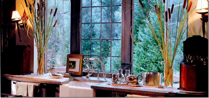 The kitchen with its long row of windows. This might be the kitchen that inspired all the farm sinks and no overhead cabinets! (sorry for the bad picture splice!)
Stage II: The White Interior
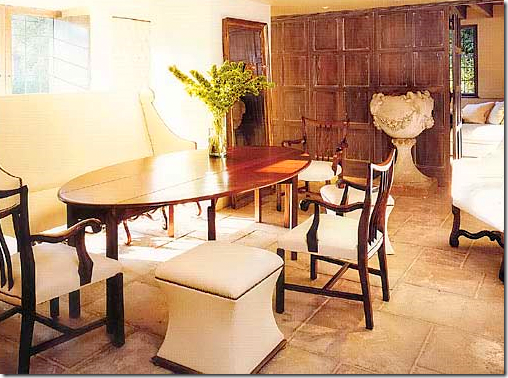
A few years after moving in, McAlpine decided to completely change his interiors. All the greens, yellows and oranges are now gone, replaced with white. Stage II is what Bobby calls his “white phase.” He was celebrating, he had lots of parties, and he became the owner of a white greyhound that he wanted to match to his house. I can really relate to that feeling!!! Notice the beautiful column made into a side table.

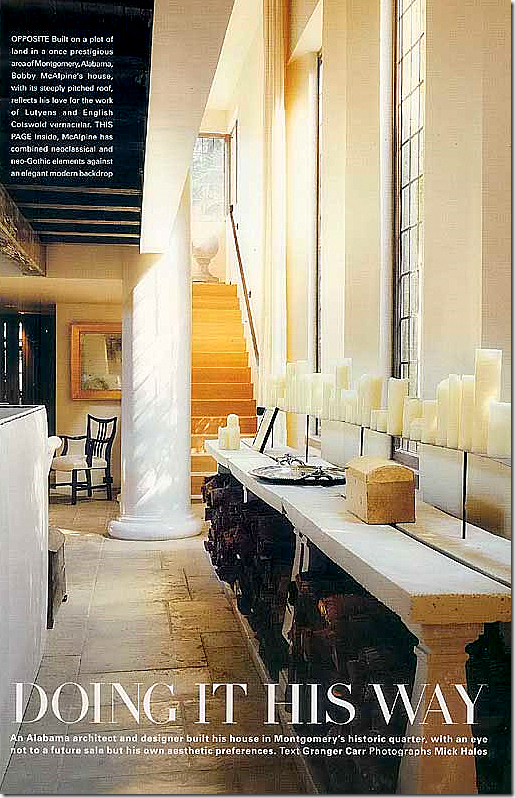
A long concrete table with logs underneath and candles above is settled in front of the wall of windows.
A beautiful concrete urns sits before the grid patterned wall. Here, McAlpine mixes stools with chairs and a settee around the dining table – an early trademark of his. Notice how the door to the bedroom is hidden in the paneling.
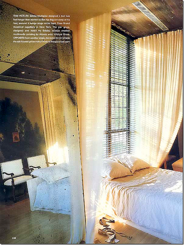
The upstairs bedroom where the bed, placed between two large pier mirrors, sits in front of the large side window.
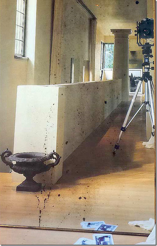
Reflection in the mirror shows the bridge upstairs between the two bedrooms.
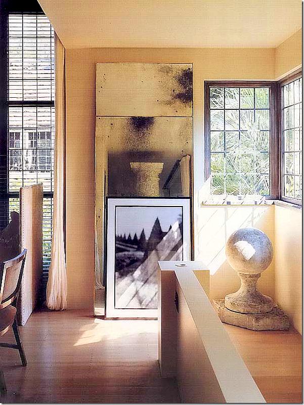 The view again of the upstairs bridge and staircase. I love all the concrete items he has in the house – like this orb in the corner on a pedestal.
STAGE III: Dark and Serious
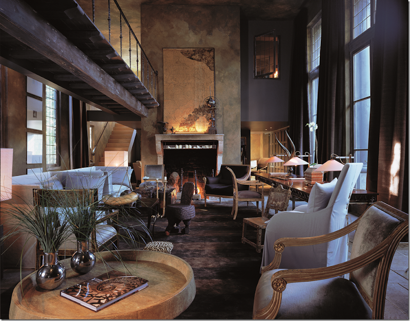
It’s difficult to realize that this is the exact same space as the White Phase, yet it is! The third makeover goes completely dark. For the first time a large dark striped rug covers the concrete floor. This third phase which followed McAlpine’s white celebratory phase is called his introspective phase. Here he wanted to “dim the houselights and contemplate all that had just happened and what was going to be.” The walls were darkened with linseed oil and pigment. Notice how beautiful and structural the rafters are that hold up the bridge. Interior designer Susan Ferrier worked with McAlpine on this phase. She is a partner with McAlpine Booth and Ferrier Interiors.
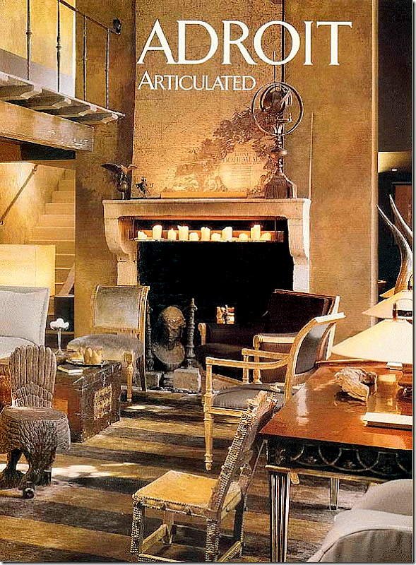
A close up of the fireplace. What a beautiful rug! And the desk and chairs are all so beautiful. I particularly love the map on the mantel. During Phase III, the house became more decidedly masculine - a sanctuary, McAlpine states. He was feeling vulnerable at this stage in his life and he darkened the walls so that they would envelop him and warm him, like a blanket. The map of Bohemia allowed Bobby to pretend the house was in another country, where he could hide out until he could figure out where he needed to go next. Actually, he ended up buying an old house in Nashville where he now lives with his partner, although his company remains in Montgomery.
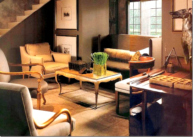
Close up of the small McAlpine sofas side by side, which give more people arm rests, he says. Notice the windows on this side are grids, like the others throughout.
The stunning desk floats in front of the three doors that lead to the side courtyard. The white curtains have been replaced with these darker ones made of chocolate brown mohair.
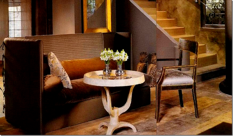 A Saladino shelter sofa sits in front of the entry. Interestingly on The Skirted Roundtable, McAlpine mentions John Saladino as the only “living” designer he admired.
Behind the fireplace, the space is filled with another shelter sofa and chairs.
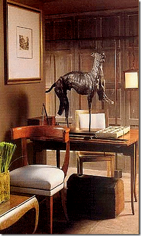 Beautiful statue of a greyhound.
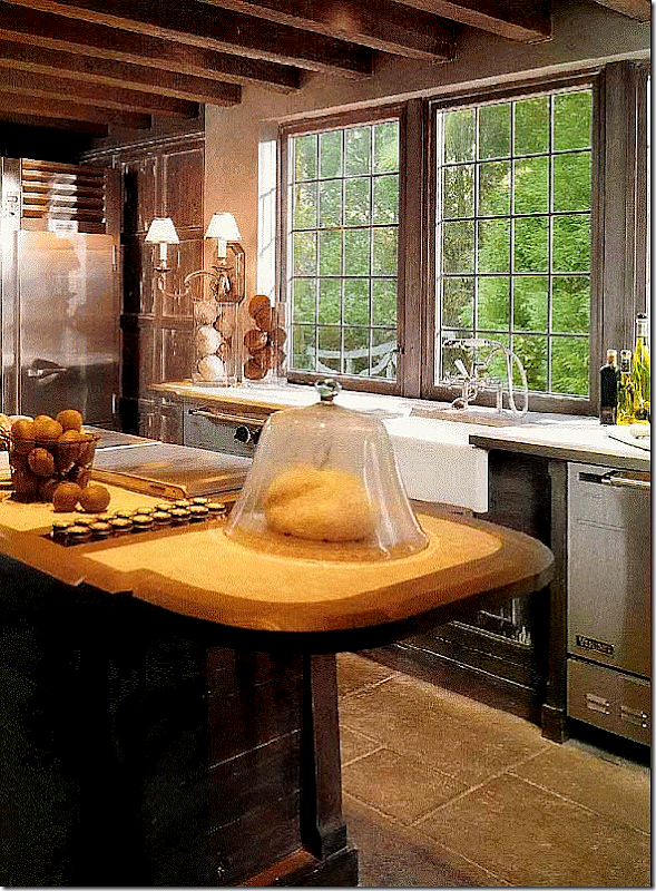 The kitchen is so gorgeous – I love the rafters, the bank of windows and the sconces flanking them.
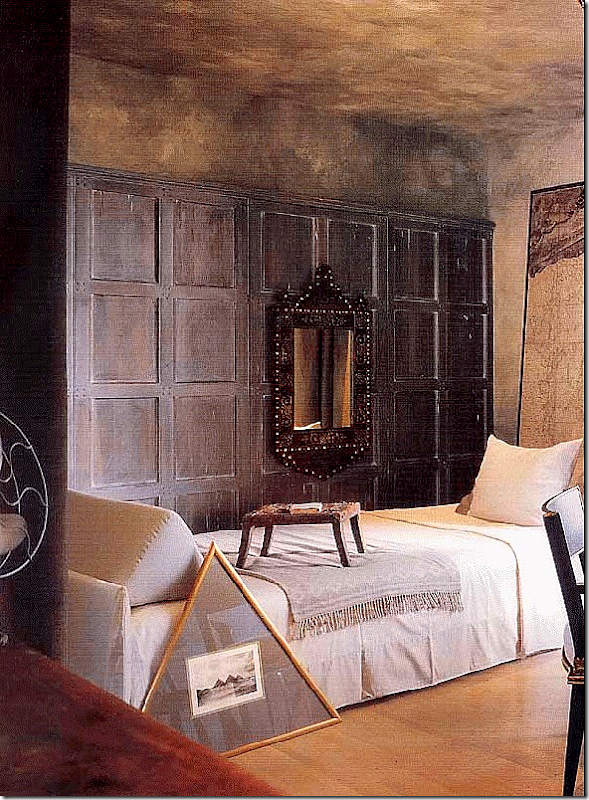
In the upstairs bedroom, this bed was designed by McAlpine, who has a line of furniture he designs for LEE Industries HERE. I wish I could see the map!
The other side of the bedroom, seen above.
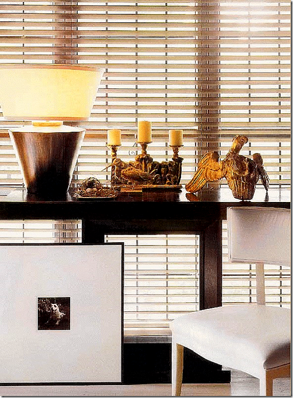
The modern and the antique - this juxtaposition is seen throughout this house.
After studying all three stages this house went through, I am not sure which version I prefer. I might like the white version most. There are things in the first version I liked too. The third version, the dark one, is probably my least personal favorite simply because it is so dark – but I do love the furniture and the interior design of the third version. So, it’s difficult to say which version I like best. I’m going to say which one I would probably like to live in the most – the white version, or Stage II, but include in that the bedroom from Stage I and the antiques from Stage III. What about you? What is your favorite of the three styles?
Be sure to listen to the Skirted Roundtable with Bobby McAlpine HERE.
And to order his book, The Home Within Us, go HERE.





0 Comments:
Post a Comment