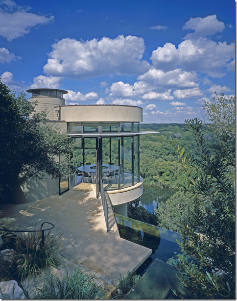
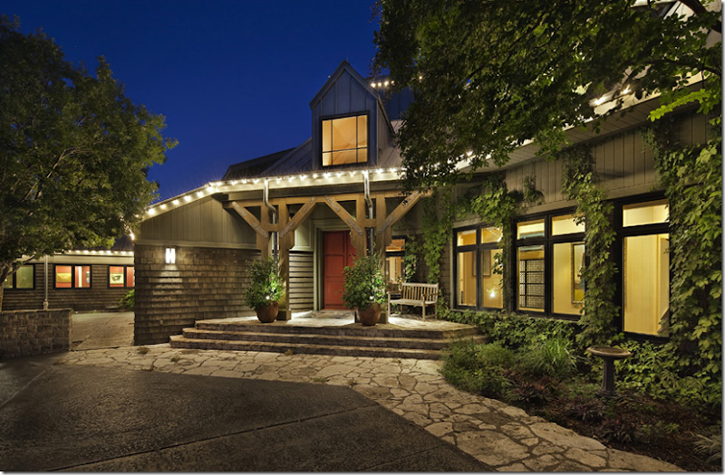
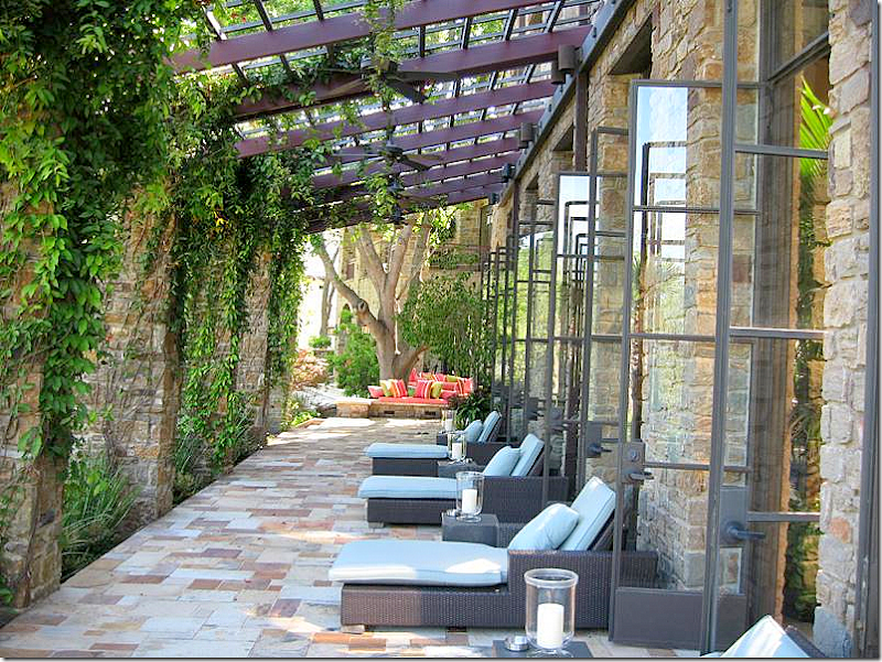
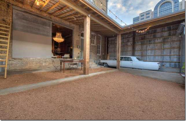
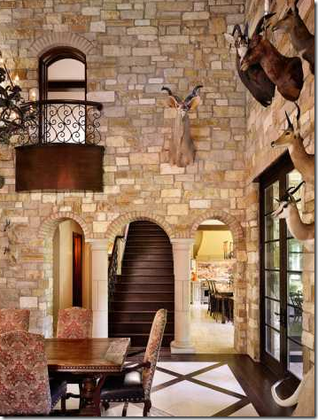
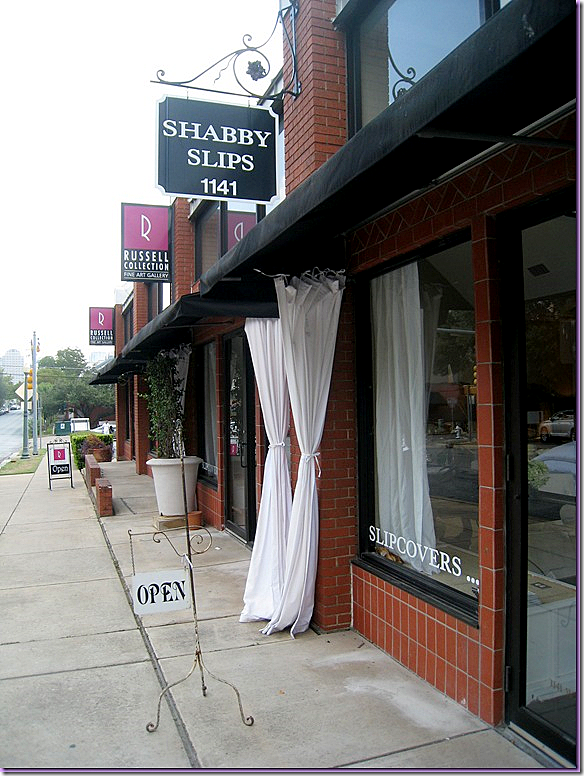
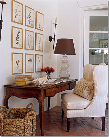
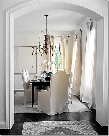
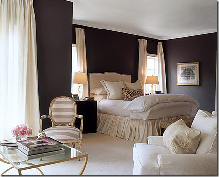
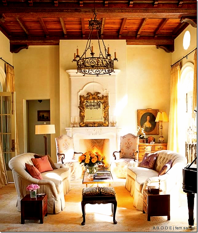
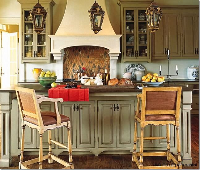
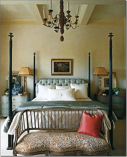
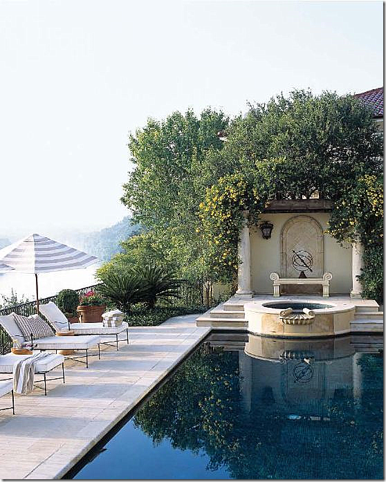
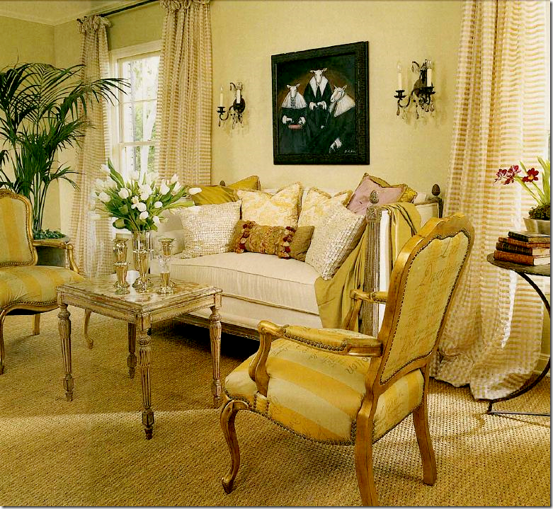
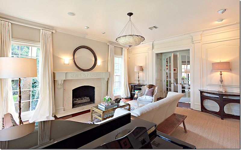
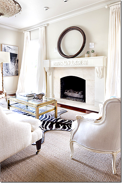
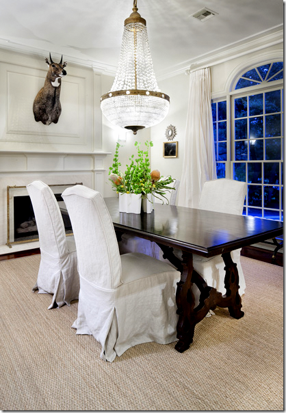
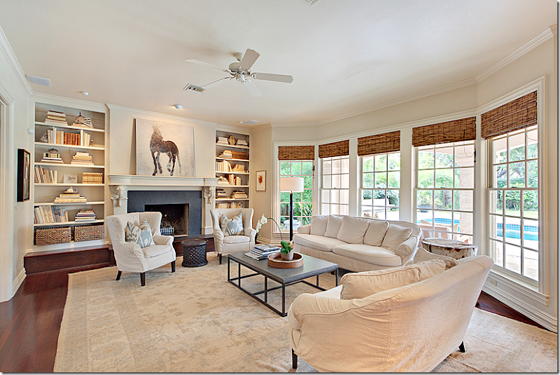
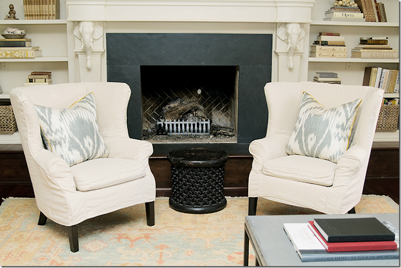
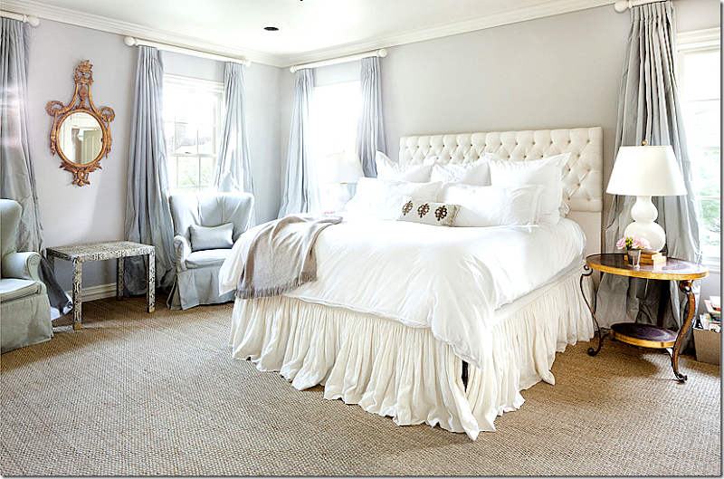
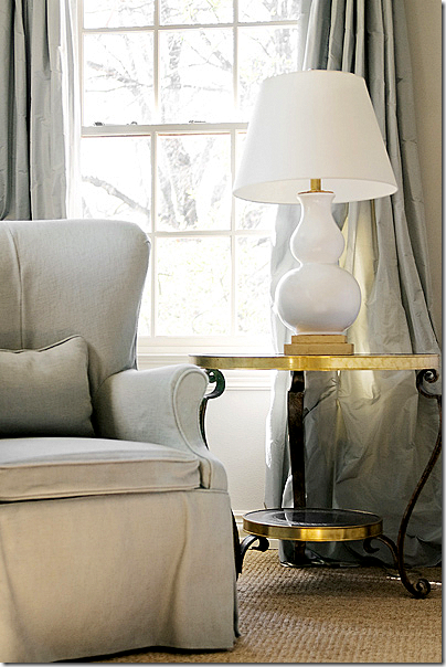
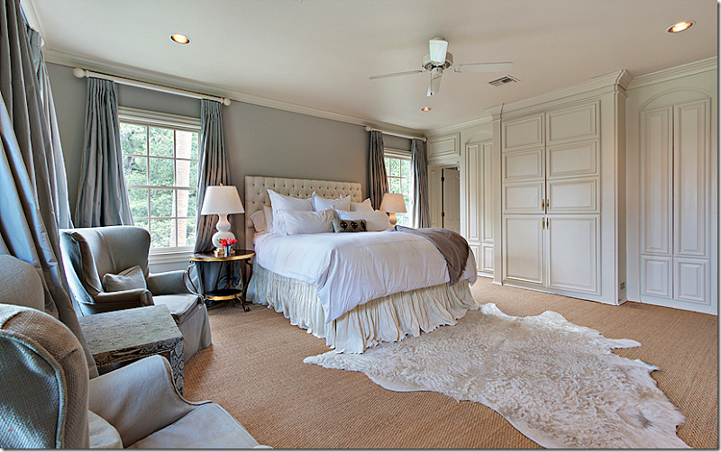
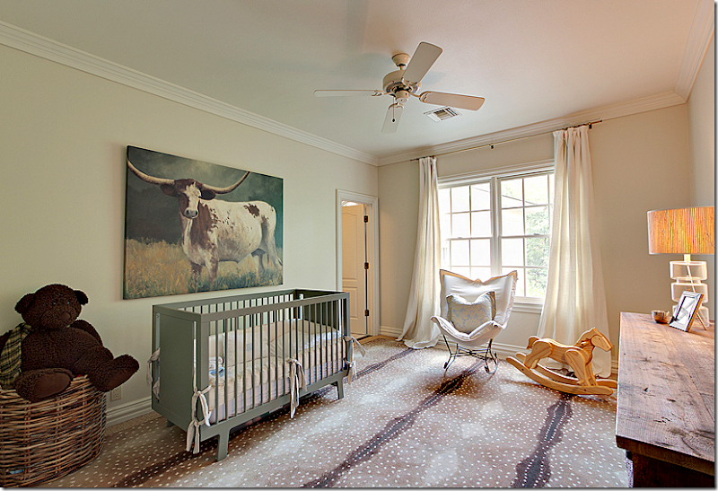
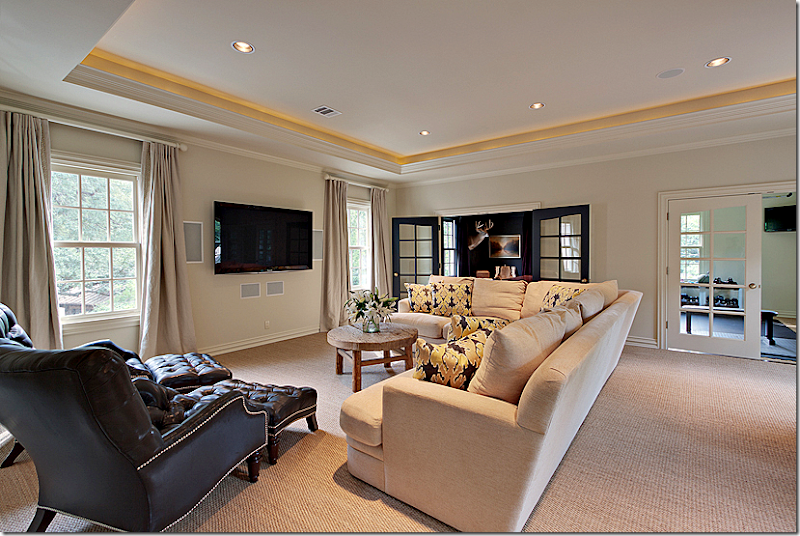
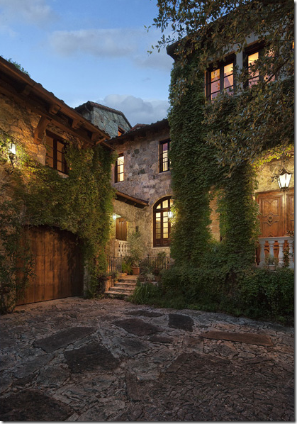
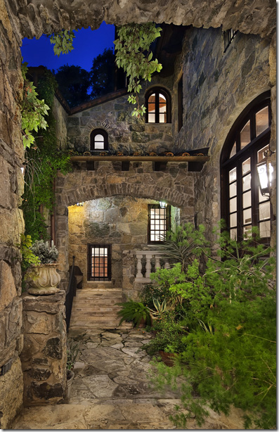
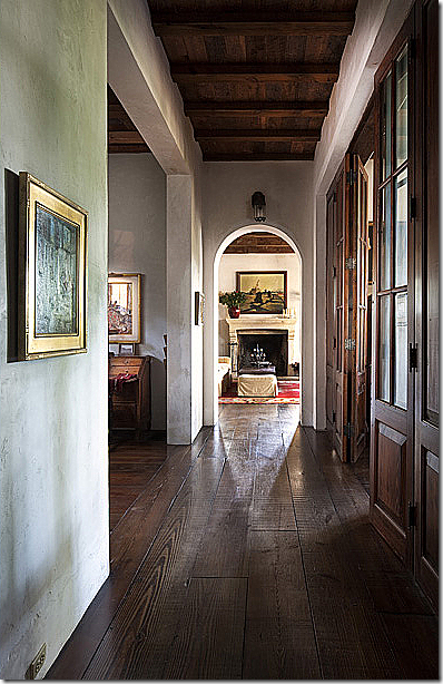
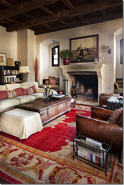
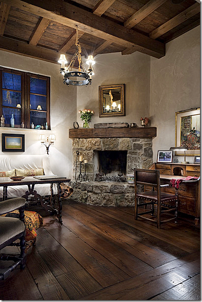
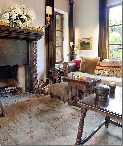
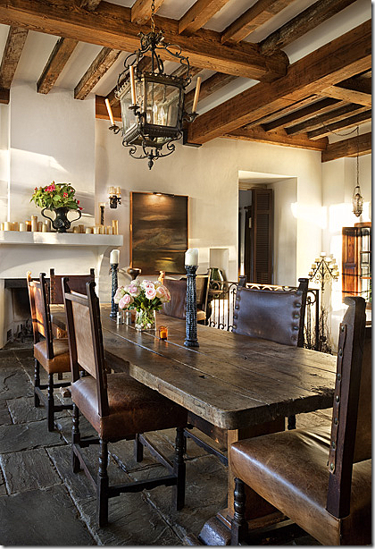
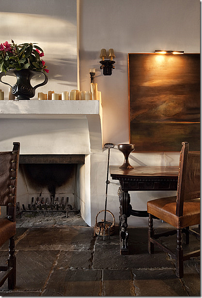
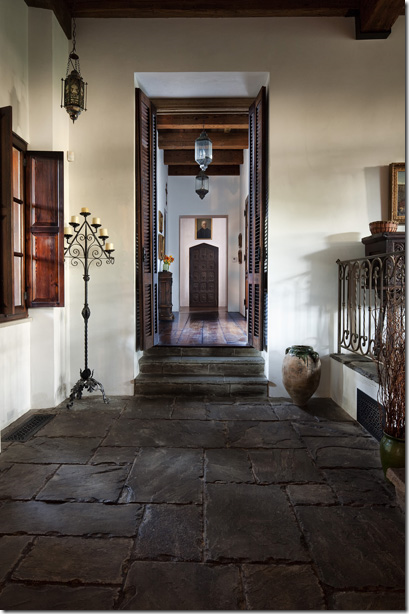
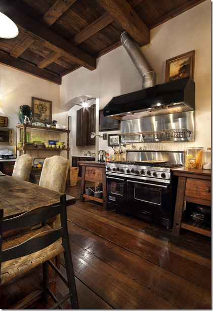
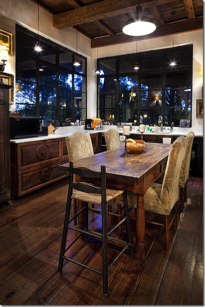
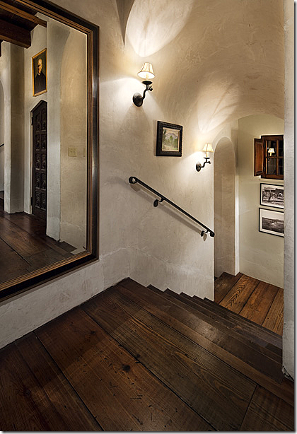
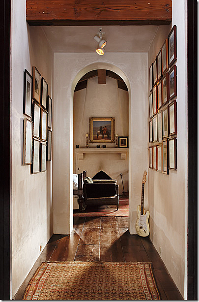
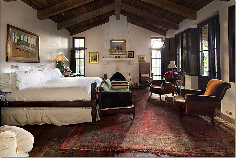
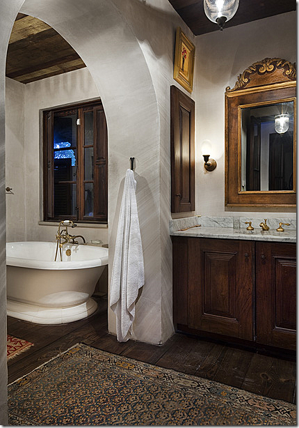
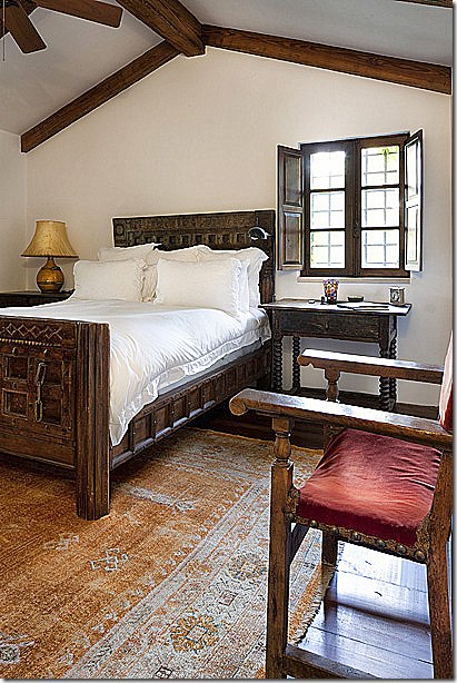
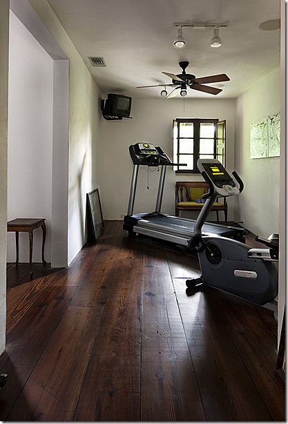
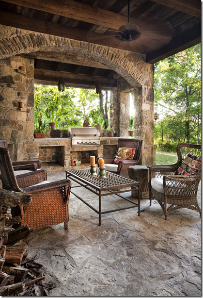
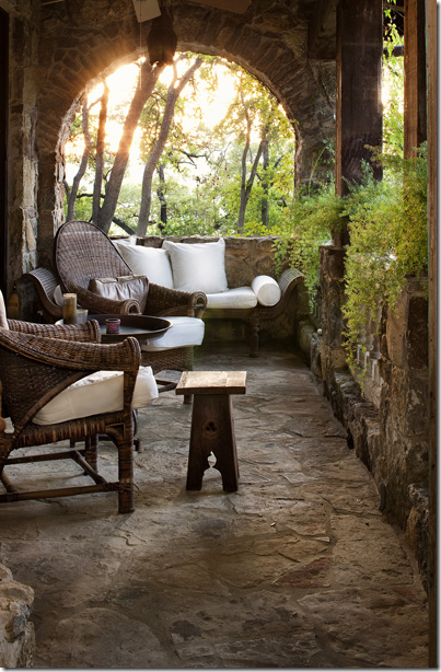
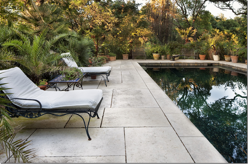
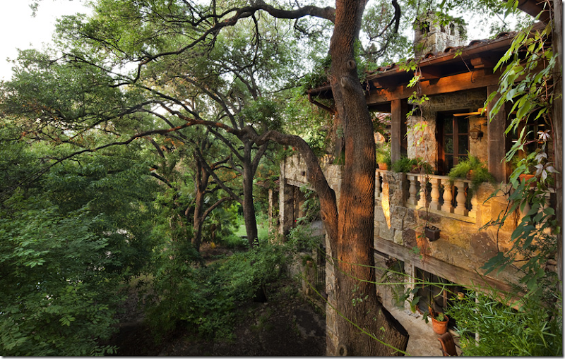
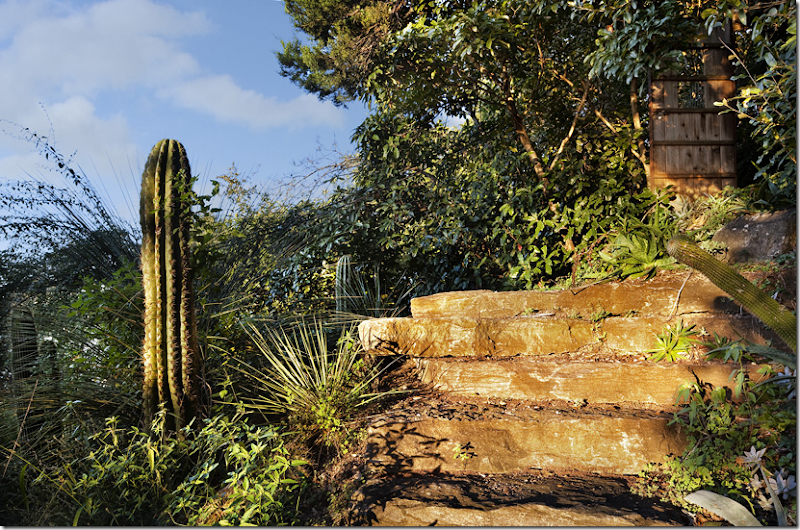
Dreamy Austin living, in town, on Lake Austin. And no, that’s not the house – it’s just the boat house. When the high tech industry landed in Austin, bringing with it untold wealth, the architecture of Austin changed drastically. The town’s official motto “Keep Austin Weird” barely applied anymore to the neighborhoods overlooking the numerous lakes in the area. Once, Austin’s neighborhoods were a mix of cottages and bungalows, along with bigger, more traditional houses; while the houses on the lakes tended to be soft contemporary or mid century modern mixed in with Willie Nelson ranch. With the new influx of a young and wealthy population, huge monstrosities starting appearing in the hills overlooking the beautiful Lakes Austin, Travis and Town (or rather Lady Bird Lake – I’ll never get used to calling it that.) The Barton Creek area was hit especially hard by the massive faux- half Tuscany, half Texian mansions, along with faux Versailles. For sure, there is some great modern architecture coming out of Austin, helped fueled by the University of Texas School of Architecture. It is cutting edge contemporary and many of these custom homes are also lessons in green living, of course. The dreaded Austin faux mansion is not those works of art. Instead the dreaded faux mansion is all Texas limestone and dark iron sconces and columns and arches and huge wine rooms and exercise rooms and 12 car garages and gift wrapping rooms. It’s pure indulgence. If you’ve got it flaunt it. Faux French – The bigger the better, right? I miss the old Austin with its quirky student housing, cozy bungalows that we all rented while attending UT. Some of the cutest places I’ve lived in were in Austin. There was a small apartment complex with shutters for doors and Mexican tiled floors with a fireplace and cypress wood paneling. Then there was a tiny cottage with one bedroom and a huge ancient stove, no garage, but instead a darling garden out back. That house has since been torn down, what a shame. Once, for a short time, there was a quasi modern duplex, with a slanted roofline. Today students live in fancy condos and fake lofts that have sprung up everywhere. While wading through Austin real estate brochures, it’s hard to find much that appeals, money being no issue in this pretend game. For sure if you have 10 children, there’s plenty available, but I doubt that any of those houses ever fill up their numerous bedrooms. Prices are crazy. Try to find a bungalow or 50s ranch for under $600,000. Slim pickings. The lake houses seem to start at $1,000,000 regardless of its condition or desirability. Stunning. This is a cliff house – built separately from the main house just to take in the magnificent view over Lake Austin. Some of Austin’s new contemporary architecture is incredible. Many houses are refurbished since the land costs have skyrocketed. Here, mid century is brought up to date for today. New architecture can still be charming without going Disney World. Combining the Texas Ranch look with contemporary. Beautiful! Even excess can be gorgeous. Overlooking Lake Austin through stone columns, this porch sits under an iron and wood pergola, next to a row of steel doors. It might be one of the prettiest in recent memory. But, I miss quirky Austin. It’s still there, just harder to find. This house located in the first fire station built in Austin is the antithesis of the porch shown above. On game day, I’ll bet this gravel yard is filled with Lone Star beer drinkers all dressed in burnt orange waiting to walk over to the stadium. Hook ‘em! Or, maybe, they hate football, and just sit around listening to a friend play the guitar. The car is too cute. New Austin Architecture: Is it Tuscany? Or is it a ranch? The lines are being blurred all over the city. For decorating, one of my favorites in Austin is Shabby Slips. The small store was started by the Houston shop of the same name, but ownership is different. I always stop by whenever I’m in Austin. The shop is small, but filled with wonderful furniture, new and old. Their slipcovers are the best there are. The Austin shop is owned by interior designer Sara Scaglione. In case her name sounds familiar, she designed one of the prettier houses shown in House Beautiful last year. Remember this: The house is Austin that Sara designed was all white paint, slipcovers and seagrass – my favorites! Mixed in were gorgeous antiques like the chest and mirror. The house is quietly elegant, not a piece out of place. Shabby Slips makes the best pillows, so plump and big. Sara talked about her store and slipcovers in her House Beautiful interview: “ I opened my Austin store, Shabby Slips, in 1994, and the look back then was oversize, loose, puddling onto the floor. Now we've gone to a much more refined, fitted, classic look. In the family room we did fitted slipcovers for the sofas.” In the sunroom, Sara added this antique French desk with a modern lamp. The dining room has an Italian light fixture and antique rug. The family room has simple striped pillows – the only pattern in the room. Another view of the family room and the sunroom behind it. I wish these pictures were bigger!!! The master bedroom pops the creams with delicious dark walls. Sara Scaglione can be reached at the Shabby Slips Austin web site HERE. Another Austin designer whose work I admire is Fern Santini. This house was also published in House Beautiful in December 2007. The house is one of the larger ones in Austin, on a cliff overlooking Lake Austin. But instead of being ostentatious, the house is subtle and gracious – helped by Fern’s design. The dining room’s ceiling is a different pattern than the living room. Beautiful chandelier and mirror. A trio of exotic lanterns hang over the kitchen’s island. The focal point is the wonderful range hood, which resembles a fireplace. The bedroom, all in blues and touches of pink. Of course there is a swimming pool overlooking Lake Austin below. Standing the test of time: The first time I was aware of Fern’s work was this house in Austin. It was published over 11 years ago and the room still looks amazingly fresh, due to the use of antique French furniture. Fern Santini has a web site if you are interested in seeing more of her work in Austin. HERE. AUSTIN HOUSE #1: Looking at available Austin real estate, I found two houses that caught my eye. Both houses are two of the most expensive for sale right now, but this is a game, where Monopoly money is used. This house, at slightly over 6,000 sq. ft. has six bedrooms. It is located on a town lot, not overlooking the lake. The living room has a baby grand piano and a mix of contemporary and antique furniture. The light fixture is Fortuny. It’s not a mirror! It’s a wheel. The dining room has another fireplace, more seagrass, white walls, white curtains and a wonderful painted console! Love the table. Look who was hiding behind the chandelier! This pretty rug is a great alternative to seagrass – so light and washed out looking, I really like it. Here you can see the muted colors in the rug – light blues and peaches. Ikat pillows pick up the blue. White and black kitchen. Great stove and hood. Contemporary leather chairs, lantern, French tin top table, cute. I really love the study – the worn Chesterfield, the contemporary desk, the deer, and I love love the wall color and matching curtains. The deep gray color works so well with the cognac colored furniture and leather. Notice how the computer bag even matches!!! My favorite room in the house is the master bedroom. I am so in love with blue walls and white bedding these days. It’s my favorite I think. I love the bed, the seagrass, the blue curtains, the gold touches. Perfect!!! Beautiful! I love the white lamps and the taffeta curtains. One more view, this time with an accent rug. The daughter’s room is precious with the vintage sofa redone in pink! What a great idea!! And I love her faux deer. The nursery is so cute for a little boy. It has the wonderful Stark Antelope rug wall to wall and that great picture of a Texas longhorn. Love the crib’s light aqua paint. And finally, the media room – off the gray study and the exercise room. I thought about this room and think it’s a perfect furniture set up for a media room. Two leather chairs and ottomans for the mom and dad and a large sectional for the kids to all watch a football game on TV. I really enjoyed looking at this house’s interiors and wonder who the designer is? I have a few ideas, but I would love to know for sure! AUSTIN HOUSE #2: The front door is right next to the garage. All the magic is in the back of the house, on Lake Austin. I love all the vines and the driveway, what is it made of??? The second house today is located on Lake Austin, on the town side in Tarrytown. Built in 1999, it is very large at just over 10,000 sq. ft. Although it’s a huge one, all stone and iron, it doesn’t read kitschy. Its interiors are wonderful and the furniture is antique in a slightly rumpled, definitely warm and comfortable manner. In other words, I could be very, very happy here! To the left of the front door, a walkway leads to a courtyard, then up a few set of steps. I love all the small windows. Walking into the house, the living room is down the hall, while a smaller living space is across the hall on the left. The ceilings are all beamed, the walls are stucco and the floors are rustic wood. While the house looks like an old castle in Spain or Portugal, it reads authentic, not someone’s version of pretend. The living room, one of 4 living spaces, has a gorgeous fireplace. The rug is incredible. The space, rather than pretentiously fancy, is cozy and welcoming. I wonder if they had an interior designer, did they furnish this themselves, adding one antique after another when they happened upon it? The smaller living space across the hall shown above. There is a fireplace in almost every room. In another living space, this room has an unusual barley twist mantel and lots of antique textiles, including the rug. In the dining room, the floor is a rough slate, the ceiling is beamed, and again, the atmosphere is very casual. To the right, is a hallway that is several steps down from the dining room. A close up of the dining room showing the fireplace and antique desk. I love the painting. The hall off the dining room. To the right, up the steps, past the iron railing, is the actual dining space. I love all the steps and changes in elevations throughout the house. Notice too, the wood window shutters throughout the house and all the lanterns and sconces that light the way. Notice too how each hallway ends in a focal point. Here, an arched door with a painting above is the focal point at the end of this very long walkway. The eat in kitchen has a huge stove, next to which are tables instead of cabinets. The other side of the kitchen overlooks Lake Austin in the back. Leading off the hall that runs through the dining room is this series of stairs. The detailing is so great, the sconces that line the halls, the lanterns, the arches, the iron railings, and the small windows with even smaller wood shutters. At the end of this hall is the master bedroom, with a guitar waiting, just in case! The bedroom has a balcony through the doors, a fireplace, and a pitched wood ceiling. Notice the open upper window next to the fireplace. I would dress this up a bit, but what great bones!!! The master bath, more charming windows, and more antique rugs! Only in Texas would the homeowner’s cowboy boots be included in the real estate brochure. Each hall ends in such a pretty view. Here a small set of stairs led down to a balcony with a piano. The painting looks like a John Alexander. The guest room, with the tiny window that overlooks the front courtyard. Even the exercise room is charming!!!! The outdoor kitchen off the main kitchen, overlooks the backyard. This porch is off the master bedroom (I guess!) The swimming pool. The back of the house overlooking Lake Austin. There’s even a cactus garden. Notice the stone steps and wooden gate. And finally, there a boat dock with room for 7 boats. Dream. Remember, there’s a giveaway going on at The Skirted Roundtable! We are giving away a large gift certificate. Go HERE to listen. This coming week we have Kathryn Ireland on as a guest – be sure to listen!!!
Thursday, December 2, 2010
Austin Design: Better and Best
Posted by home&interior at 8:09 AM
Subscribe to:
Post Comments (Atom)

















0 Comments:
Post a Comment