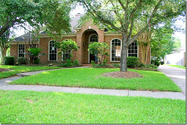
BEFORE: This foreclosed house was a mess and in need of a total redo. Outside, there was no real landscaping, just a few bushes. Still, the owner knew she could make it home.
A friend of mine sent me pictures of a remodeled house that she had recently seen saying “You’ll love this one!” She was right! After looking at a zillion “before” pictures, the first “after” picture had me stunned. I couldn’t even believe it was the same house. I love a good remodeling story and know that many of you do too. So, I begged the homeowner to let me show her pictures and she graciously agreed to open her doors to us!
This story starts with a family looking to downsize a bit. The owner is a mother of 2 teenagers who will soon be leaving for college. The house is located in a suburb of Houston where most houses are around 10 to 20 years old now – just old enough to be looking a bit dated and in need of a facelift. In fact many houses in the neighborhood have been updated somewhat. Which is exactly what she didn’t want. She was looking for a house that she could put her own stamp on. She didn’t want to buy something that had already been remodeled because she wanted to redo everything, down to the doorknobs. Luckily, she found her “dream” house in foreclosure, which was even better on the pocketbook. Her friends and family thought she was crazy when she bought it. It was a wreck. Dated, dirty, and with no curb appeal – it was perfect for her! She likes to remodel: she grew up in an old, Victorian house in San Francisco that her parents had completely redone on their own. Living in a half finished house seemed normal to her.
Despite the homeowner’s history with remodeling, the task at hand was huge for a number of reasons. She was pressed for time and she was on a tight budget and had to prioritize. The biggest savings was not hiring a contractor. She had only 20 days to finish the job. During the closing process, she started ordering flooring, lighting and hardware to save time – even knowing she might be risking the money. But by ordering before she closed on the house – she was ready to start the demo on day one. Friends pitched in to help with the frenzied redo. She saved money by going to Lowe’s and buying from catalogues like Ballard Designs. She removed the light fixtures and curtains from her old house before it was sold – which added more savings. And most amazing – the homeowner is not a designer, she works in the health industry. The owner does admit that she has five very creative friends and a daughter who all helped her with decorating decisions. I think she is just being humble.
I hope you enjoy these pictures as much as I did when I first saw them!!!!
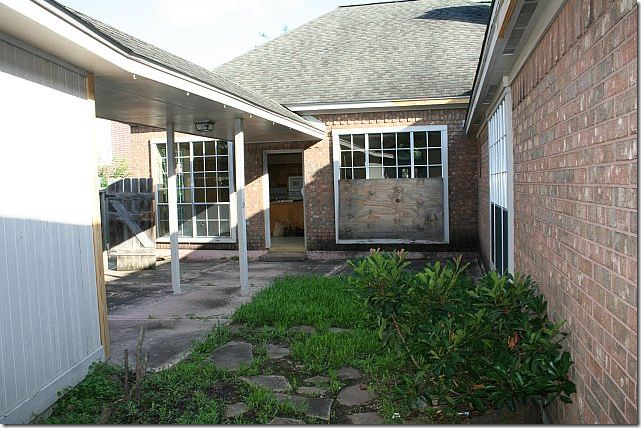
The back yard was in even worse condition than the front. Boarded up windows added to its “appeal!”
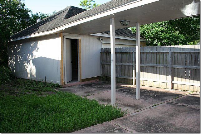
There was a fence between the house and the garage – which was immediately removed by the new owner!!
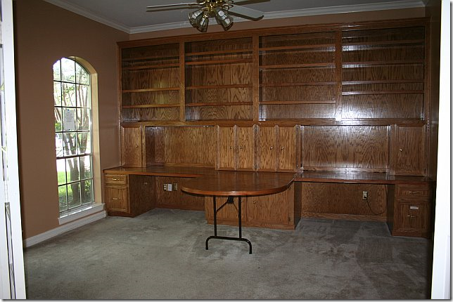
Walking in the front door, to the left was an office with paneling and a built in desk, along with old carpet. Luckily there were a pair of French doors that closed off the room and provided a bit of charm. After closing, the built in desk was immediately torn down.
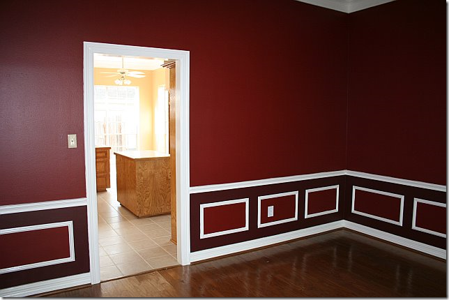
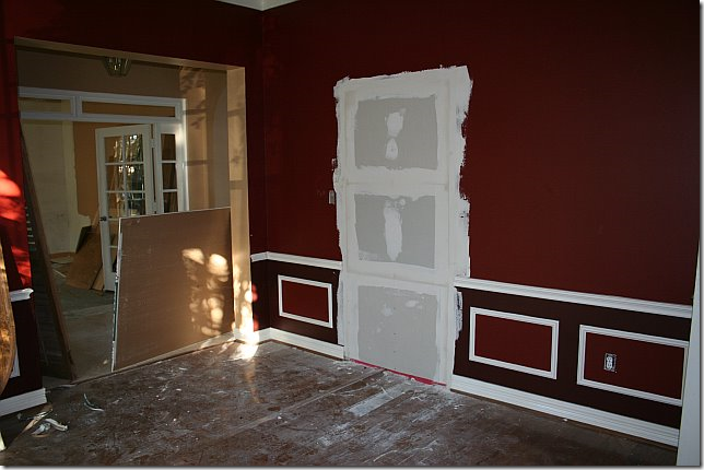
To the right was a red dining room that led into the kitchen. Love all the different shades of red in the molding.
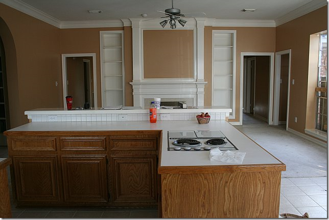
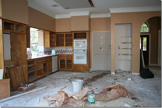
The kitchen had never been updated. It was stuck in the 90s with its light oak stain, white appliances, checkerboard backsplash and tiny island. You can see the door to the dining room before it was removed.
The kitchen is across from the family room. The front door, study and dining room are through the archway on the left.
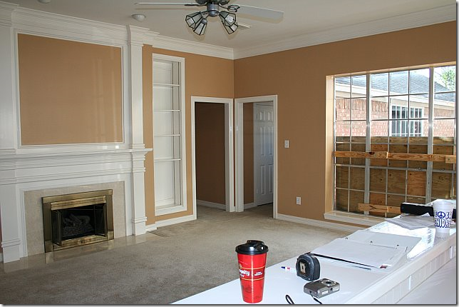
The family room with its sea of carpeting and ceiling fan had a dated fireplace though the molding was as asset. The 3 bedrooms are off the doors in the corner.
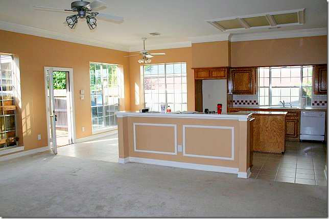
Looking back from the family room into the kitchen with its dated white tiled floor, ceiling fans, and fluorescent lighting.
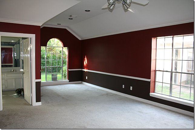
The master bedroom was painted like the dining room in two tones of red. It is large with an attached sitting area.
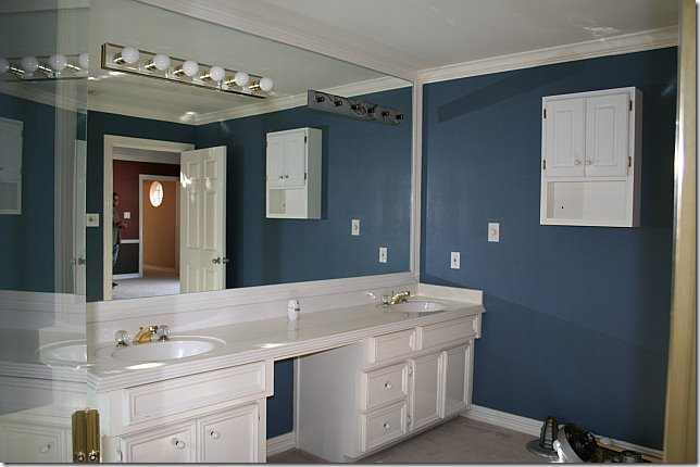
A blue bathroom to match the red bedroom? Strange decorating!
The blue master bathroom was large, with a tub and shower and carpeting and tile and brass.
DEMOLITION:
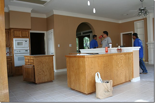
The demo on the kitchen was extensive. The door to the dining room was closed off and the island and bar were removed. The owner was able to reuse the cabinetry which was another huge savings.
Without the island and the bar, it already looks so different!
The front study without the paneled built in desk.
One of the changes was closing up the door to the kitchen, which allowed for much needed counterspace.
JUST TWENTY DAYS LATER, THE FAMILY WAS READY TO MOVE INTO THEIR NEW HOME:
New landscaping was installed. The trim was painted a deep gray. New lanterns were installed next to the door. Ready to go inside????
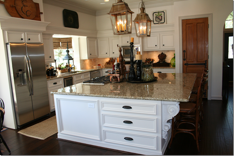
I told you!!!!! Can you believe this is the same house?????!!!! First, the flooring and carpet was replaced with hardwoods. Next, the cabinets were painted a fresh white. New stainless appliances were added. And instead of a bar and an island – one large island was built. Next, granite countertops were added along with subway tiles. The fabulous lanterns were the owners – she bought them at market 8 years ago and Alcon wired them for this house. I love the lanterns in the sink window, along with the textured blinds – they add so much warmth, as do the curtains in the breakfast area.
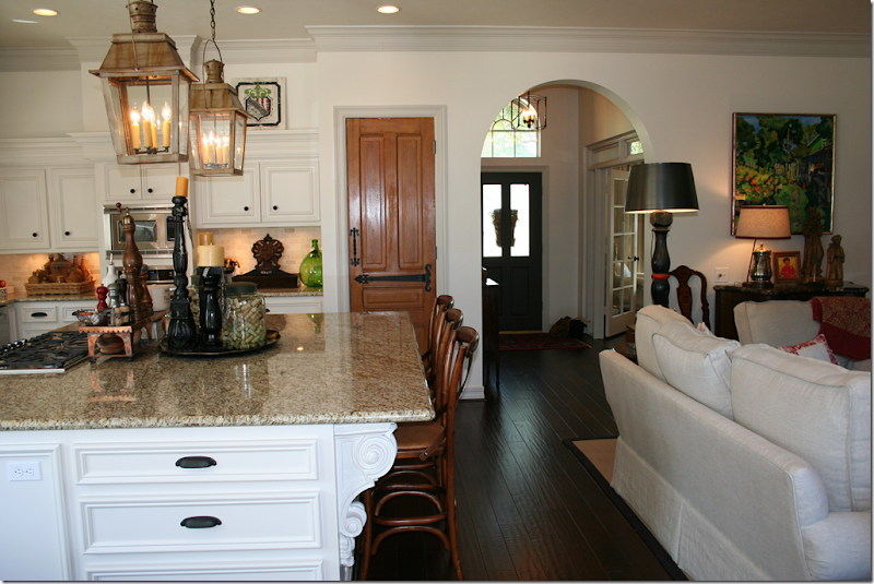
Looking towards the family room. You can see where the added countertop space came from closing up the dining room door.
And, notice the door to the pantry – it’s old and was bought at Atkins and new charming hardware was added to it.
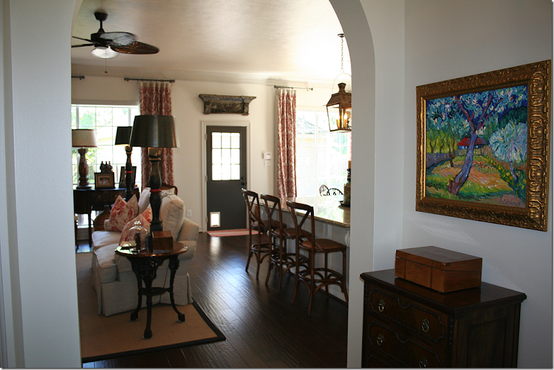
Looking towards the front door. The study, with its French doors is to the right, the dining room is across from it. Notice the lantern in the entry hall.
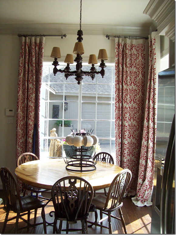
The breakfast room has a wood chandelier and red curtain panels hanging from pewter like rods.
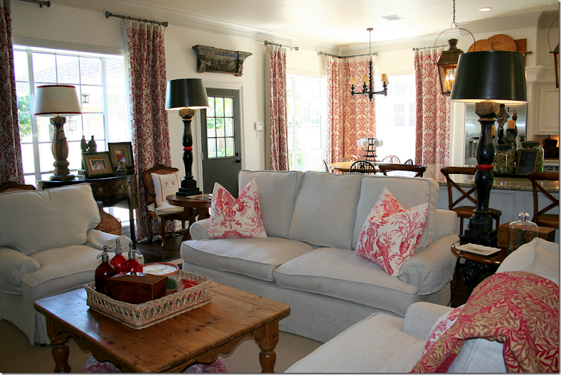
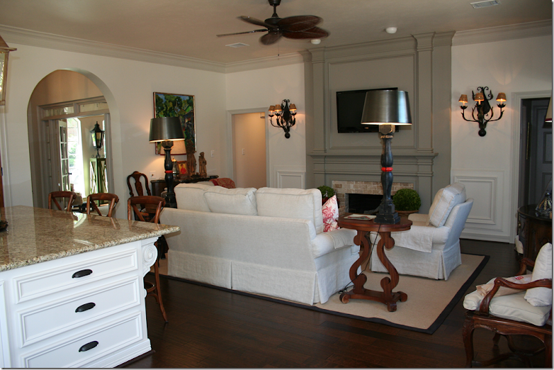
The family room and kitchen were painted white with gray trim. The owner removed the built in bookcases next to the fireplace and painted the mantel a deeper gray. The fireplace was also redone – with a light brick. Seagrass covers part of the new hardwoods. The same curtains in the kitchen hang here for continuity. I love the small antique cabinet – it looks like it was made for that space! Love all the white slipped furniture – this room is so cozy and warm and inviting.
Looking back towards the kitchen. I really love the dark gray on the door and the fireplace with the lighter gray on the molding. It’s so chic looking. Love the antique piece in front of the window flanked by two chairs with trendy pillows. And I love the old wooden piece over the back door. Just darling!!!!! Isn’t this the cutest ever???
The owner installed sconces next to the fireplace and she added a new ceiling fan (it’s Houston people!!!) By removing the bookcases, it all looks so much cleaner and bigger.
Looking from the entry hall into the family room
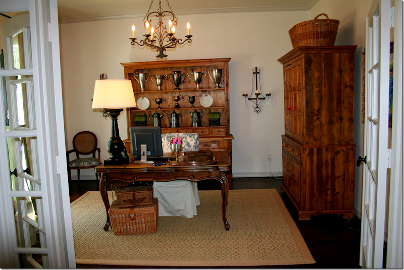
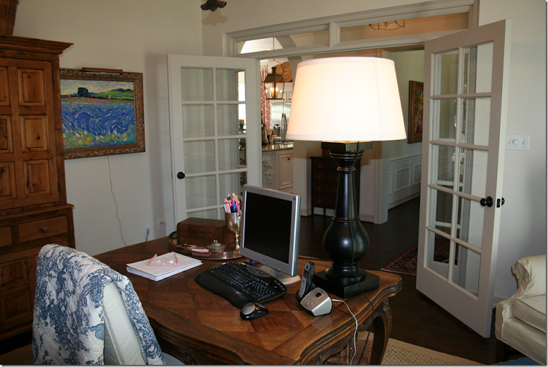
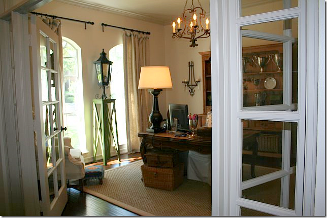
The front study used to have a wall filled with a paneled built in desk. That was removed to make way for her collection of antique furniture. The homeowner added a chandelier and sconces. The French doors are a nice touch that came with the house.
Looking back towards the entry hall and dining room.
And looking out the two front windows. Cute lantern!
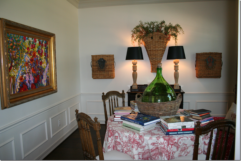
The dining room has a skirted table and an assortment of chairs surrounding it. Cute baskets flank the console with its tall lamps.
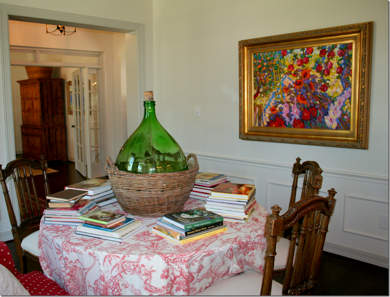
Here you can see where the door to the kitchen was removed. The owner uses her dining room as a library. Love that wicker bottle.
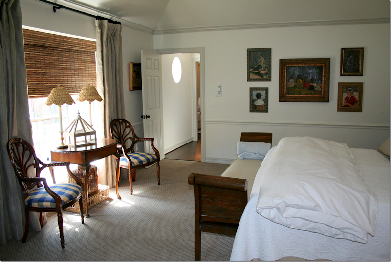
The once red master bedroom got new patterned carpet in a soft taupe. Her bed is all white and taupe. Love those silver lamps!!!!
Overlooking the new back courtyard, the owner added linen curtains and textured shades along with her collection of antique furniture.
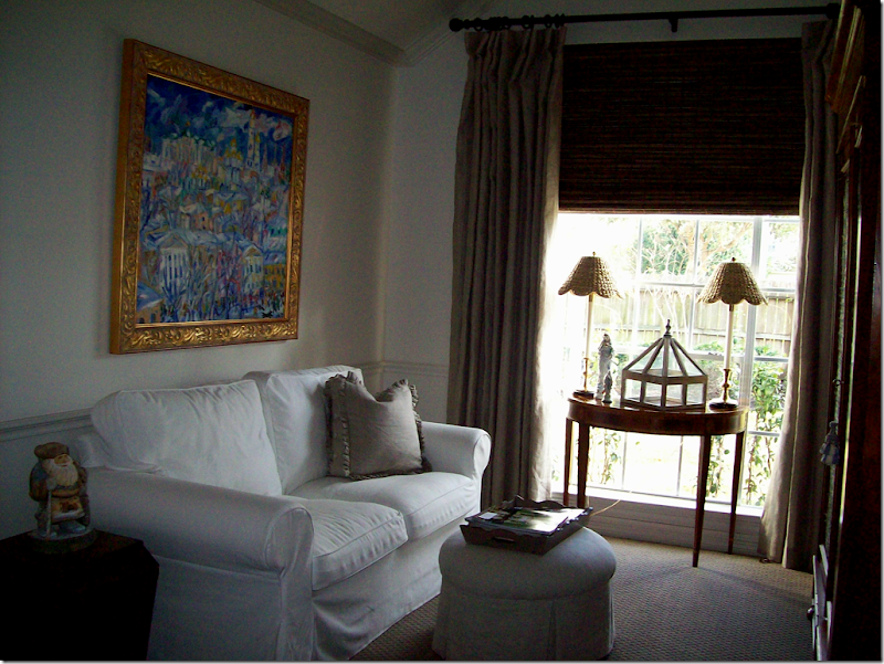
In the sitting area of her master bedroom, the owner added more white slipped furniture and an antique armoire along with the curtains and shade. Cute scalloped wicker lamp shades match those in the bed area.
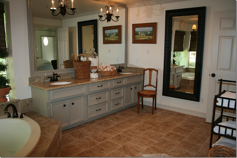
The once dark blue bathroom is now all white with the deep gray. Granite was added to the countertops and new tile was placed on the floor and tub surround. The mirror adds a cozy touch, as does her styling on the sink. The bathroom vanity once had an open area to sit at, but she replaced it with more drawer space instead. Gray painted molding added to the mirror makes it look more substantial.
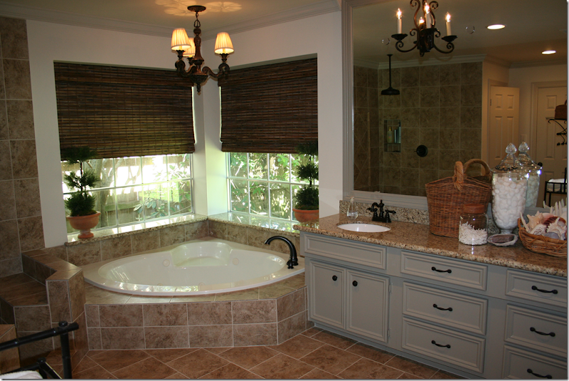
The owner added sconces and a light fixture over the tub, along with textured blinds.
The dated brass doors were removed and the shower was given a complete facelift in the new tile. New plumbing fixtures were added throughout the bath.
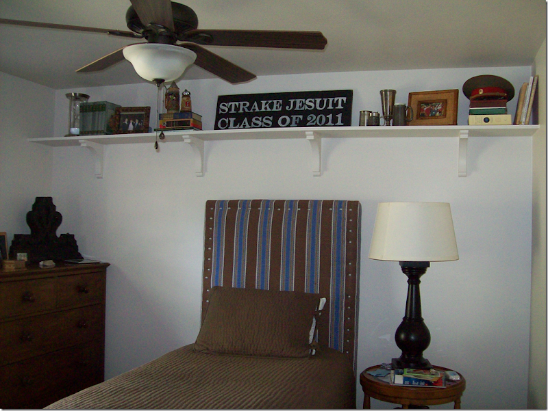
Here’s a peek at her son’s room with its cute striped upholstered headboard.
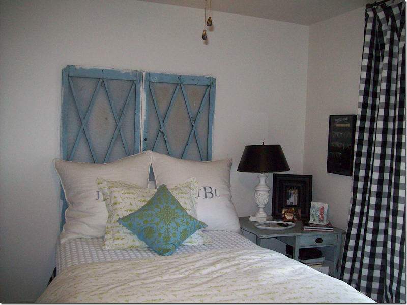
Her daughter’s room is darling with old shutters for her headboard, a charming blue painted side table and black and white check curtains. So cute!
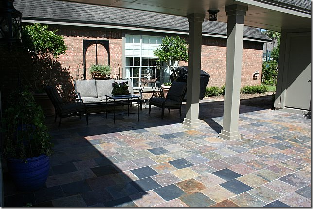
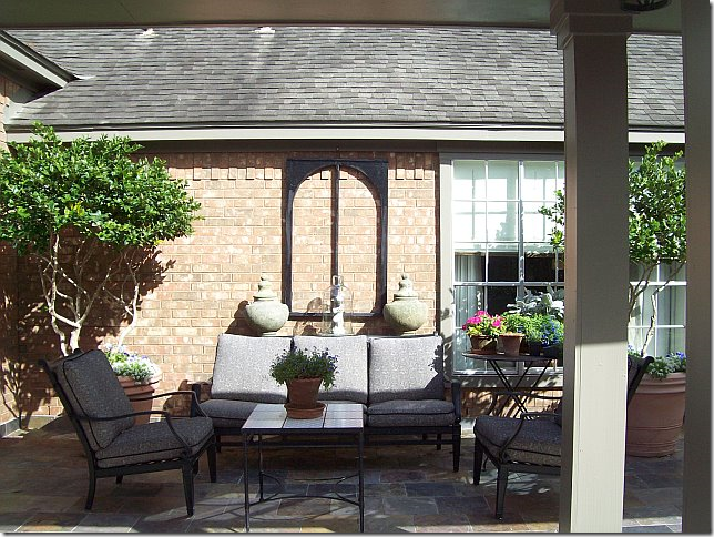
In the back, the fence between the garage and the house was removed, making room for a large courtyard, which was paved in slate tiles.
The master bedroom overlooks the charming courtyard.
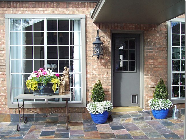
The back door today.
Finally, it’s hard to believe – the house went from this…..
To this in just twenty days. Unreal.
Thank you so very, very much to our homeowner who so graciously shared her house with us!!!
Friday, January 14, 2011
An Incredible Renovation!
Posted by home&interior at 12:56 PM
Subscribe to:
Post Comments (Atom)










0 Comments:
Post a Comment