The cover was the first clue that this Veranda was going to be special. I was crazed by the cover picture and by the promise of “Romantic Decorating Returns.” Yes! Finally! This is the Veranda issue we’ve all been waiting for. Might this bedroom be the prettiest one ever seen? There’s that blue again – blue is everywhere it seems. In fact, this entire issue is filled with all different shades of beautiful blues. I’m loving the bench, the bed, the gilt, and the Hodsoll fabric on the gorgeous curtains.
Dear Dara,
I’ve been harsh, I’ve been a little mean, but Dara, I am asking for your forgiveness. You see, Dara, I haven’t given you a proper chance as the new editor of Veranda. I was still missing Southern Accents and I took it out on Veranda – expecting your magazine to take up the slack and keep serving up gorgeous images month after month. And then, Veranda goes and has a changing of the guards and Lisa Newsom was gone after all these years. And, Dara, I know her shoes were hard to fill. I’ve nitpicked and complained about every issue – loudly - and I’m terribly sorry for that. Because, Dara, this month, you happened to have produced the best magazine issue I’ve seen in a long, long time. Each story is fresh and new and utterly gorgeous. “Romantic Decorating Returns” – I’ll say! My mother warned me. She called a few nights ago asking if I had seen the new Veranda yet. That early warning phone call hasn’t happened in ages. She said, “just wait, you’re going to die over it.” And Dara, she was right. You did good this month. You’ve proved that romance isn’t dead, that decorating is alive, and we can still have pretty. So, Dara, I’m asking your forgiveness. If you never produce another issue this good, it wouldn’t matter to me. This one will be remembered for years and years.
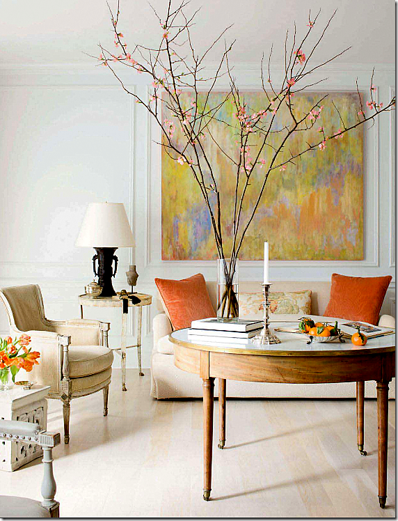
The first story shows a Georgetown townhouse designed by Frank Babb Randolph, done in French antiques, monochromatic fabrics and splashes of persimmon. So refined, so simple, so elegant. Randolph is becoming a favorite of mine. His interiors are always quiet and spare, he rarely disappoints. The owner is an attorney and artist and his canvases are the spark behind the tranquility Randolph created. Max Kim-Bee photography.
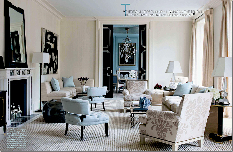
The next story is a stunning NYC apartment by David Kleinberg. Done in blues and creams with black accents, the space is a smart mix of traditional and classic. It has a grown up glamour vibe that reminds one of a Hollywood movie from the 30s and 40s. That’s a Franz Kline over the banquette on the left. Simon Upton is the photographer.
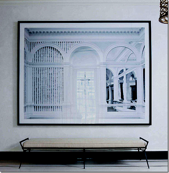
In the same apartment, a large photograph by Candida Hofer is found in the entry hall. See HERE for a story I wrote about her works.
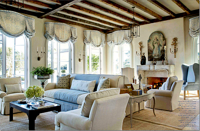
The next house is in Florida, designed by James Howard, partner to the famous Mrs. Howard. Two of the busiest designers around, their work is consistently pretty and consistently perfect. What a gorgeous room! Those windows, that fireplace! I’ve always found back to back sofas to be somewhat awkward but not here! I could stare at this room forever. Again, the house is filled with blues and creams. The cover story bedroom is found in this house, of course. I’m waiting for these two to produce something horrid! They can’t keep up this winning streak forever, can they????? Miguel Flores Vianna photographed the house.
The next story is all about pink and Paris and made me think of House Beautiful’s pink issue. Oh well. I’m sure I’ll be writing a mea culpa to HB soon too. What a darling pied a terre, owned and designed by Roberto Bergero. All bubblegum and black stripes with limes and lilacs thrown in. Photographed by the incomparable Rene Stoeltie and written by his wife, Barbara, it comes from their newest book, Parisian Interiors.
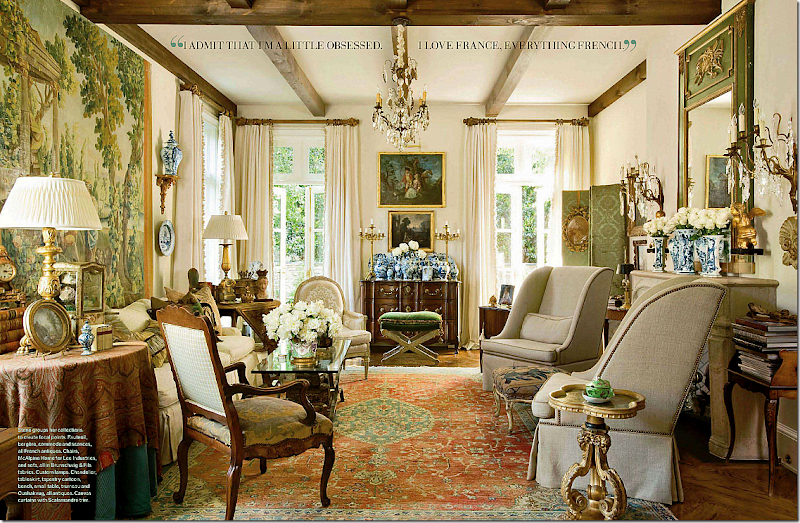
And then there is this house – a French mas found in Atlanta. Designed by Peggy Stone who lives here, and photographed by Peter Vitale. All I can say is I want to move here! The house looks like it is located in the south of France. In fact, at first glance I thought it was a restored mas in Provence. But no, it’s American and it’s new and it’s beautiful. Again, lots of blues – this time of the more aquamarine tones. And skirted tables are back! I counted several skirted dining room tables in this issue, including this house. Belgian who?????
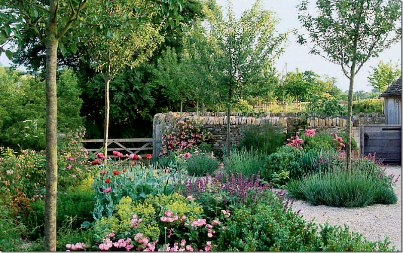
Even if you aren’t a gardener, you will still love the romantic Cotswold garden designed by Jinny Blom. Charming.
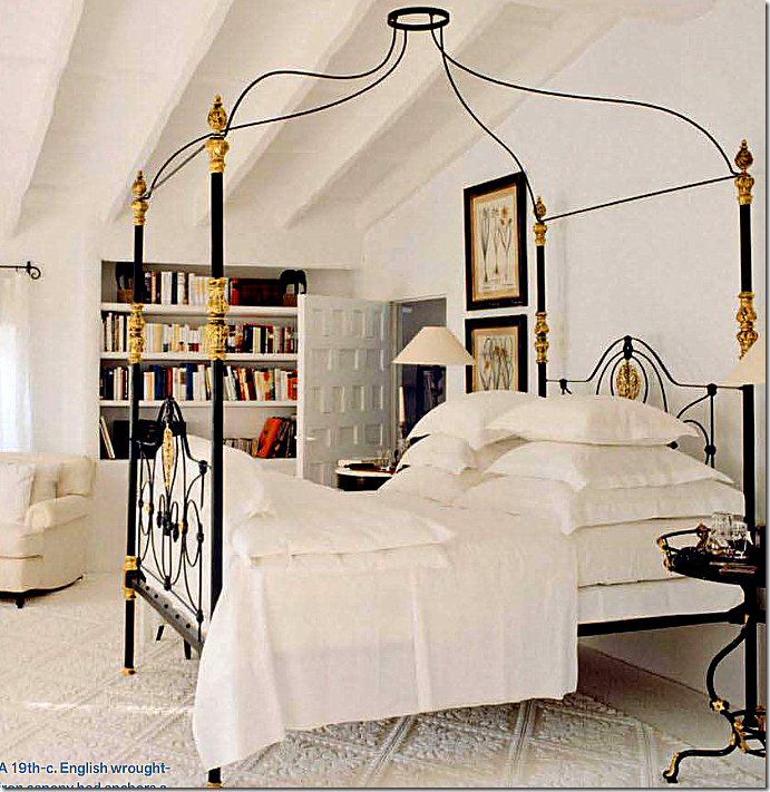
And finally, even the filler articles are great this month. A catalogue on canopy beds includes this antique beauty by Mimmi O’Connell, featured HERE. There’s an article on charm bracelets and turquoise. And back to House Beautiful’s pink issue, there’s a story about five iconic living rooms – all done in pink!
So, Dara, do you forgive me? I’m back in love with Veranda and can’t wait for the next issue!
Thursday, March 24, 2011
Dear Dara:
Posted by home&interior at 1:44 AM
Subscribe to:
Post Comments (Atom)


0 Comments:
Post a Comment