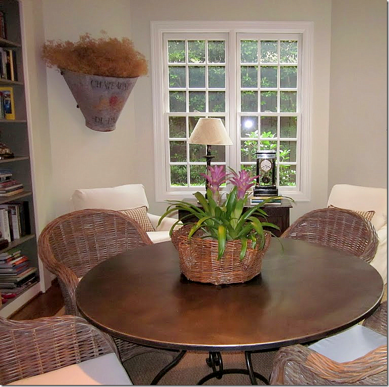
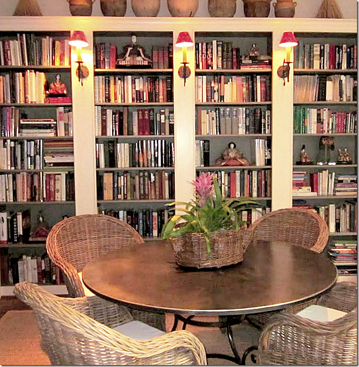
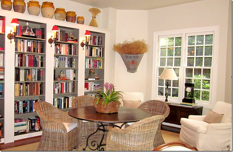
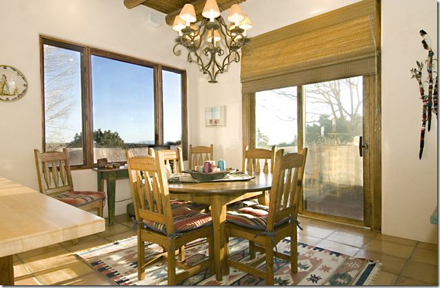
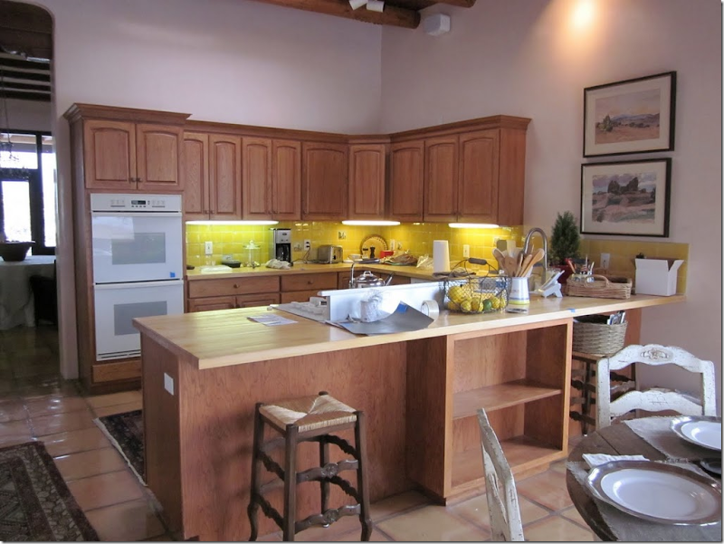
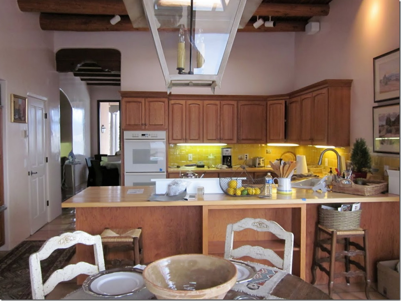
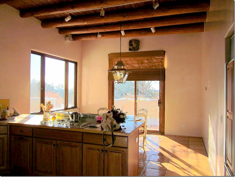
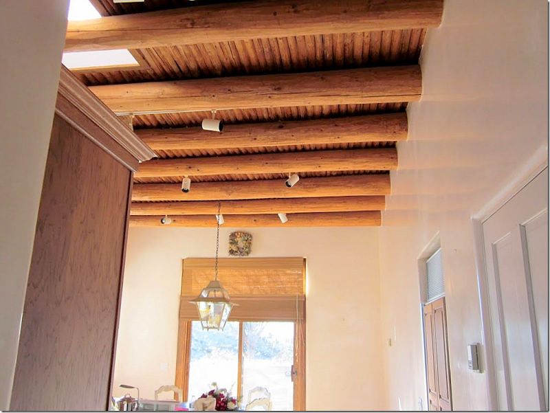
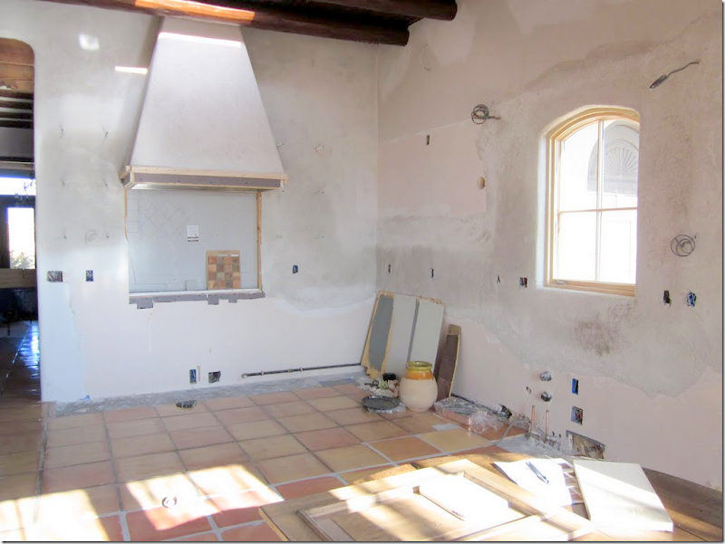
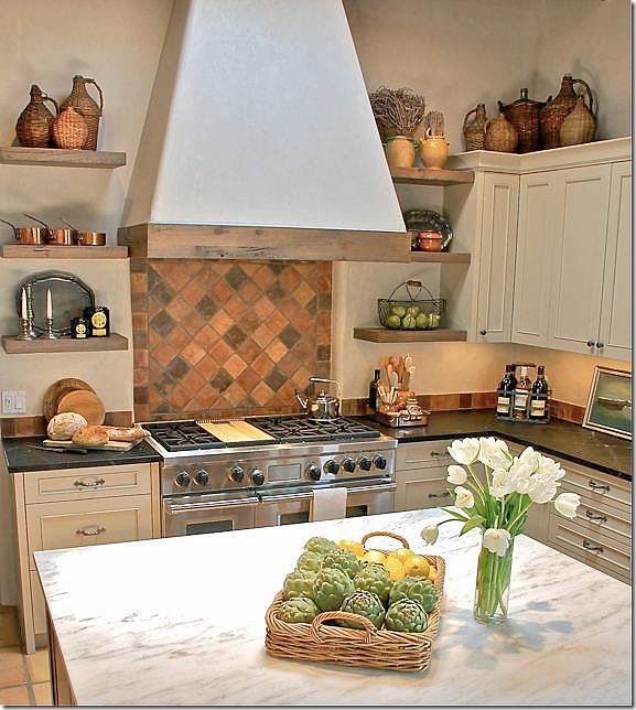
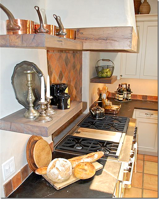
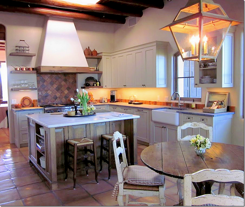
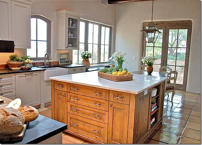
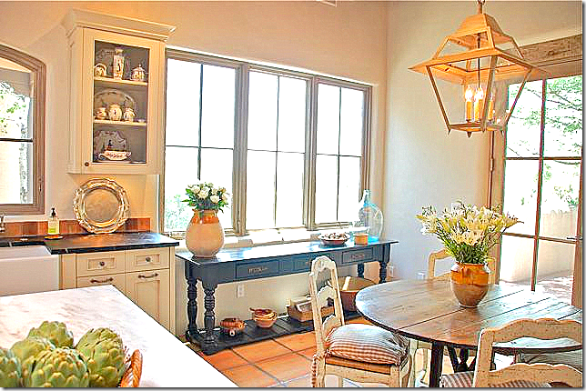
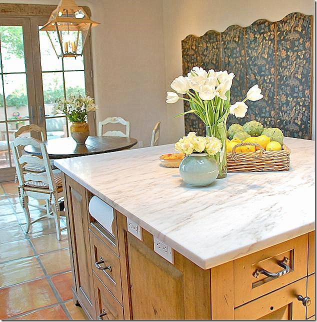
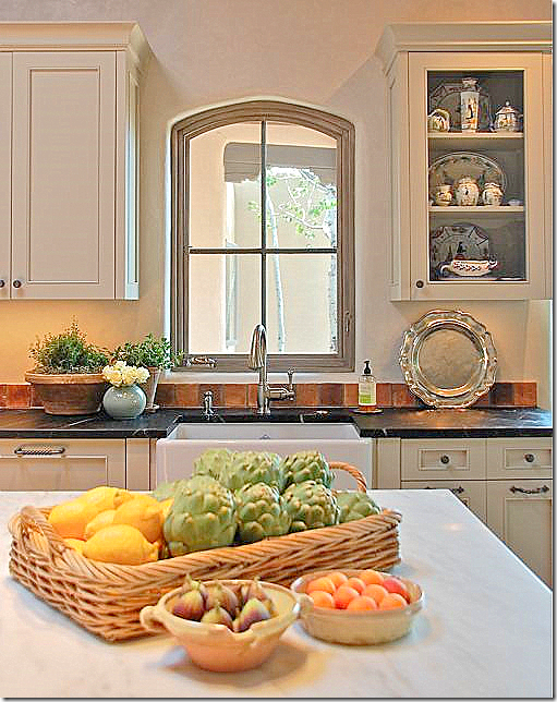
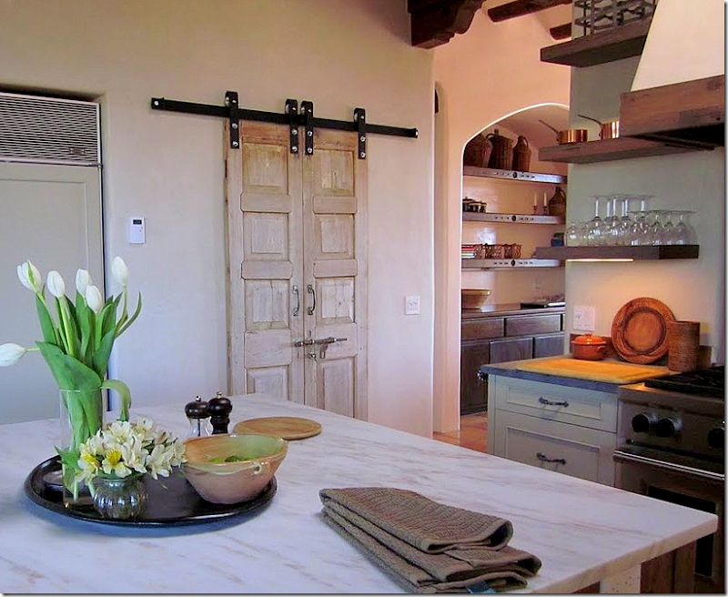
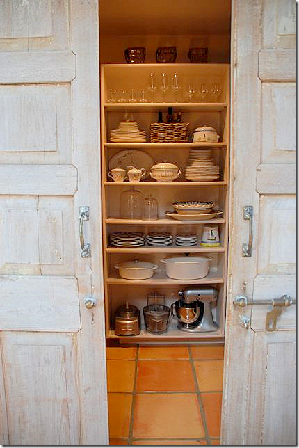
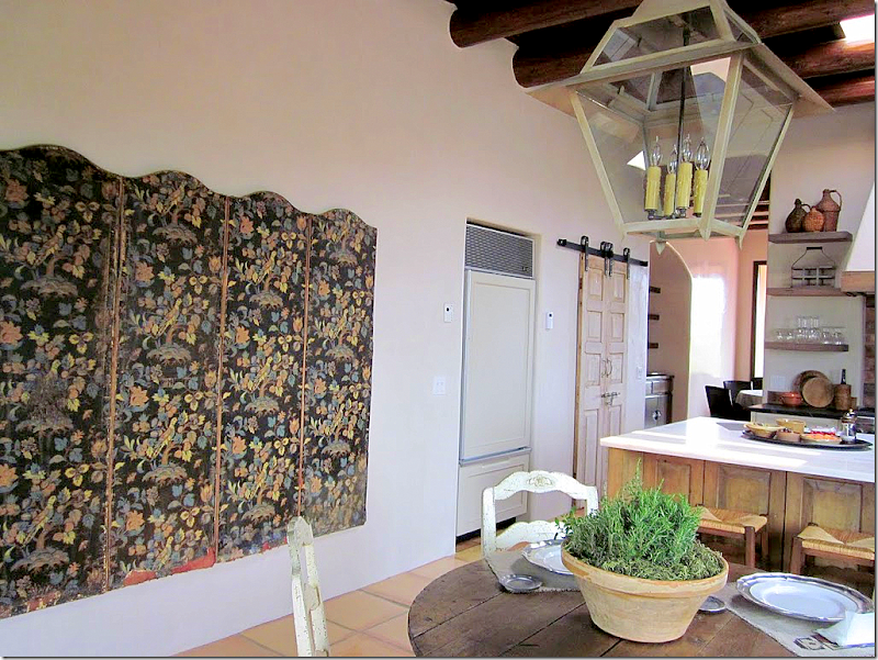
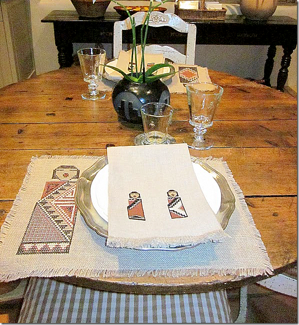
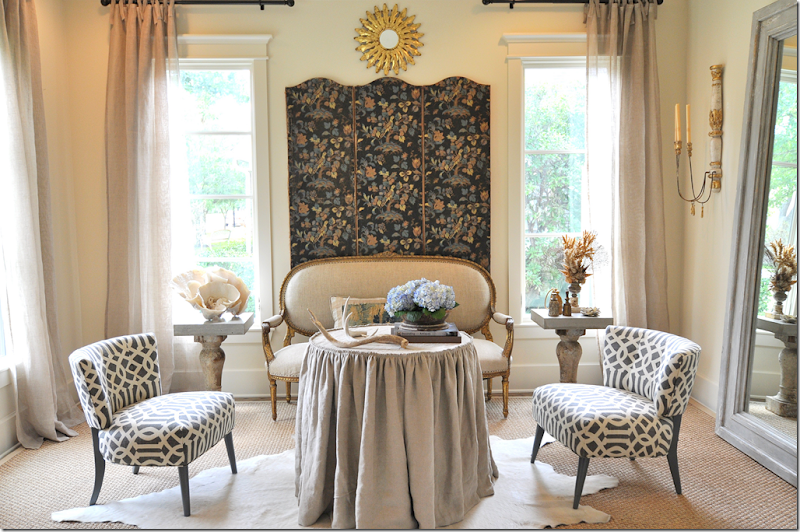
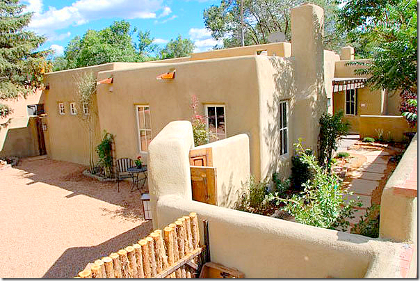
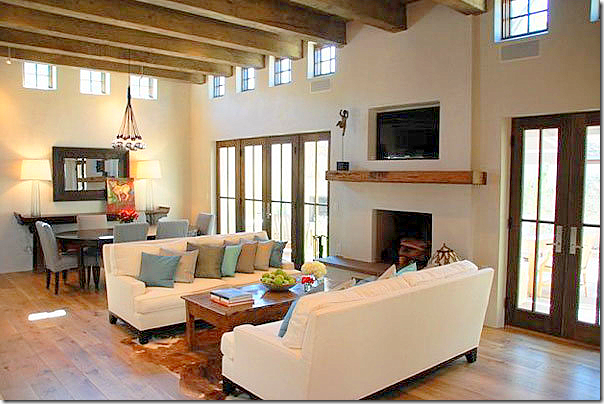
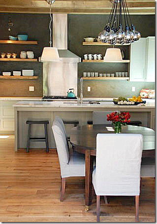
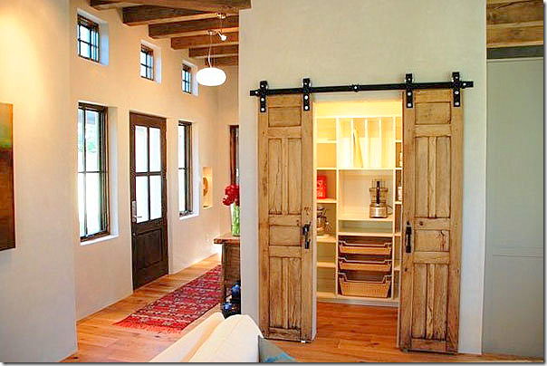
Continuing on with the series, Readers Kitchens, I want to thank everyone who has sent in their pictures. If you still haven’t, don’t worry, you have plenty of time to do so. Judging from the number of admissions, the series will run for quite awhile. Also, if you have a new house or a recently redecorated one and are proud of it, send in those pictures too! LECTURE TIME: I want to take a moment to discuss the comment section, since it seems to be causing a lot of discussion lately. I am a rare bird in blogging, in that I do not moderate the comments. I do this for several reasons. The first is because there are usually a large number of comments – moderating them would cut down on the time they would be posted and it would really slow the process down. Secondly, I like the debate unmoderated comments sometimes cause. The comment section often becomes more interesting than the actual blog post. When I post pictures of my own home, I am opening myself up to criticism. After four years, I have developed a thick skin and negative comments don’t bother me that much, although, a cruel comment can still sting, for sure. For instance, my own parents did not like my living room redo and even told me so in an email! It just goes to show that no one likes everything. Blogs with comment moderation tend to be all “Oh, I love that!” and they can be really tedious to read. Negative, yet constructive, comments that offer ideas and tips are always welcome. By contrast, it’s the comments that are just downright mean and vicious that sometimes can cross the line. When a reader is featured on the blog, she/he is an invited guest, and I just ask that they be treated as such. A good way to judge if your comment is too negative is whether you would say the same thing to the homeowner’s face. If your comment is so critical that you would be embarrassed to say it out loud in real life, then maybe you need to tone it down just a bit. Remember, home owners aren’t used to having their houses put up for critiquing. The rude comments left here don’t offer any helpful criticism and they leave the homeowner bewildered and hurt. I just ask that you remember that these homeowners are people with families and friends who will all be reading your comments. By far, 99 percent of the comments left are interesting and civil. It’s just that 1 percent that can ruin it for everyone. Thanks for listening and understanding. LECTURE OVER. The third kitchen in this series will probably not get any negative comments at all! I think it's fabulous and you will probably love it too! The owner is from Houston. You might recognize pictures from her Houston townhouse that she submitted for the Readers Kooboo Chairs story. She recently bought a vacation house in Santa Fe and totally redid the kitchen, ripping it all out and starting over. There are lots of before and during pictures so you will get the entire picture of her efforts. Enjoy!! The homeowner lives in a townhouse in the Museum District of Houston. The dining room is also a library and a sitting area. It is open to the kitchen and the living room. The wall of bookshelves is especially striking with its back painted a deep gray and the sconces with their touch of red. The Kooboo chairs from Cost Plus surround a French scrolled iron table. Looking towards the courtyard, there is a small sitting area with two slipped chairs. Here you can really see how dark the bookshelves were painted. Painting the shelves raises the notch up a bit. It makes them so dramatic and rich looking against the white walls. Great idea to take home!! SANTA FE: BEFORE: This is how the breakfast room in the Santa Fe house looked under the previous owners. It is true Pueblo style, but the owner loves French and Belgian designs, so everything is going to change! BEFORE: Notice the bright yellow backsplash. The owner really objected to the peninsula with the sink in the corner. This counter does cut off the flow of traffic into the kitchen. BEFORE: Another view of the kitchen with its long counter. The breakfast room had out of style slider doors and contemporary windows. The first thing the owner updated was the lantern. Look familiar? It’s the same exact lantern I have in my family room. The homeowner bought the last one from M.Naeve. The beautiful ceiling was marred by old fashioned tract lighting. These came down and were replaced with smaller, less noticeable spots. Also, the ceiling’s vigas and latillas were stained darker. During: the Saltillo tile floor is found throughout the home and it was kept – the only element that remained. Here you can see the new range hood already constructed; the casement window is also new, which will be over the sink. Formerly there were no windows in the kitchen. More new windows: the sliders were replaced with French doors and the contemporary looking windows on the side were replaced with romantic casements. Notice how dark the ceiling is now. The new windows really bring in the view – here is the winter view of the mountain range – Sangre de Cristo. And the summer view of Santa Fe. The cobblestones at the Ralph Lauren store in Paris provided inspiration for the backsplash. Here is a closeup of the backsplash with its cobbled tile appearance. The tiles are Arto - Normandy Cream. The tiles were purchased in Houston at Materials Marketing. And viola! Here is the finished kitchen. Notice how the long counter was removed and an island was placed there instead. This opened up the kitchen to the breakfast area. The range with its hood is the focal point – it’s backsplash is made of the tiles placed on the diagonal. The cabinets are painted gray - Benjamin Moore’s Revere Pewter. Not sure what the countertops are – they look like matte granite. The homeowner will have to let us know in a comment! The island is topped with white Carrara Sunrise marble. There are skylights over both the island and the breakfast table. The homeowner’s collection of antique wicker bottles was started after she first saw Carol Glasser’s collection in a magazine. Old timbers were used for the open shelves and to trim the range hood. The homeowner wanted more open shelving but she said it is so dusty in Santa Fe its almost impossible to have all open shelving. Another view – with the under cabinet lights on. Looking towards the breakfast room. The island was stained instead of painted – which adds to the array of textures and colors in the room. I love her hardware. The breakfast room with its antique French wine tasting table. One last thing on the to-do list, the homeowner wants to add linen drapes and shades to the windows in this area. Across from the table is a beautiful large antique screen the homeowner bought in Houston. It has six panels, but she only used five. Does the screen look familiar? The answer to its ownership is at the end of the story!!! I like how the paper towels are open here – so easy! The new casement window over the farm sink brings in the view of the Aspen trees – where there was no view before. This portion of the upper cabinet is wired to show off the owner’s extensive collection of French Quimper. I love her styling! Here’s a view of the new spotlights – small and black, they disappear as opposed to the older, large white ones that were previously used. The pantry doors are old doors found by the contractor. They kept the original hardware. The doors really add a great decorative element to the kitchen. Closeup of the doors and hardware. The pantry has three sides with ceiling to floor shelves. A look at the back side of the kitchen. The homeowner says: “Santa Fe meets Provence. I purchased these wonderful placemats and napkins from an 80 year old lady at Indian Market about 4 years ago. The petit point stitching on the napkins are incredible! So, so pretty! I loved seeing a Santa Fe kitchen with an updated look. So, did you recognize the screen? When Sally Wheat decided to remodel her French/Belgian styled living room to its now Hollywood Glam look, she decided to sell her screen. Here she was using only three of the six panels. The homeowner always loved the screen and jumped at the chance to buy it. She shipped it to Santa Fe where it now resides in her breakfast room. Did you recognize it?? The homeowner’s contractors Casa Solterra are well known in Santa Fe. They also helped the homeowner with picking out design elements. The owner Scott Wong found the pantry door and the barn door hardware. His wife Maika is co owner. This Santa Fe home pictured above was an award winner at last year’s Parade of Homes show in Santa Fe. It’s amazing that this house is new – it looks vintage Santa Fe from the outside. Inside, the ceilings are raised, creating a more modern look. The living area is open to the kitchen. The range hood and backsplash are the focal points of this kitchen. I wish I had bigger pictures! The pantry has a door similar to the homeowners. She used this door as her inspiration. And finally, the bedroom. I love all the heavy beams – so authentic looking. To contact the Wongs of Casa Solterra, please visit their website HERE. I hope you enjoyed Kitchen #3. A huge thank you to the homeowner. So far, the kitchen series has been international: Paris, Canada and Santa Fe. And I bet you thought they would all be from West University-Houston!!!
These were my inspiration for the house colors--even though I went with a Belgian-French theme”
Wednesday, August 10, 2011
READERS KITCHEN SERIES: #3
Posted by home&interior at 4:30 PM
Subscribe to:
Post Comments (Atom)






0 Comments:
Post a Comment