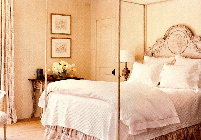
My daughter Elisabeth recently emailed me that she wanted to get some new bedding for her apartment. I didn’t really blame her, the duvet cover we bought at Restoration Hardware was a disappointment. It is linen, in a dark linen color, and it is just a wrinkled, dull looking mess. It needs to be professionally ironed for one thing, plus the color just does nothing for her bedroom. When you live in a pretty house, with beautiful architectural elements and antique furniture – plain bedding can be an asset:
In a gorgeous room, with antiques and architectural interest – the most simple bedding can be an asset. Design by Eleanor Cummings, Houston.
Even, in a plainer room – but with luscious curtains and French doors - plain bedding can be beautiful. Design by Rachel Ashwell, Shabby Chic.
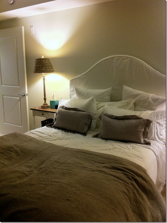
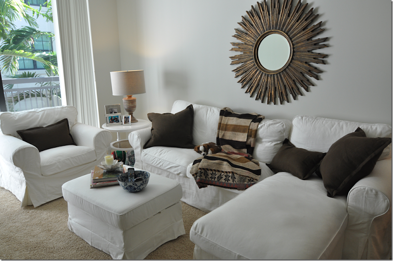
But, when you live within four boring apartment ivory walls and standard apartment beige carpet with horizontal blinds – plain bedding can be a real negative. Originally Elisabeth bought crisp navy and white with lime green accent bedding – but, despite my objections, she returned this in favor of the neutral Restoration Hardware linen collection. She paired it all with the white slipcovered headboard from Pottery Barn. Still, she never complained about her bedding, so I just let it go. Her apartment turned out cute enough, despite the plain linen.
The wrinkled mess – maybe a professional ironer could straighten this out, but it’s just really boring looking in person. It looked much cuter in the RH catalogue. I even bought two lilac pillows – thinking they would be a great accent color. Wrong. It all just blends together.
Still, her apartment is cute enough. We took this picture the week she moved in – since then she’s changed a lot – she got a wood coffee table, a reject from a client of mine, added an area rug, took out the chaise – and made the sofa into one long one instead (Ikea is amazing!) – among other things.
Since she never complained or mentioned her bedding, I assumed she was happy with it. That is, until last week when she mentioned that she had found some John Robshaw bedding that she really liked. John Robshaw? Now, I know Elisabeth has a Pinterest account and likes to lurk there several times a week, but still her John Robshaw knowledge stumped me. Where did THAT come from? Now that she’s home for Thanksgiving, we decided to watch a movie the other night – The Change Up – and lo and behold, that movie is exactly where the John Robshaw connection came from. When the movie started, she said – “Mom wait until you see their house – it’s adorable.” Might I have a budding partner for my interior design business? I only wish!!!
Anyone who reads this blog knows one of my all time favorite movie houses is the Hamptons beach house in Something’s Gotta Give, designed by Set Decorator Beth Rubino.
A close second is the two houses in The Holiday, designed by Set Decorators Cindy Carr and David Smith, Jon Hutman, Production Designer.
The English countryside house in The Holiday.
Beth Rubino of Something’s Gotta Give and It’s Complicated fame, is probably my favorite Set Decorator. Her work for Nancy Meyers, along with Jon Hutman as Production Designer, is phenomenal. We even had Rubino as a guest on The Skirted Roundtable (if you missed this interview, you should give it a listen HERE.) But after watching The Change Up, I might have found a new Set Decorator who obviously has a great eye for decor. In fact, much like Something’s Gotta Give, the house in The Change Up is so cute, it steals the movie away from its stars. The director, David Dobkin, of Wedding Chasers fame, chose Barry Robison for Production Design – a very wise choice. Robison’s resume is long and varied – from Wolverine and The Chronicles of Narnia to Wedding Crashers and You, Me, and Dupree (two other great “house” movies.) The Set Decorator is Debra Schutt – known for her work on Revolutionary Road and The Stepford Wives, just a few of her very many credits.
The Change Up stars Ryan Reynolds and Jason Bateman who switch bodies – one is a married father, the other is a perennial bachelor. Leslie Mann is fabulous as the long suffering wife and Olivia Wilde is the temptress at work. The first time I saw the movie, I kept telling Elisabeth how terrible it was. But, while grabbing these photos for the blog – where I had to watch it three times – I actually like the movie now! It’s very funny in places and Leslie Mann steals the show. Mostly, though, I just enjoyed looking at the house. Apparently the house’s exterior is located in Buckhead, Atlanta, where Dobkin and Robison had scouted – looking for the perfect “first” McMansion for the up and coming lawyer that Jason Bateman plays:
"It's not quite Colonial or Arts and Crafts but a pastiche of traditional elements," Robison said of the house. "We noticed that a lot of houses in Atlanta had a similar style: dark floors, white cabinetry, iron railings, creamy walls, which we replicated with Benjamin Moore Linen White, and beautiful fabrics on windows and furniture. We wanted to tap into that."
Ah, yes, a Production Designer familiar with Linen White! He must have great taste! Furniture for the house was purchased at Bungalow Classic in Atlanta HERE, another aesthetically pleasing choice. The blue and white bedroom was inspired by Victoria Hagen and Barbara Berry - ok, I am loving this designer more and more!! AND, get this – the window treatments throughout the house are all Colefax and Fowler and Osborne and Little!!! And to top it all off, John Robshaw blogged about his fabric’s appearance in The Change Up saying how thrilled he was when Debra Schutt showed up at his store to shop for the movie. Must be such a fun job to design a house without any client input!
Today, I am only going to show the McMansion owned by Bateman and Mann, but the single Ryan Reynolds’ bachelor pad is quite a vision itself - with a weird collection of found furniture, toys, sports memorabilia and junk. There is one thing in the apartment that caught my eye though – a bright red SMEG refrigerator!
Bachelor Ryan Reynolds apartment has a red SMEG refrigerator. Broke and out of work – I’m not sure how he could afford the SMEG, but this is Hollywood.
Unfortunately, there are no official photographs of the movie house – so I had to grab them off the DVD, hence the poor quality. Sorry for that. And, I’m just going to show the house – not a recap of the movie (don’t worry!) If you like a movie with décorative visuals and pretty houses, then watch it. But, if you don’t like potty jokes or sexual humor – beware, this movie isn’t for you. I will warn you, the first scene is vile, dealing with dirty diapers. Close your eyes and wait it out for a minute or so for it to be over. Trust me.
Since this is Hollywood, only the exterior of the house is real, located in the Buckhead area of Atlanta. The interiors are all built on a soundstage.
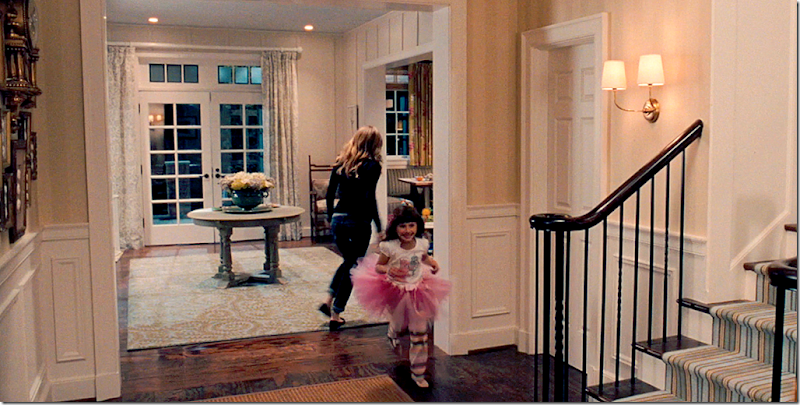
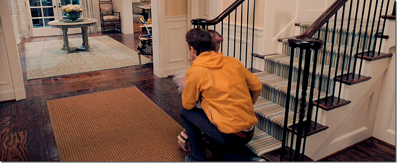
The front hall: The walls are wallpapered in a light yellow stripe above the wood molding wainscot. The stair rail is trendy iron and the floors are very dark hardwoods. Brass sconces light the area – sconces are actually found throughout the house. The living room and dining room are to the left and right of the entry hall. Straight ahead is the family room on the left and the kitchen and breakfast room on the right. The round table divides the two areas.
The runner on the stairs is probably by Dash and Albert HERE. Seagrass is used on the foyer. The round, gray painted table divides the family room from the kitchen. A blue and green area rug sits underneath the table. And the rug under the table is this Dash and Albert rug HERE.
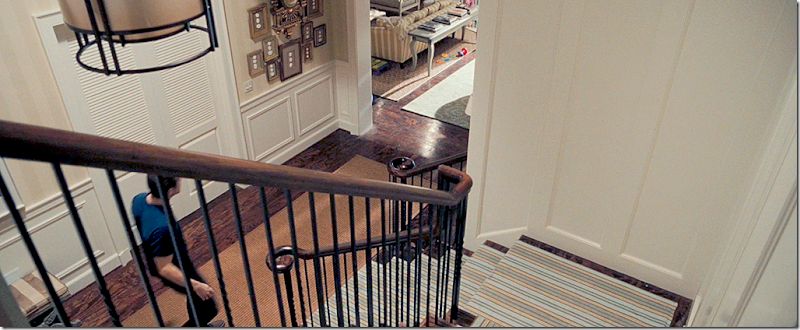
Looking down at the foyer, you can see a collection of antique intaglios hanging on the wall – surrounding a gilt, antique clock.
Entering the family room – wing chairs covered in a reversed brown and white oriental toile flank the doorway. The walls are board and batten. Now understand this about the movie – the family that lives here is a modern family. The husband is an attorney, the wife is an architect. They have a young daughter and baby twins – a boy and a girl. The house is a mess, always! There are piles of toys and baby gear throughout. I wish they had taken professional photographs of the house without all the mess and without the actors, but they didn’t. So, imagine it all cleaned up and without Jason and Ryan wondering about!
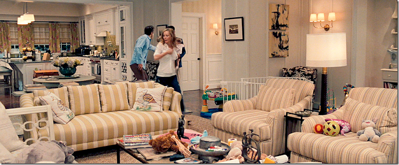
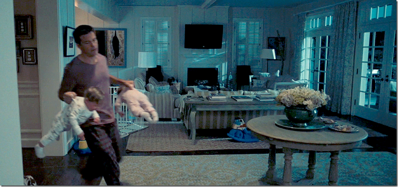
The family room has a sofa, two chairs and a bench on the left. You can see the mess of toys everywhere! In the back is the kitchen – the round table divides the two rooms. Brass sconces continue into this room.
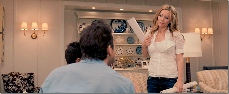
Behind the two chairs is a china cabinet set inside a niche. Three armed sconces flank the cabinet filled with blue and white antique dishes, reminiscent of the Something’s Gotta Give dining room.
One of the funniest scenes in the movie is here when the best friends try to convince the wife that they have changed bodies. They ask her to quiz them to prove they’ve switched bodies. She says – ok – “what’s my favorite color?” Her husband stammers and says RED? The bachelor says CELADON. “Just look around, man, everything in your house is celadon – all the accessories, all the furniture.” And it’s true. Most the of the painted furniture is a shade of bluish-green.
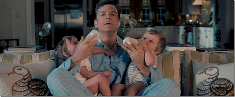
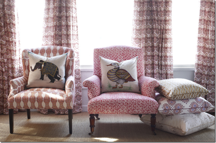
The two hand painted pillows on the sofa are from John Robshaw – though this particular one appears to be sold out.
For more information on the hand painted pillows, go John Robshaw’s web site, HERE.
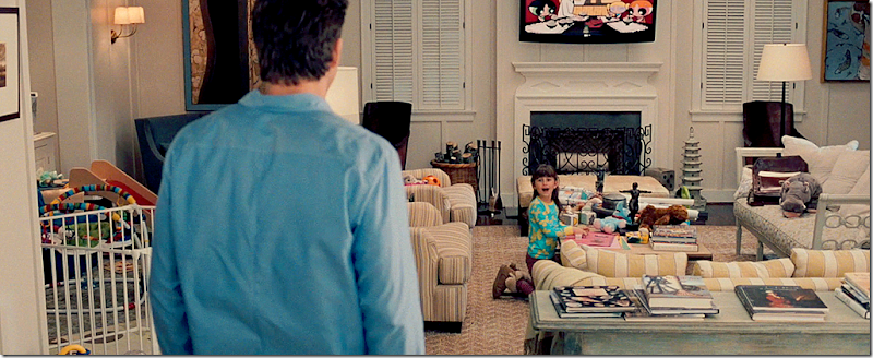
Facing the back wall – there is a fireplace with a flat screen above it. Here you can see the cute bench on the right. There’s a celadon colored pagoda next to the fireplace and a celadon colored painted console table behind the sofa.
Here, you can see the clock and the intaglios hanging on the wall – and the Dash and Albert rug. In the back is the baby’s playpen in front of the china cabinet.
In this night view, you can see the celadon colored round table and French styled console table behind the sofa, piled high with design books. A wall of French doors, covered with blue and white curtains, open to the backyard.
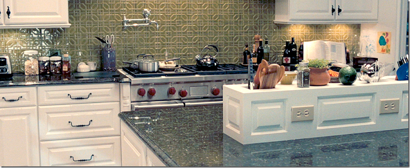
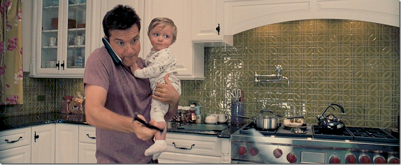
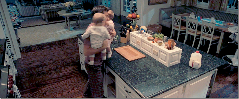
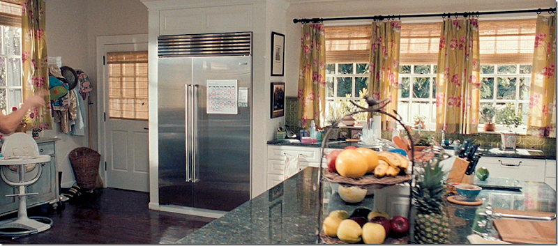
The kitchen has cabinetry by Kitchen Craft and polished Vermont granite countertops. "We needed something to energize the unrelenting neutrals and bring color and youth to this environment," Production Designer Robison said. They used a patterned green backsplash made of tile from Waterworks. A large island separates the kitchen from the breakfast area.
Here you can see the arch that the stove sits under. There are many arch elements repeated throughout the house.
Along the sink wall, there are no upper cabinets – another trendy choice. The windows are covered with a lime green-yellow and pink fabric that looks like an Osborne and Little fabric to me. Notice the meat cleaver hanging off the upper cabinet. hehe!! Even the hardware is first rate. Truly, no expense was spared when decorating this house. Remember in Something’s Gotta Give – in a cost savings measure - instead of black granite, they painted plywood black to mimic the stone countertop. Here, there is real granite.
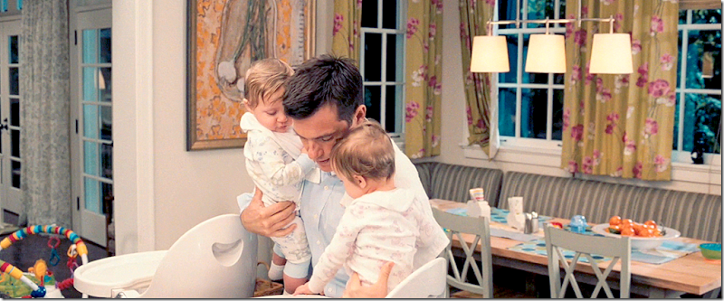
Looking down – you can see the banquette under the wall of windows that surrounds the breakfast table. In the background to the left is the family room.
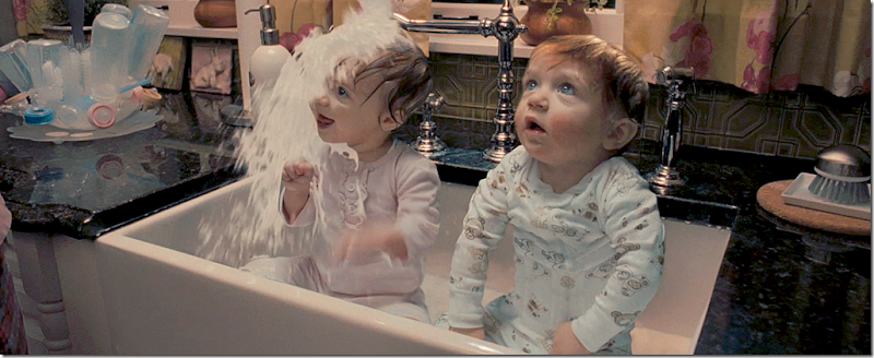
Of course, there is a large, single farm sink with a polished nickel faucet. Here the twins get a milk bath instead of a bottle from the bachelor stuck in their father’s body. Don’t ask.
The wall of windows above the sink. All the appliances are trendy stainless. The curtains are paired with textured blinds and the windows are beautiful casements.
A close up of the fabric.
Here you can kind of see the family room curtain fabric. Wish there was a close up.
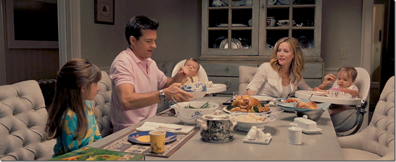
The dining room is a favorite of mine. It’s filled with gray painted furniture and a set of contemporary tufted chairs. It’s hard to tell what the dining table looks like. The curtains are yellow silk plaid with lace sheers. An area rug in yellow sits underneath. Not sure where the rug is from, but it might be Restoration Hardware. Love the enfilade along the back wall. Cute lamps.
Here you can see the china cabinet – painted gray or celadon – hard to tell. The walls are a soft yellow above the linen white wainscot. This is another very funny scene.
This is the ONLY glimpse of the living room – across the foyer. It has another wood mantel fireplace with a crystal chandelier above. The walls are a deep greenish celadon. Wish we could see inside the room! And here, you can see the fixture above in the foyer. Bateman is going into time-out here. So funny.
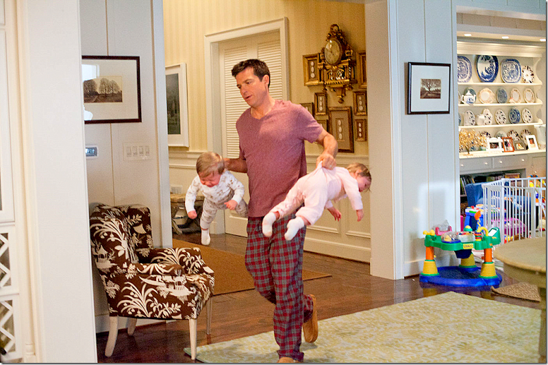
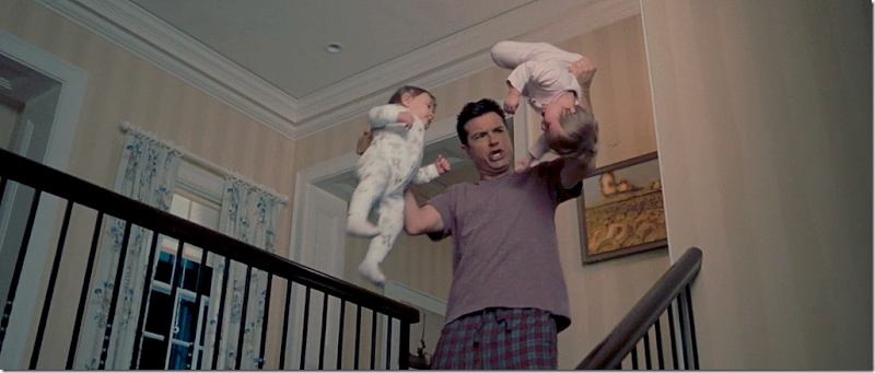
The yellow striped paper continues upstairs to the large landing. In case you are wondering – this is the bachelor inside the father’s body – he has no idea how to hold babies, much less twins, and he is slinging them all around the house. Another funny scene. Here you can see the blue and white curtains. This fabric looks more like Colefax and Fowler to me. Very English decor landing.
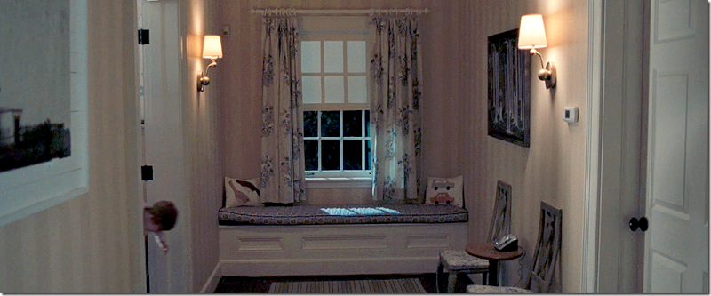
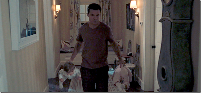
At the back of the landing is a window seat with more pillows from John Robshaw, as is the fabric on the window seat. Here, single brass sconces light the hall. Two Swedish style chairs are against the hall. And – there are black and white photographs hanging throughout the house, along with a collection of modern art.
And yes, there is a trendy gray painted Mora clock! Of course!
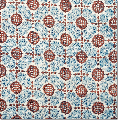
A close up the curtain fabric and the John Robshaw fabric on the window seat.
John Robshaw hand blocked linen fabric, found HERE.
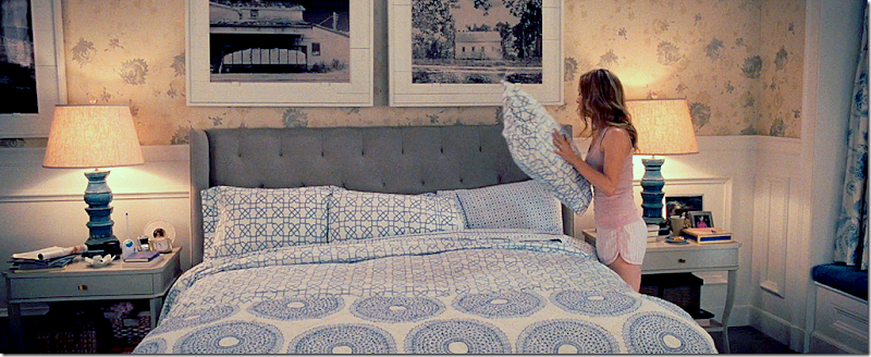
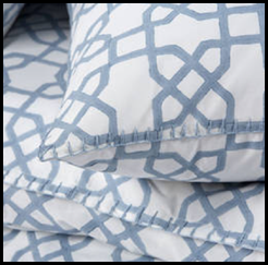
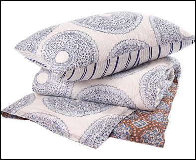
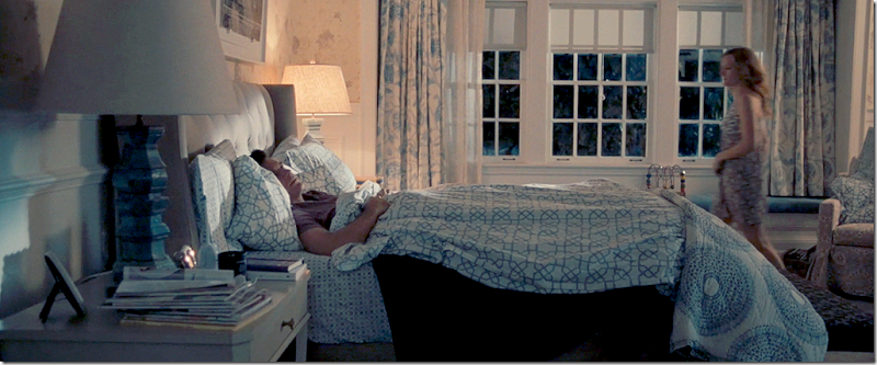
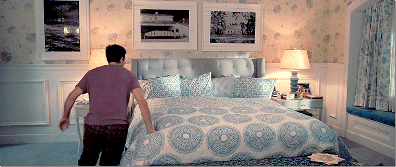
And finally – the star of the movie – the master bedroom with its blue and white bedding from John Robshaw. This is the bedding that Elisabeth went crazy for – as did a lot of movie goers, judging from the numerous online questions asking where to buy this bedding. The bedroom, like most of the house, is wallpapered above the wood molding wainscot. The headboard is gray tufted with wings. On the bed, a duvet covers the dark blue blanket – and a mix-matched quilt is folded at the end of the bed. Robshaw sells his collections online – so it’s very easy to get this look for yourself. The bedding is a collection of three different fabrics:
Trellis sheets and duvet – found HERE.
Sag Harbor Indigo sheets and pillowcases found HERE.
Lapis Quilt found HERE.
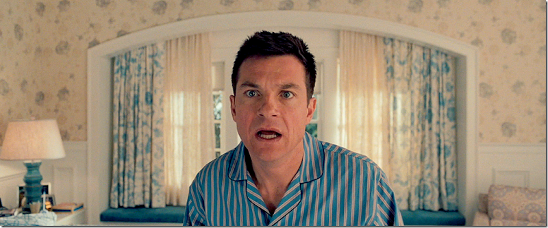
Along the side wall is a very long window seat covered in blue velvet. Blue and white curtains hang at the windows. Perhaps the funniest scene in the movie just happened here. You will have to enjoy potty humor though. But, it really is a very, very funny scene that depicts the close physical relationship between a husband and wife – something that completely turns off an immature bachelor. I’m laughing now just thinking about it.
If you can possibly ignore Jason Bateman’s shocked face (he just realized he is in the wrong body) – you can see how the window niche is beautifully arched. And in the corner is a chair that you barely see in the movie.
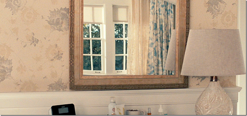
Along the dresser is a mirror that reflects the windows and curtains. Here is a close up of the wallpaper. Can anyone figure out what this is?
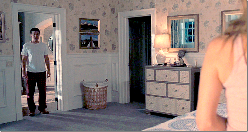
Here’s a view of the side wall with the chests – there are two exactly alike with a mirror over each.
Above the bed are more black and white photographs and at the end of the bed, is a barely visible bench covered in what looks like a cut velvet fabric.
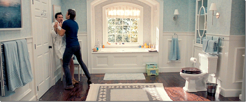
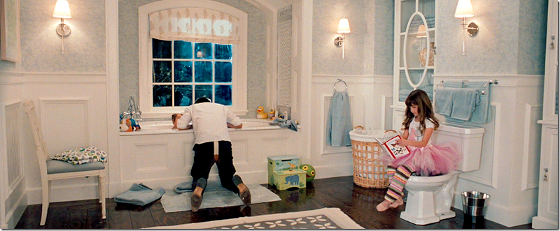
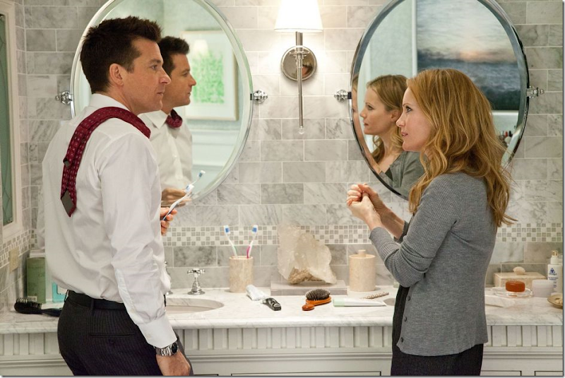
The bathroom is the setting for quite a few scenes. It is so pretty – with more wood paneled wainscot, and blue wallpaper above it, along with arches that top the windows, the bathtub, and the sink area. Love the hardwood floors and the wood toilet seat. The bathroom was furnished in Waterworks and Restoration Hardware.
On each side of the toilet are cabinets with wonderful glass doors.
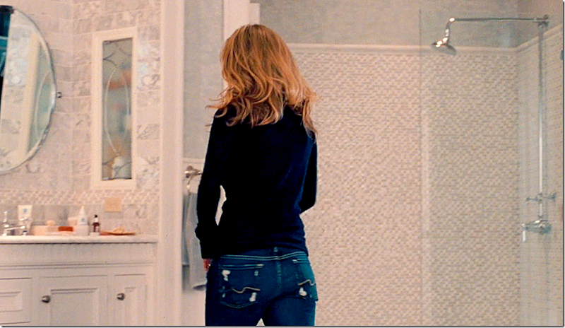
The tiles are all Carrara marble in different sizes – including the shower stall below.
The shower stall is completely tiled in tiny Carrara marble tiles.
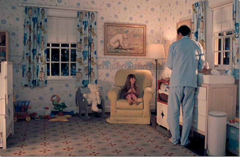
Finally, the nursery where the twins sleep. The twins are actually twins in real life – a brother and sister! They are beyond adorable.
The rug is Dash and Albert HERE.
A close up of the wallpaper.
Dwell Studio makes the baby girl’s bedding HERE. It’s so cute and there are many different accessories that match it, like a rug, trash cans, etc. The baby girl is so cute. Hard to believe my own daughter was once this little. Now, she’s grown up and in college asking for John Robshaw bedding!
I hope you enjoyed this look at this stylish movie house.
To order The Change Up, go HERE.
To read about more movie houses on Cote de Texas, use the search engine on the upper life sidebar of my blog and search for Something’s Gotta Give, The Holiday, and It’s Complicated.














0 Comments:
Post a Comment