This latest kitchen in the Readers Kitchens Series is located in Hudson, in upstate New York. When the homeowner forwarded me these pictures, I emailed her back asking for the “before” pictures of this renovation. Imagine my shock when she said it was new construction! Wow, the kitchen really has that old house look. Apparently the owners live in a 1930s bungalow and when the time came to remodel the kitchen, they opted to build an entirely new space. But, who wants a brand new, white marble and granite temple when you live in an older, more casual house? The homeowner actually designs kitchens in her area, so she knew exactly what she wanted. In this design she tried to use as many vintage and antique items, along with salvaged materials that she could. Enjoy!
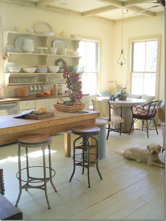
I love the painted wood planks used in the addition. They really set the tone that this is a casual room – not a slick, modern kitchen. In the middle is an old, wood island that acts as the focal point. Be sure not to miss the ceiling – a grid of darker painted beams that create a mass of interesting squares.
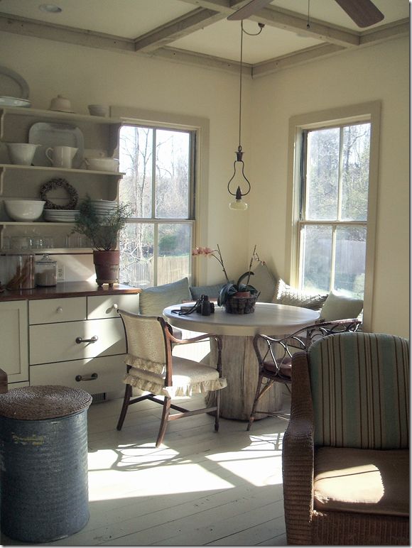
The corner becomes a banquette for the breakfast table, with its rustic wood base. Notice the charming light fixture that hangs above the table. I love how the sun streams through the windows here. And, don’t miss the recycling bin – an old metal can topped with a round, straw mat.
The countertops are wood. Instead of upper cabinets, a series of shelves holds all the dinnerware. Notice the mixture of hardware, two heavy brass handles are mixed with smaller round white ones.
Along one side of the kitchen, a railing overlooks a stairwell, while two octagon shaped windows break up a blank wall. The appliances are found mostly on one side, while an extra oven is built into the end of the island. The refrigerator uses the fool-the-eye trick of appearing built in by bringing the cabinet above it all the way out.
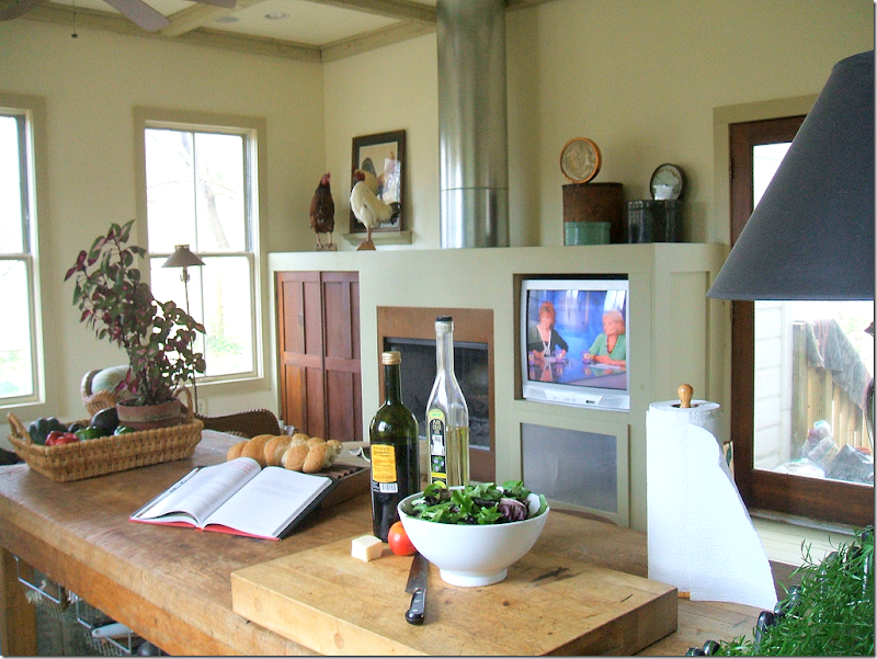
And finally, looking at the opposite wall, a fireplace is built in, along with a television. The chimney becomes an architectural element in this clever design. It’s truly hard to believe this is new construction! It is as seamless an addition that I’ve ever seen. I think this kitchen has an important lesson – just because you can build it new, doesn’t mean you have to build a monument to yourself. This homeowner chose to build a kitchen that is truly keeping in with the style and age of the house.
To contact the homeowner for design work in the upstate NY area, please email her at dsrd@mhcable.com
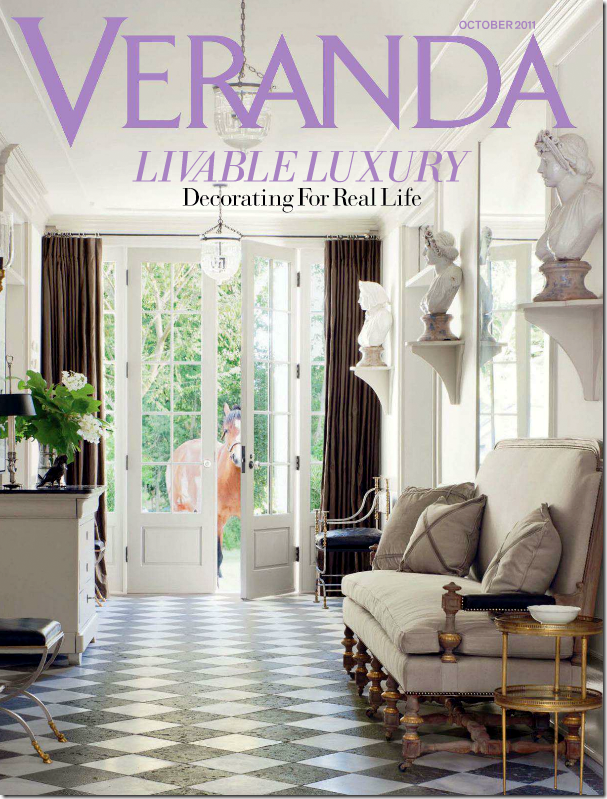
Next: The comment section on the last blog story, Pamela Pierce Does It Again, was more interesting than the story, something that happens a lot! I love reading your comments and it is always interesting to see where you are coming from. This week, a lot of you commented on the new Veranda magazine. I have really been enjoying Veranda lately, especially with the new editor, whom I really didn’t think I would like! Instead, I’ve found that I have enjoyed the direction she has taken. I do have to agree with you though, that this month was not a stellar issue. Many of you said you got your issue and tossed it out after one quick look. At the time I hadn’t received my Veranda yet, but I have now.
Well – there were a few houses I enjoyed, the Swedish one for example. But I have to say, if you are looking for a replacement for Southern Accents – this issue isn’t it. This month, Veranda looks more like Elle Décor and I can’t understand why. I find it strange because other issues have not been like this. So, I’m going to just say this was not their best and wait until the new one comes. Because what else is there? I’ve gotten where I can barely tolerate Elle Décor – I just don’t understand it anymore. House Beautiful has never really recovered after Stephen Drucker left. The biggest turnaround has been Architectural Digest since Margaret Russell landed there. I’ve found that this is one magazine I really enjoy. Mostly though, I wait for Lonny and Rue – the two biggest online magazines. They are more interesting and filled with more décor than most of the printed ones. Hopefully, now that the economy seems to be heading slowly upward, more advertisers will return to magazines and we will have something to look at again.
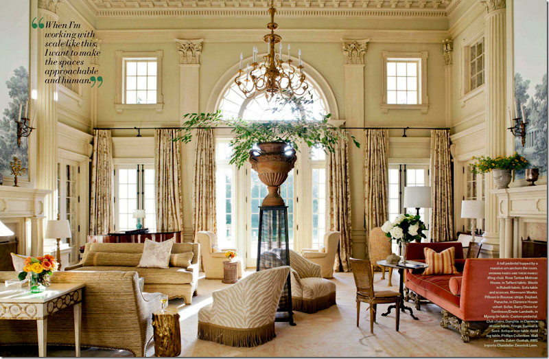
This library was my favorite image from this month’s Veranda. I would die to have a room like this!
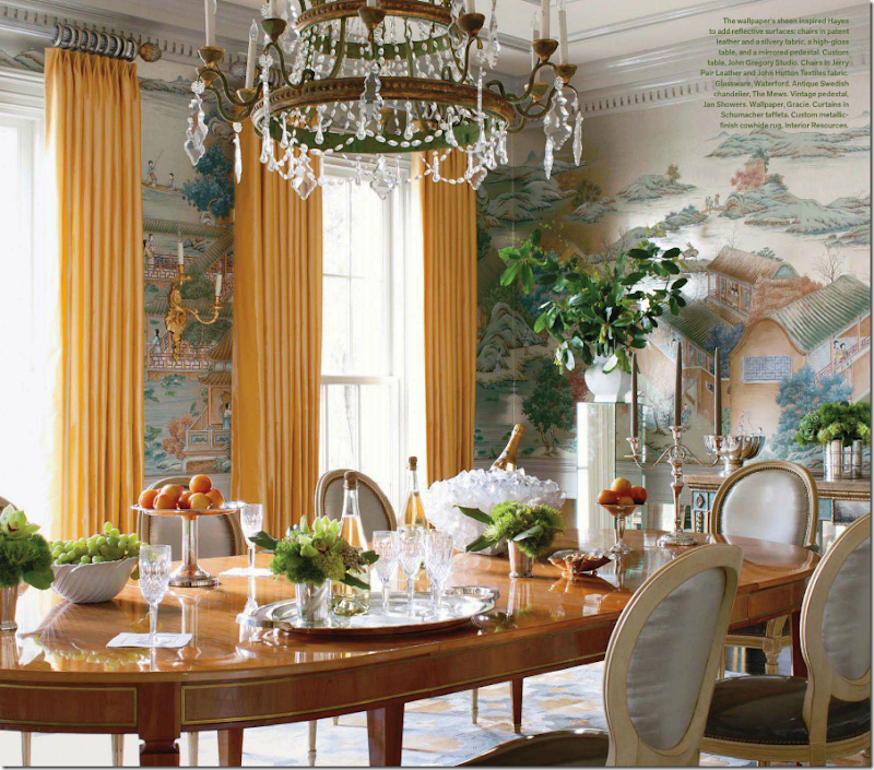
I liked the dining room of this house and thought the styling was pretty. The yellow curtains were a pleasant surprise.
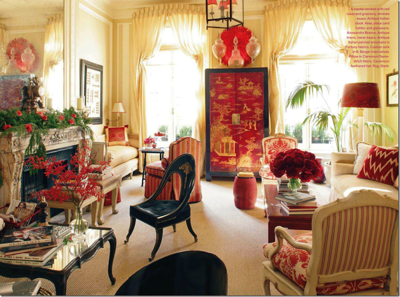
No one loves Alessandra Branca more than me, but really – how many times are we going to see her NYC apartment? I was shocked that it was shown in this month’s Veranda. Why??? This is probably the 3rd or 4th time this apartment has been published.
Last month’s issue was a keeper for me. The Windsor Smith house shown on the cover – drool worthy.
I know we can’t see an entire issue of dreamy houses like this Barry Dixon one, but I do think each issue should have at least one like this – totally decorated to the nines. Where else can you get ideas?
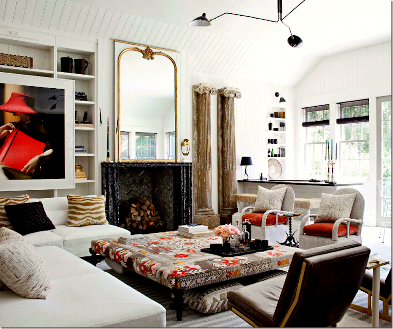
Windsor has become one of my favorite designers – I’m crazy for her style. That ottoman!! Gorgeous!
I’m not sure anyone does a better kitchen than Windsor. This one is beyond incredible! The walls of marble, the silver accents, the pendants, the island table topped with more marble, the refrigerator columns flanking the door, the marble sink – how does she think of all this? Amazing!!!!!
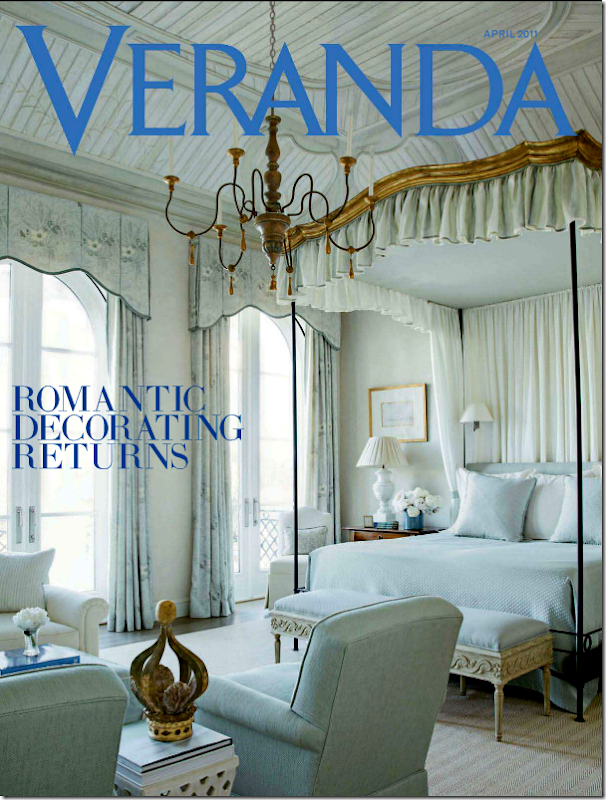
As long as Veranda can come out with issues like this one in April, I’m willing to forgive issues like the newest one. April’s issue was one of the prettiest in memory. It was called “Romantic Decorating Returns” – why would anyone want their house to not be romantic, beautiful and endearing? Who wants a house that isn’t romantic??? I don’t get that.
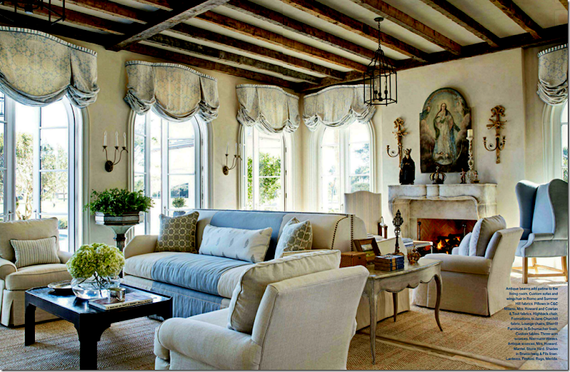
This house by Jim Howard was beyonod beautiful. But is there anything that he or his wife does that isn’t?
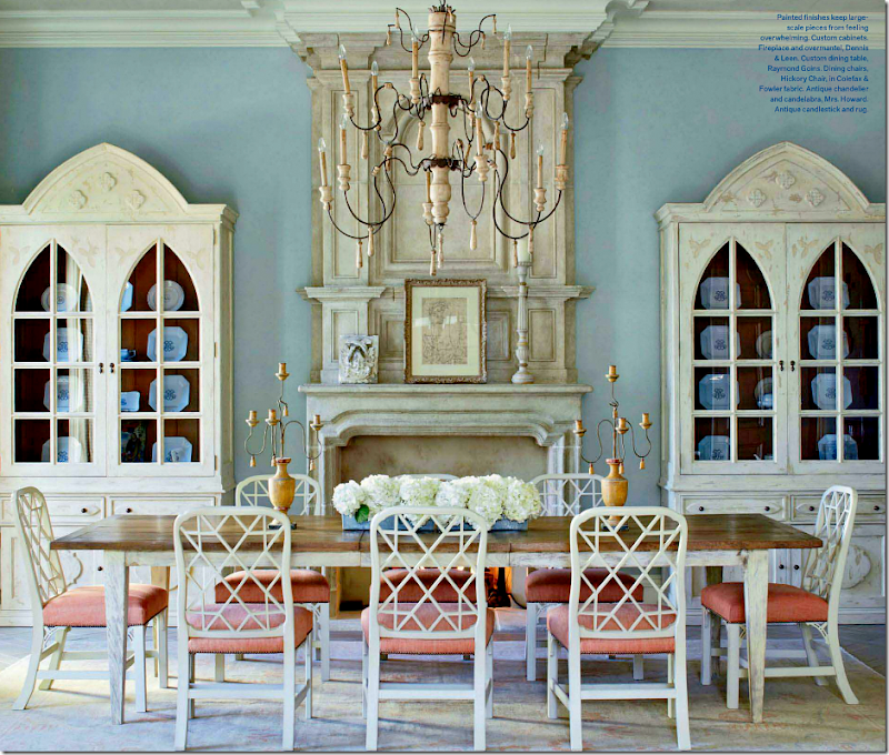
I love the dining room in blue with touches of peach.
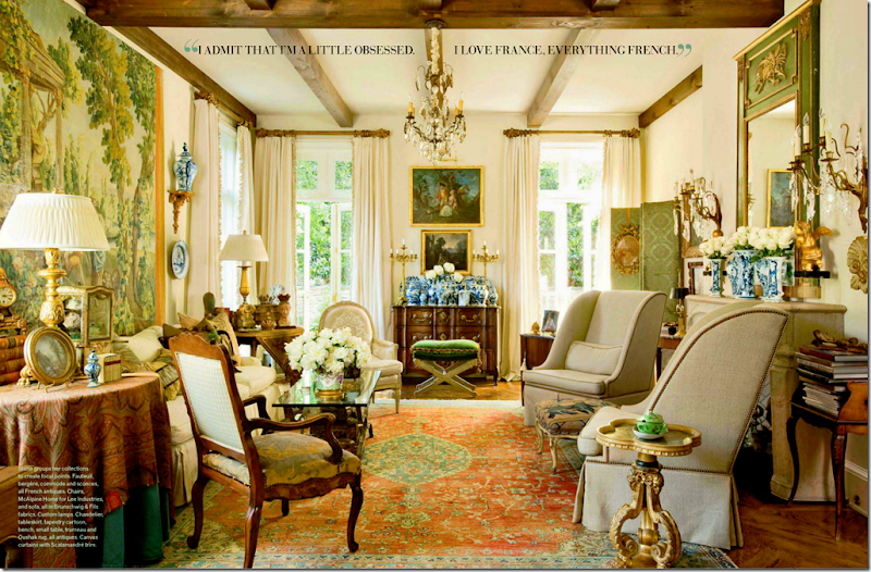
This house by Peggy Stone was reminiscent of Southern Accents and older Verandas. Can’t we get more of this each month? It’s what we want, isn’t it? I just hope Veranda realizes its readers don’t want another Elle Décor – we want Veranda, like it always was.
And finally, I have a favor to ask of you today. My niece’s friend Annie (who is also a reader) is trying to win a contest that will pay for her and her fiancé Tyler’s entire wedding! Wouldn’t that be nice??? Tyler and Annie are looking for votes and asked if you could be so kind and vote for them.
The website Entwined is hosting the contest for a wedding worth over $100,000. Can you imagine? What a dream come true. The wedding will take place in Blanco, a tiny town in the Hill Country outside of Austin, Texas. Out of all the entrants, 11 were chosen as finalists and Tyler and Annie are amongst them. If they win, they have pledged to donate $3,000 to the Houston Humane Society – as they are huge animal lovers.
If you have the time and don’t mind – I know they would so much appreciate your vote!
To vote for Tyler and Annie, just go HERE
And a huge thank you to the homeowner who so graciously allowed us a peek into her new kitchen addition! If you have a kitchen you want to show off – just email me the pictures at mrballbox329@aol.com. Hopefully, I’ll be running this series for a few more months!
Saturday, November 12, 2011
READERS KITCHENS SERIES #6 AND THIS MONTH’S VERANDA
Posted by home&interior at 6:39 PM
Subscribe to:
Post Comments (Atom)







0 Comments:
Post a Comment